
Any way you slice it, data visualisation involves important choices
Data, and data visualisation, feel objective. It seems like any way you aggregate or disaggregate data, you should be able to answer the same questions and reach the same conclusions, right? Well, maybe not. Often, choices about how data is sliced, diced, and displayed really matter.
The way you slice data matters
Contrary to the old saying ‘any way you slice it…’, the way you disaggregate data does matter. Let’s see why using a visualisation published in the Post following the release of the most recent New Zealand budget. The sourcing for that says: ‘GRAPHICS: TREASURY’; however, while I could find the data shown on the Treasury website I could not find this exact visualisation, so it appears that journalists at the Post used the Treasury data to make their own visualisation.
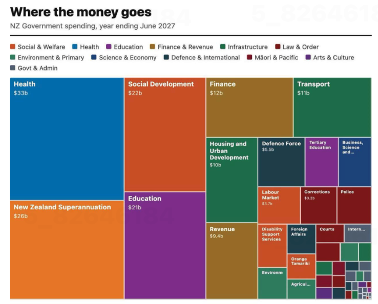
Image from page 17 of the Post, 29 May 2026, reproduced for purposes of education, criticism and commentary.
Let’s start our examination by acknowledging that communicating data about the budget for an entire country – even one as small as New Zealand – is hard. It involves sums of money that are difficult for most people to conceptualise — which makes choices about how to show it all the more important.
The visualisation is trying to communicate ‘where the money goes’ and does that by breaking spending down into categories, and colour coding those categories into larger groupings such as education and law and order. That all sounds reasonable, but you start to notice things when you look at individual rectangles within the treemap (more on this specific chart type soon).
As soon as we glance at the chart, our attention is likely to be drawn to the largest rectangle on the chart: health spending, shown in the top left corner. Looking more closely at the chart, we may then realise that is one of the only colour-coded categories that is represented by a single rectangle. Most others, such as education and law and order, are divided into more granular categories. For example, tertiary education is broken out from the rest of education, and law and order is broken down into police, courts, corrections and several other unlabelled rectangles.
There is no obvious reason for these choices, and they influence the questions you can answer using the chart as well as the conclusions you might draw from it. For example, you might want to know how much health spending goes to GPs versus specialists versus hospitals versus pharmaceuticals, but this chart would be of no help to you if you did. The dominant health box might also leave many viewers with the impression that more is spent on health than on anything else; however, adding up just the fully labelled social and welfare category rectangles — Social Development, New Zealand Superannuation, and Labour Market — quickly reveals that social and welfare spending is far greater than health spending, even before accounting for the smaller unlabelled or partially labelled rectangles in the social and welfare category.
To make it easy for people to quickly and easily get an accurate impression of data, it’s best to show it at a consistent level of granularity. For instance, RNZ showed 'how every dollar in the budget is spent' using one chart of the same type, with the data aggregated into high-level categories that allowed viewers to click on each major category to break it down into its component parts, so at any one time you were either seeing the high-level categories or the more granular categories for everything – not a mix of the two. That’s a more user-friendly way to communicate the same information.
Lesson: When showing different categories of things, aim for similar levels of granularity.
The way you combine and display data matters too
The issue just described is exacerbated by the fact that rectangles with the same colour coding are not combined together in the chart. If they were, it would give a better visual sense of how much of the budget each category represents collectively. Scattered all around, as the different categories are, it’s difficult for us to get a sense of that.
Beyond that, it’s worth questioning whether this type of chart is the best choice for communicating this data. The chart shown is a treemap. Like pie charts, stacked column charts, and stacked bar charts, it is intended to show proportions. However, all of those vary only on one dimension (the angle of each slice in a pie, the width of each slice of a stacked bar or height of each slice of a stacked column) whereas both the height and the width of rectangles in treemaps vary.
Furthermore, unlike stacked bars or columns, where every segment shares a common baseline, treemap rectangles are placed wherever they fit, meaning most pairs of rectangles share neither a common edge nor a common axis. That makes visual comparison between non-adjacent rectangles much harder — it's easier to compare education ($21b) to social development ($22b), since they share an edge, than to compare education to finance ($12b) or health ($33b) since those are not adjacent within the chart.
The combination of those two differences makes it harder for humans to visually compare two rectangles of a treemap and get an accurate intuitive sense of how they differ than it is for them to compare two slices of a pie chart, stacked bar, or stacked column.
Of course, the number of categories represented in this and many treemaps might be overwhelming in a stacked bar or column chart or a pie chart, but there are a number of ways to solve that problem. One is to use multiple charts, as described previously, first breaking things down at a high level, and then within sub-categories. Another is to use a non-stacked column or bar chart where each category has its own bar or column.
Lesson: Choose a chart type that fits not only the data, but also how humans naturally process information.
The charts from the Post and RNZ represent only a tiny portion of coverage of the budget. It attracts a great deal of commentary and conversation about the country’s financial commitments and priorities. A great chart can’t balance, or even stretch a nation’s budget, but any way you slice it, making good choices about how the underlying financial data is communicated to citizens and voters can make all that commentary and conversation better informed.