
Any way you slice it, data visualisation involves important choices
Data, and data visualisation, feel objective. It seems like any way you aggregate or disaggregate data, you should be able to answer the same questions and reach the same conclusions, right? Well, maybe not. Often, choices about how data is sliced, diced, and displayed really matter.
The way you slice data matters
Contrary to the old saying ‘any way you slice it…’, the way you disaggregate data does matter. Let’s see why using a visualisation published in the Post following the release of the most recent New Zealand budget. The sourcing for that says: ‘GRAPHICS: TREASURY’; however, while I could find the data shown on the Treasury website I could not find this exact visualisation, so it appears that journalists at the Post used the Treasury data to make their own visualisation.
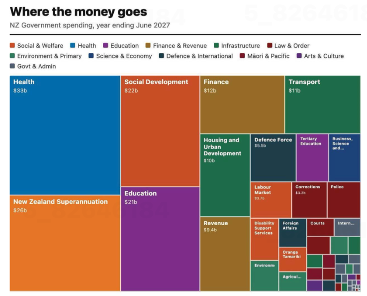
Image from page 17 of the Post, 29 May 2026, reproduced for purposes of education, criticism and commentary.
Let’s start our examination by acknowledging that communicating data about the budget for an entire country – even one as small as New Zealand – is hard. It involves sums of money that are difficult for most people to conceptualise — which makes choices about how to show it all the more important.
The visualisation is trying to communicate ‘where the money goes’ and does that by breaking spending down into categories, and colour coding those categories into larger groupings such as education and law and order. That all sounds reasonable, but you start to notice things when you look at individual rectangles within the treemap (more on this specific chart type soon).
As soon as we glance at the chart, our attention is likely to be drawn to the largest rectangle on the chart: health spending, shown in the top left corner. Looking more closely at the chart, we may then realise that is one of the only colour-coded categories that is represented by a single rectangle. Most others, such as education and law and order, are divided into more granular categories. For example, tertiary education is broken out from the rest of education, and law and order is broken down into police, courts, corrections and several other unlabelled rectangles.
There is no obvious reason for these choices, and they influence the questions you can answer using the chart as well as the conclusions you might draw from it. For example, you might want to know how much health spending goes to GPs versus specialists versus hospitals versus pharmaceuticals, but this chart would be of no help to you if you did. The dominant health box might also leave many viewers with the impression that more is spent on health than on anything else; however, adding up just the fully labelled social and welfare category rectangles — Social Development, New Zealand Superannuation, and Labour Market — quickly reveals that social and welfare spending is far greater than health spending, even before accounting for the smaller unlabelled or partially labelled rectangles in the social and welfare category.
To make it easy for people to quickly and easily get an accurate impression of data, it’s best to show it at a consistent level of granularity. For instance, RNZ showed 'how every dollar in the budget is spent' using one chart of the same type, with the data aggregated into high-level categories that allowed viewers to click on each major category to break it down into its component parts, so at any one time you were either seeing the high-level categories or the more granular categories for everything – not a mix of the two. That’s a more user-friendly way to communicate the same information.
Lesson: When showing different categories of things, aim for similar levels of granularity.
The way you combine and display data matters too
The issue just described is exacerbated by the fact that rectangles with the same colour coding are not combined together in the chart. If they were, it would give a better visual sense of how much of the budget each category represents collectively. Scattered all around, as the different categories are, it’s difficult for us to get a sense of that.
Beyond that, it’s worth questioning whether this type of chart is the best choice for communicating this data. The chart shown is a treemap. Like pie charts, stacked column charts, and stacked bar charts, it is intended to show proportions. However, all of those vary only on one dimension (the angle of each slice in a pie, the width of each slice of a stacked bar or height of each slice of a stacked column) whereas both the height and the width of rectangles in treemaps vary.
Furthermore, unlike stacked bars or columns, where every segment shares a common baseline, treemap rectangles are placed wherever they fit, meaning most pairs of rectangles share neither a common edge nor a common axis. That makes visual comparison between non-adjacent rectangles much harder — it's easier to compare education ($21b) to social development ($22b), since they share an edge, than to compare education to finance ($12b) or health ($33b) since those are not adjacent within the chart.
The combination of those two differences makes it harder for humans to visually compare two rectangles of a treemap and get an accurate intuitive sense of how they differ than it is for them to compare two slices of a pie chart, stacked bar, or stacked column.
Of course, the number of categories represented in this and many treemaps might be overwhelming in a stacked bar or column chart or a pie chart, but there are a number of ways to solve that problem. One is to use multiple charts, as described previously, first breaking things down at a high level, and then within sub-categories. Another is to use a non-stacked column or bar chart where each category has its own bar or column.
Lesson: Choose a chart type that fits not only the data, but also how humans naturally process information.
The charts from the Post and RNZ represent only a tiny portion of coverage of the budget. It attracts a great deal of commentary and conversation about the country’s financial commitments and priorities. A great chart can’t balance, or even stretch a nation’s budget, but any way you slice it, making good choices about how the underlying financial data is communicated to citizens and voters can make all that commentary and conversation better informed.
Little changes can make a big difference
On page 139 of his revered book ‘The Visual Display of Quantitative Information’, Edward Tufte says: ‘Multifunctional graphical elements, if designed with care and subtlety, can effectively display complex, multivariate data.’ Let’s consider charts Statistics New Zealand created to show immigration data to see how a bit more care and subtlety could improve the display of multivariate data in those examples.
Adding patterns can help show multiple dimensions
If you look at the first chart below, you can see that it is showing two different things: Whether people are arriving into or departing from New Zealand (also shown as the net difference between arrivals and departures), and whether or not the people arriving or departing are New Zealand citizens. Six different colours are used in the chart to show the combination of those two things.
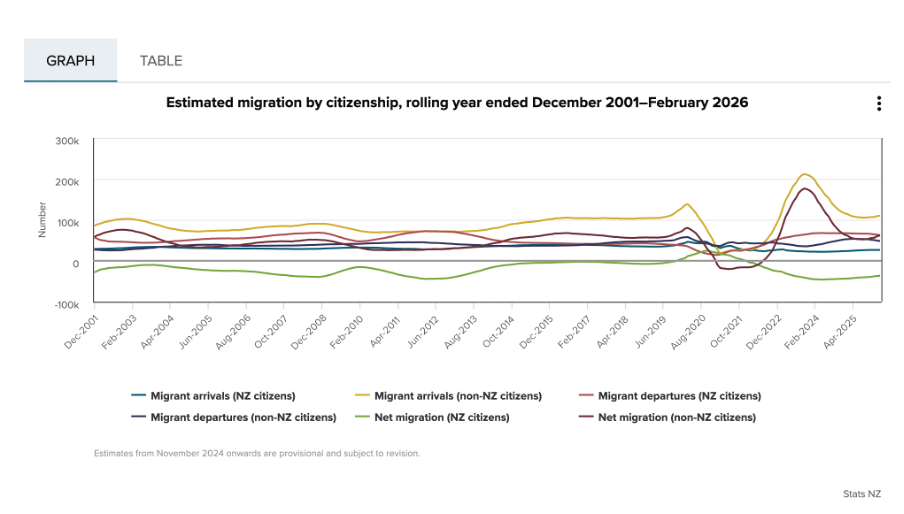
Image reproduced for purposes of education, criticism and commentary.
Since there is nothing particularly intuitive about the colours used, viewers of the chart need to repeatedly look back and forth between the legend and the line chart to remember which colour refers to which data series. This is exacerbated by the facts that: 1) different charts showing different immigration data on the same webpage use the same colours to show different things, as the chart below illustrates, and 2) all of the lines are fairly close together.
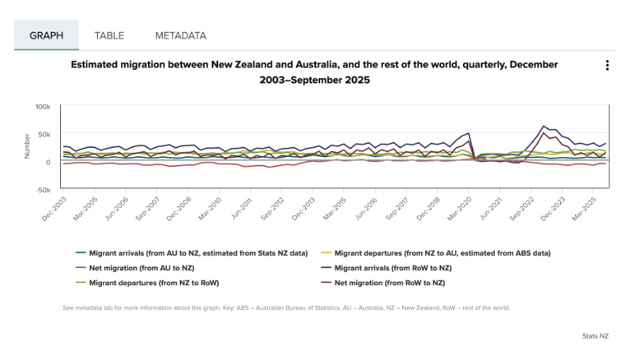
Image reproduced for purposes of education, criticism and commentary.
One way to use Tufte’s concept of multifunctional graphical elements would be to use different markers or symbols to convey one of the dimensions to make it easier for the viewer to distinguish between the different data series. In this situation, an obvious example would be to use up and down arrows or triangles to show arrivals and departures. That would then allow us to use one colour for New Zealand Citizens and another for non-citizens, which also helps make it easier for viewers to distinguish the different data series, as shown in the example below, remade with the data available after clicking on table tab in the top Statistics New Zealand chart.
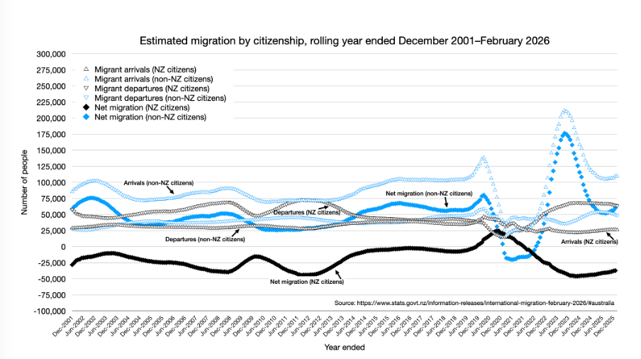
Author's own chart, using Stats NZ data.
Lesson: Consider using patterns as well as colours to distinguish between different data series in charts — particularly when trying to show multiple dimensions.
Making choices about chart sizing using care and subtlety
The main plot area of the original Statistics New Zealand charts are quite short vertically, but relatively wide horizontally. The width is likely to be a function of the fact that there are a large number of data points to show (one for each month, showing rolling years). Since the charts are shown online, it’s not clear why so little space was allowed for the vertical dimension. Sometimes page sizes or layouts restrict the vertical dimension of a printed document, but that should be less of a concern online within reason.
Expanding the vertical dimension of the chart, as shown in the remade example above, makes it easier to distinguish between the different data series. Because it still uses the same numeric range, which includes zero, expanding the vertical dimension does not give a misleading sense of things like changes and differences — it just makes them easier to see. Part of the reason care is important here is that truncating the range of an axis, especially to exclude zero, can magnify things such as changes and differences and therefore be misleading.
Lesson: Changes to the size or dimensions of a chart may make it easier for viewers to see patterns in the data — just make sure it enhances those rather than distorting them.
Err on the side of labels
Another noteworthy bit of wisdom from ‘The Visual Display of Quantitative Information’ (page 180) is: ‘Words and pictures belong together. Viewers need the help that words can provide… It is nearly always helpful to write little messages on the plotting field to explain the data, to label outliers and interesting data points, to write equations and sometimes tables on the graphic itself, and to integrate the caption and legend into the design so that the eye is not required to dart back and forth between textual material and the graphic.’
As noted in that quote, labels can be very helpful, and if in doubt it’s prudent to err on the side of more labelling rather than less. For instance, in the remade chart above the up and down arrows or triangle symbols may be somewhat hard to see because there are a lot of them and some viewers may be using small screens, so the individual data series are labelled in situ as well as in the legend.
Lesson: Make sure axes, data series, and other elements within data visualisations and other forms of data communication are well-labelled to avoid ambiguity and confusion and to ensure viewers can focus on patterns and insights revealed in the data.
The Visual Display of Quantitative Information was published more than 40 years ago, yet it remains as relevant now as the day it was first printed. The need to ‘effectively display complex, multivariate data’ is as important now as it was then.
EVs are getting better all the time; so should data communication
Current geopolitics and associated oil and petrol prices have me feeling good about owning an EV. I bought mine a few years ago, and knew sales had dropped after incentives were removed in New Zealand, but I was curious to see if they had picked up again given current events. Anecdotal news reports suggest that they have, but it was harder than I expected to find the actual data.
Show your sources
After a bit of online searching, I found the dashboard shown below from Infometrics. The surge in EV registrations during the period of the Clean Car Discount is evident in the middle chart, as is the falloff after. I suspected the data came from the New Zealand Transport Agency (NZTA), as that’s the first place I checked myself (more on that later), but at first I could not verify that. Eventually I realised that the small red ‘i’ symbol under ‘Highlights for New Zealand’ was clickable and led to a list of data sources, but I had to search through that to find the one I was looking for and even then it just said NZTA without saying exactly where to find this specific NZTA data on their website.
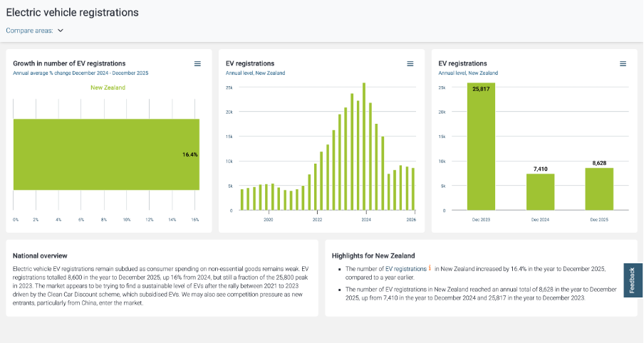
Image reproduced for purposes of education, criticism and commentary.
Not everyone wants to see sources, but some people do, and providing sources and making them easy to find adds to the credibility of your data communication. Sometimes it can be essential for viewers to really understand what they’re looking at. For instance, in this example, you may be wondering if plug-in hybrids are being counted within this dashboard or not. They were not, but the only way to know that for sure is to find and click the symbol and read that additional information about the source.
Lesson: Always show your sources, and make it easy for those who want them to find them.
Provide comparisons
While it’s clear from the last two charts that EV registrations dropped between 2023 and 2024 and from all three that EV registrations grew between 2024 and 2025, what’s not clear is how that compares to other types of vehicles. For example, during 2024 you often heard the mantra ‘survive until 2025’ reflecting the difficult economic times, so perhaps sales of all vehicles were down in 2024. Without comparative data, we can’t tell for sure.
While the second chart in the Infometrics dashboard is very helpful, the other two essentially just show the same information in different ways, and would have been usefully replaced by charts for hybrid and petrol only vehicles so we could compare and contrast registrations for each type of vehicle across time.
Lesson: A lot of data is most informative when shown in relationship to relevant comparative data.
Getting granularity right
The other thing that’s missing from the Infometrics dashboard is data for the first three months of 2026. Given the rapidly changing situation in the oil-rich Middle East, things might have changed a lot in the past few months, but we can’t tell from the Infometrics dashboard.
As I mentioned, I went to the NZTA website first because I recalled that they have their own dashboard, and that did indeed have data up through March 2026 and it did have comparative data for different types of vehicles, but it had different limitations from the Infometrics dashboard. Specifically, even after several attempts I was unable to get it to display data by month as opposed to showing it for one month or a group of months added up.
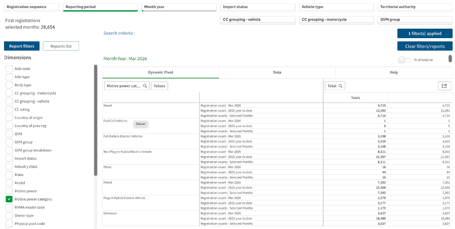
Image reproduced for purposes of education, criticism and commentary.
If I really needed to, I could have downloaded the data for January, February, and March 2026 one month at a time, but obviously that’s not the most user-friendly experience. In this situation, people making decisions about things such as whether to accelerate the roll-out of additional EV charging infrastructure probably want to know about any changes in trends sooner rather than later and therefore would have appreciated being able to access that more granular data without having to do a lot of their own manipulation of the data.
Lesson: Communicate data insights at the level of granularity that will be most useful for decision makers.
While I’m less concerned about current fuel prices and potential fuel shortages than owners of cars with combustion engines, my own EV from just a few years ago doesn’t go as far on a charge as the new ones being sold today. EV manufacturers didn’t get everything perfect on the first try. They needed to improve battery technologies and redesign car bodies to accommodate differences in things such as the weight distribution resulting from EVs having much larger batteries than internal combustion cars, but no engine.
It’s also hard to get data communication right the first time. Neither the Infometrics nor the NZTA dashboard is perfect or individually sufficient, but that same sort of patience to redesign and refine pays off in data communication, just as it has for modern EVs.
What the screen industry can teach data communicators
People in the screen sector excel at telling stories, and a report about the New Zealand screen sector provides an opportunity to consider how we tell stories with and about data. The report provides an interesting overview of the sector, but also illustrates some common ways in which the use of charts is not quite as effective as it could be.
The film director David Fincher is quoted as saying: "My idea of professionalism is probably a lot of people's idea of obsessive." Attention to detail can elevate a data communication from serviceable to excellent just as it can elevate a film or a TV show.
Consider the metric you’re using when creating stacked bar and column charts
Figures 3 and 6 of the report focus on how the New Zealand screen sector breaks down into sub-sectors such as production and post-production. It does this based on a count of firms in Figure 3 and a count of people in Figure 6. That’s interesting and important information, but it’s shown in a way that makes it harder to digest than it needs to be.
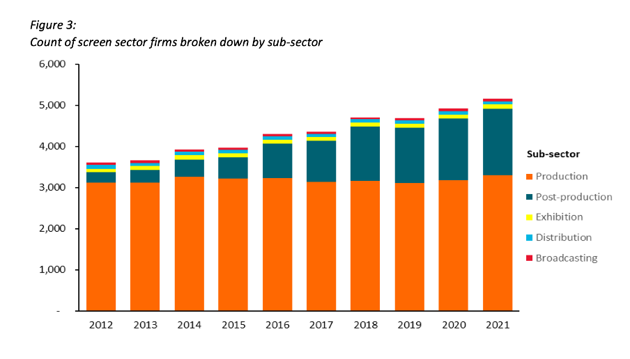
Image reproduced for purposes of education, criticism and commentary.
Because both figures show the data as counts, or absolute values, rather than as percentages, it’s somewhat hard to discern to what extent a particular sub-sector is growing because that can be masked by growth in the sector overall. For example, looking at Figure 3 we can reasonably conclude that, when it comes to firms, the production sub-sector is shrinking as a percentage of the overall sector and post-production is growing because the orange portion of each column has stayed around the same height while the columns have grown overall and the dark teal portion appears to have grown as a percentage of the columns.
Beyond that though we don’t have a very good idea of the magnitude of the shift in those percentages, and we have even less idea of whether there have been any changes in the proportions of the smaller sub-sectors since those are represented by relatively small slices of relatively tall columns.
When using stacked columns or stacked bars, the story being told will generally be more clear if the data is shown as percentages rather than as counts or absolute values. That makes it easy to scan horizontally (for stacked columns) or vertically (for stacked bars) to see differences. For example, while not perfect for other reasons we will touch on shortly, Figure 19 of the same report uses stacked columns showing percentages to illustrate the breakdown of sub-sectors by region and from that we can easily see that people working in post-production are concentrated primarily in Wellington, whereas production represents a large proportion of people working in the screen sector in all regions.
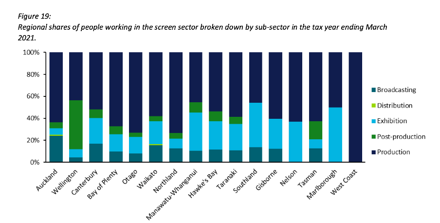
Image reproduced for purposes of education, criticism and commentary.
Lesson: Stacked column (and bar) charts usually work best when they show percentages rather than absolute values
Continuity
While Figure 19 is good in the sense that it represents the data as percentages rather than counts or absolute values it’s not as good as it could be in that the colours used to represent the different sub-sectors have changed from what they were earlier in the report, such as in Figure 3. That is a common problem in data communication, as we’ve seen in earlier posts. It can occur when different people work on the same output or even if the same person works on it at different times. It often occurs because people rely on software defaults, which are a function of the order the data is in and sometimes the particular theme or template a person has on their computer.
No matter how or why this shift in colour assignment happens it’s as disruptive as it would be if the colours of the costumes the characters in a TV show or movie you were watching changed part way through for no apparent reason. In our data communication, as in film or TV production, we should take care to avoid that.
That maintenance of consistency is called continuity in the screen industry. For example, besides noticing if a costume has changed colour from one scene to the next without explanation we would also be likely to notice if an object is in a different place. Similarly, in data communication the idea of continuity applies to order as well as colour. Once we have established a particular order for something, such as the sub-sectors in this report, maintaining it makes it easier for viewers to understand what they are looking at in a given chart and to make comparisons across charts.
For example, like Figure 3, Figure 6 shows the breakdown of sub-sectors, but this time by workers rather than by firms. It’s interesting to compare and contrast the two, but if you visually scan back and forth between Figures 3 and 6 you can see it’s not that easy to do. Part of that is because both use counts rather than percentages, as described previously, but it’s also because the order of the sub-sectors has changed. Maintaining continuity when it comes to the order of the sub-sectors across both charts would have improved the experience of the viewer.
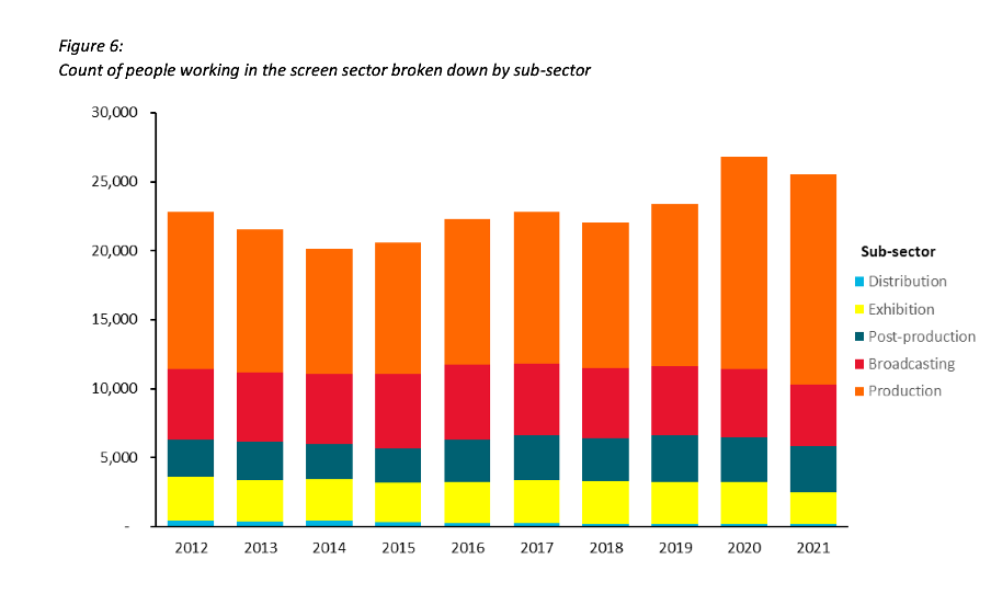
Image reproduced for purposes of education, criticism and commentary.
Lesson: Once you’ve established a colour scheme or an order in which to show different groups, categories, etc., maintain it unless there is a very good reason not to
Two (or more) charts are often better than one
Just as filmmakers use different scenes to show us different insights into characters, we can use different charts to show different insights derived from data. The stacked column charts shown in the current versions of Figures 3 and 6 each show two different insights: 1) total growth in firms or people working in the New Zealand screen industry, and 2) changes to the proportional breakdown of firms or people by sub-sector.
There are many similar situations in data communication. For example, we might want to show how the number of customers or clients has changed and how that breaks down by region, age, income, etc.
In all of those situations it generally works better to use a chart with solid bars or columns first to show the change in the absolute value or count of whatever we are focussed on and then follow that up with a stacked bar or column chart showing the proportional breakdown than to try to do both at once as happens in the current versions of Figures 3 and 6. The first chart establishes the overall change and then the second one shows whether that is being driven disproportionately by particular sub-groups. Additional stacked bar or column charts can be used to show additional breakdowns.
Lesson: If you are trying to communicate multiple insights consider using multiple charts
Those of us trying to communicate data-driven insights are like filmmakers and TV producers in that we are trying to create an engaging narrative. We can learn from them in taking care to ensure the story we tell is clear, maintains continuity when it comes to things such as colour and order, and is not unnecessarily complicated to follow. We should carefully attend to those details because in data communication, as in filmmaking, Fincher's 'obsessiveness' is really true professionalism.
Consistency is helpful to those viewing data visualisations
Famous quotes such as: “A foolish consistency is the hobgoblin of little minds” by Ralph Waldo Emerson and Oscar Wilde's "Consistency is the last refuge of the unimaginative" give the concept of consistency a bad name. Like most things though, consistency has its place, and one of them is in data visualisations.
Ideally, the structural elements of a data visualisation should fade into the background to enable viewers to take away the key insights without having to spend a lot of time orienting themselves. Consistency in the use of axes, colour, and chart types can help achieve that. Let’s see how by looking at some examples from a report on the literacy and numeracy skills of New Zealand adults produced by the Ministry of Education.
The report has inconsistencies in the use of axes, colour, and chart types. Resolving those would turn an accurate but clunky data communication into a better, more polished one.
Axis consistency
The main focus of the report is on the literacy and numeracy skills of adults in New Zealand as measured through surveys conducted in 2014 and 2023. The report goes into a lot of detail about the response rate being much lower in 2023 than in 2014, resulting in the need to exercise caution when interpreting and comparing results; however we will focus on how the results are shown rather than how they were derived.
Possible scores on the numeracy and literacy tests that are the focus of the report can vary between 0 and 500 with higher numbers meaning greater literacy or numeracy. Eight different visualisations within the report show results based on those scales, yet none of them show the full 0 to 500 range. The ranges that are actually used vary. Figures 1, 4, 5, 7, 17 and 18 use 180 to 300 whereas Figure 2 uses 150 to 350 and Figure 6 uses 170 to 310. This makes it difficult for users to intuitively grasp the magnitude of differences being described without looking carefully at the axis value labels.
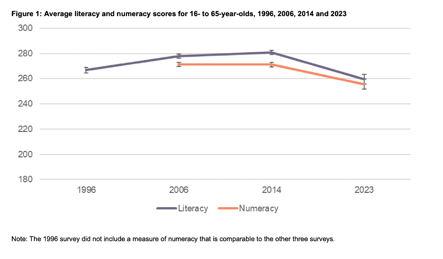
Image reproduced for purposes of education, criticism and commentary.
In a situation like this, it's generally better to show the full range of possible values for a metric. That eliminates the problem of inconsistency across visualisations (within and across outputs) and also results in more accurate intuitive interpretation of the magnitude of differences.
Lesson: When showing the same metric across multiple charts to the same audience (whether in a single output or multiple outputs) the range of the axes should remain constant.
Colour consistency
Another aspect of the design of the visualisations in this report that viewers would need to attend to before focussing on the survey results or their implications is the use of colours. The charts showing the test scores all use two colours – purple and orange; however what is purple and what is orange varies. In Figure 1, literacy is purple and numeracy is orange, but in Figures 2, 5, 7, 17 and 18 the year 2014 is purple and 2023 is orange. In Figures 4 and 6 males are purple and females are orange.
Many organisations have style guides that stipulate the use of particular colours, and that’s likely to have influenced this choice, but using the same colours for different things at best results in viewers needing a little bit more time to digest each chart and at worst can result in confusion or misunderstanding. There are multiple ways to avoid that, even staying within a restricted colour palette.
First, small changes to some of the charts would mean that literacy could always be purple and numeracy could always be orange. In Figure 2 making the marker in the second box (literacy 2023) purple and the marker in the third box (numeracy 2014) orange would maintain the colour convention established in Figure 1: literacy purple, numeracy orange. In Figure 4 consistency could be achieved by changing the structure so the columns show literacy type by gender by year instead of gender by year by literacy type. Alternatively different colours (besides just purple and orange) could be used to designate different things. Even fairly strict style guides typically include more than two colours, and use of different shades and patterns are options for stretching a limited colour palette further.
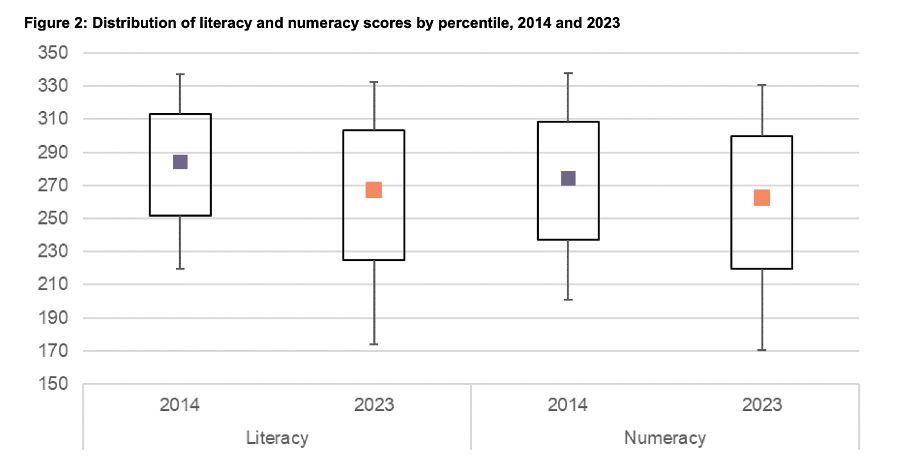
Image reproduced for purposes of education, criticism and commentary.
Lesson: When using colour to designate different groups, try to make colour assignments consistent.
Chart type consistency
Even though Figures 1, 2 and 4 all show literacy and numeracy scores, they do so using three different chart types. There is no reason for that, and as with the different colours at best it results in viewers needing a little bit more time to comprehend each chart and at worst it can result in confusion or misunderstanding.
In a situation like this when trying to show overall results for a particular metric and then how it varies based on different characteristics it can be helpful to use the same chart type, and gradually build it out or show versions that vary only on those different characteristics that you want to highlight. That makes it easy for viewers to understand what is being communicated and to see where the key differences are.
For example, this report could have started with the data communicated via box and whisker charts as it is shown in Figure 2, but with the colour changes and axis adjustments described previously and then used subsequent charts with the same structure but broken down by characteristics such as gender, age, educational attainment, and time in New Zealand.
Or, depending on the intended target audience, column charts showing averages could be used, such as a modified version of Figure 4, for all of the charts. Either of those options would enable the viewer to orient themselves to the structure of the chart once and from then on focus on changes resulting from showing the same data for different years and groups.
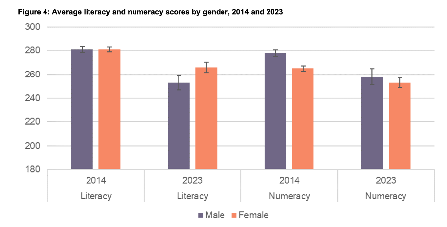
Image reproduced for purposes of education, criticism and commentary.
Since either of those chart types could work for showing the data consistently, the choice between them would come down to the intended target audience. Box and whisker charts would work well if the intended target audience is highly numerate themselves. That’s because the ability to interpret charts is part of the measurement of numeracy. Box and whisker charts contain more information than column charts in that they are a compact way of showing the median (marker in the middle) as well as the 10th (bottom whisker), 25th (bottom of the box), 75th (top of the box), and 90th (top whisker) percentiles. All of that information presented in a compact display would be appreciated by people who are highly numerate, but may confuse those who are less so. Column charts convey less information (in this example only an average), but are easier for a target audience that is less numerate to interpret.
Lesson: When telling a story about if or how a given metric varies based on characteristics such as demographics it's helpful to keep the chart type consistent so that people can focus on just how the focal metric changes depending on the characteristics that are changing.
Once all of the analysis has been completed for a big piece of work, it’s tempting to try to get the results out as soon as possible in a ‘good enough’ format, but spending just a bit of extra time on things like consistency can help ensure that all of that analytical work can be clearly understood and actioned. That work to improve the experience of the audience is not unimaginative. It’s sensible and considerate.