
Good jokes, and good data communication, depend on the audience
Everyone knows that explaining a joke can wreck it. Over-explaining a data visualisation can have the same effect. The trick in both situations is that failing to explain can also sometimes be a problem. The skill is knowing which is which. Jokes often draw on things such as cultural references. An audience already familiar with the references will pick up on them and enjoy getting them. On the other hand, the same joke told to an audience with different cultural references (due to age, location, etc.) might fall completely flat. That second audience might either need some additional explanation or else a different joke.
The same type of audience awareness is important in data communication, though in that case what’s relevant is how knowledgeable the audience is about the domain or about data and analytics more generally. Previous posts have described the importance of making data communication accessible to general audiences that include people who are not particularly data-savvy, but what about the reverse? How do you tailor data communication to an audience with a relatively high level of data capabilities?
The strengths and weaknesses of bubble charts
A chart developed by The Economist and posted on LinkedIn provides a good illustration. They use a bubble chart to show the relationship between three characteristics of recent graduates in different fields of study: 1) how exposed the field is to AI, 2) the change in the percentage of graduates in full-time employment between 2022 and 2024, and 3) the number of graduates in that field.
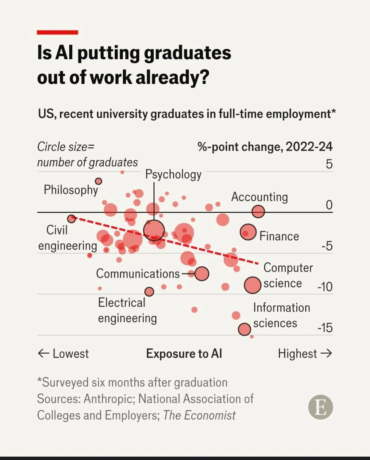
Image reproduced for purposes of education, criticism and commentary.
That packs a lot of information into a concise format for an audience that is comfortable with charts and graphs. Given the nature of the content it publishes, it seems safe to assume that includes most readers of The Economist and its LinkedIn followers. Such viewers are likely to be able to assimilate information about the three dimensions simultaneously.
In contrast, bubble charts can be very challenging for more general audiences to understand. Without a lot of explanation, and possibly a more gradual build-up, they may miss or misunderstand some of the information being communicated. The same is true of other more complex chart types, such as box and whisker or charts with two different y-axes.
Lesson: Complex chart types can reward data-savvy audiences but may confuse general ones.
To explain or not to explain
With its three dimensions’ worth of information, the Economist’s chart reveals interesting patterns with the help of some subtle cues. The solid black horizontal line separates fields in which more graduates were employed in 2024 than in 2022 (above the line) from fields in which fewer graduates were employed in 2024 than in 2022 (below the line). The downward sloping dashed red line shows the overall trend amongst all of the fields with the fields seeing the greatest drop in employment tending to be those that have the greatest exposure to AI. Scanning all of the bubbles with the help of those cues and the labels provided, we can see that computer and information science appear to be both among the most exposed to AI and among the fields that saw the greatest drop in employment of recent graduates between 2022 and 2024.
While all of that is interesting, the visualisation doesn’t say any of that, nor does the LinkedIn post in which it featured. The visualisation simply poses the question: ‘Is AI putting graduates out of work already?’ For a data-savvy audience, such as readers of The Economist, that creates an interesting puzzle to be solved. The chart gives them the information needed to solve it, and they have the skills to do so.
With a different audience, much more explanation would be needed to help them see how the chart answers the question posed. For example, they might not intuitively grasp the purpose of the dashed line or the meaning of the pattern of the bubbles. They also might not understand why the vertical axis shows the change in employment rather than just the employment rate.
You might be thinking: why not just explain everything all of the time? It does make sense to err on the side of explanation when you’re not sure about an audience, but too much explanation to an expert audience can easily come off as boring or condescending. It can also deprive them of the pleasure of finding the patterns themselves.
Lesson: More sophisticated audiences require less explanation.
This visualisation is a Good example of data communication for this audience — but with a different audience, the same chart could easily be Bad. Like knowing when not to explain a joke, knowing when not to explain a chart is a skill — and it starts with knowing your audience.
Discussion and visualisation of data should make an issue more understandable
Housing is a fraught topic in New Zealand, as it is in many places. Too many people lack access to a decent place to live at a price they can afford. On the other hand, people who have lived in neighbourhoods they love for decades may be reluctant to see them change through intensification. That is a hard problem, and one that’s helpful to consider in light of good available data.
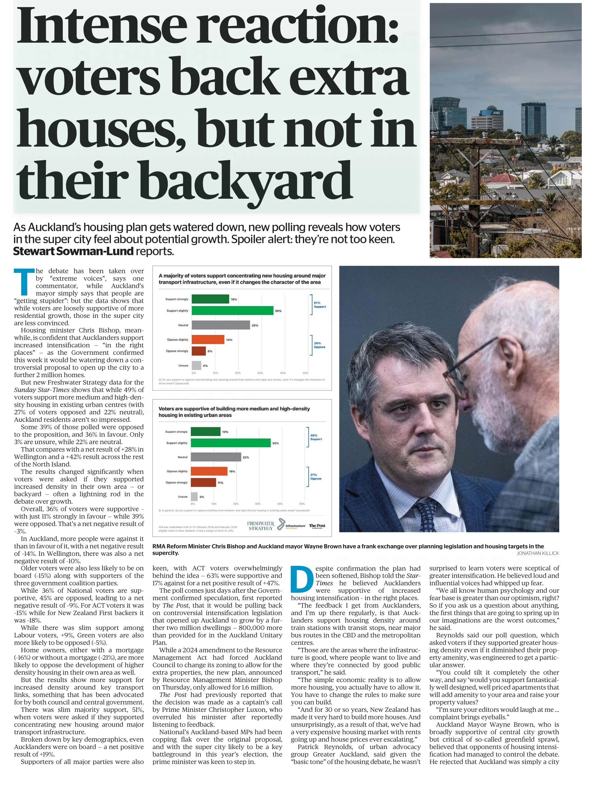
An article in the most recent edition of The Sunday Star-Times missed an opportunity to do that. The article describes results of a survey conducted by Freshwater Strategy on behalf of The Sunday Star-Times. The survey measured attitudes of eligible voters toward new housing and increased housing density. Ideally the survey results would have helped to inform the debate around these issues, but the results were communicated poorly, reducing their ability to make a constructive contribution to the debate.
Reproduced from page 6 of the Sunday Star-Times from 22 Feb, 2026 for purposes of education, commentary, and criticism.
Show the things that are most important for the audience to know
One data communication choice in the article that limits its likely use and usefulness relates to which results were featured in visualisations and which were not. The headline of the article says that ‘voters back extra houses, but not in their backyard’ and the text of the article describes density in people’s own local area as ‘often a lightning rod in the debate over growth’. Given those things, it’s surprising to see that even though the text of the article discusses attitudes toward increased density in survey respondents’ own local areas, those results don’t feature in either of the two charts shown in the article. The two charts that are shown illustrate fairly similar responses to fairly similar questions (about increased housing intensification around transport infrastructure and in existing urban areas, which in practice are often likely to be the same places).
Lesson: When using a combination of text and visualisations to communicate insights from data, the data visualisations should be used to illustrate the most important points.
Show (and tell) your audience about your results at a level of granularity required to inform their decision making
A second problem with the way the data from the survey is communicated in the article is that the charts that are shown present more granular results than the text descriptions that accompany them. That makes it difficult to understand the results in detail – particularly for the crucial question for which there is no visualisation.
That is problematic because for emotive issues such as housing there is a big difference between being strongly supportive versus slightly supportive or being strongly opposed versus slightly opposed. Those who are strongly supportive or opposed are much more likely to take actions such as contacting their elected representatives, signing petitions, participating in consultation processes, and sharing their views formally or informally. Their votes are also more likely to be influenced by the issue.
Showing more granular results with all six possible responses to each question would have made it easier to see the differences in attitudes when increased density is discussed in the abstract versus in a way that could have an immediate effect on the people expressing the attitudes. Obviously data communication almost always involves choices about what to include and what to exclude or present in an aggregated manner, but in this case a relatively small change in the type of chart used would have enabled much more information to have been communicated to help readers understand the issue being discussed.
Both of the charts shown are bar charts, with each bar representing the proportion of survey respondents who gave each response to the question shown at the bottom of the chart. Because they are mutually exclusive proportions (each person can give only one answer to each question, and all respondents are represented if only to say they are neutral or unsure) then these results could have been shown using a stacked bar chart. That is where there is a bar sliced into segments – in this case based on which response people selected for each question. One stacked bar chart with three bars could have been used to compare overall results for the three questions discussed in the article.
The text of the article also discusses variation in responses to all three questions based on location, age, voting preferences, and home ownership. There are no charts for any of those things, which makes it somewhat difficult to follow the text-based discussion about how results vary by group. Additional stacked bar charts would have helped to show key differences based on location, age, voting preferences, and home ownership.
Lesson: When possible – and especially when details are important to truly understanding an issue – try to preserve granularity when communicating data and only aggregate when doing so helps the viewer understand the data more clearly.
Define your metrics
Given the previously described issues with what was shown in visualisations, the text of the article had to carry most of the burden of communicating the survey results; however many readers would probably struggle to fully understand the text-based descriptions. To see why, let’s take a look at an excerpt from the text of the article.
“… while 49% of voters support more medium and high-density housing in existing urban centres (with 27% of voters opposed and 22% neutral), Auckland residents aren't so impressed.
Some 39% of those polled were opposed to the proposition, and 36% in favour. Only 3% are unsure, while 22% are neutral. That compares with a net result of +28% in Wellington and a +42% result across the rest of the North Island.”
The last sentence in the excerpt shown discusses ‘net results’ of +28% in Wellington and +42% across the rest of the North Island. The subsequent discussion also uses the ‘net’ terminology. People who regularly review survey data are likely to know that ‘net results’ in this context mean the total percentage in support (slightly + strongly) minus the total percentage in opposition (slightly + strongly); however the article does not say that anywhere and it seems unlikely that most readers of the Sunday Star-Times are familiar with that convention. Calculated metrics like that should be explained when viewers may be unfamiliar with them.
Lesson: If you are using a calculated metric, you should explain how it’s calculated if more than a very small percentage of the target audience are unlikely to know that.
Between the most salient question not being shown in a chart or described in full, group differences not being shown in charts or described in full, and many people not understanding the concept of net results in this context I suspect this article may leave many readers no better informed than they were before they read it. That is a lost opportunity for data to play an important role in helping people understand and make decisions about this important issue for our society. A detailed understanding of how attitudes vary by group and by form of intensification is likely to be necessary for finding housing solutions with enough community support to be implemented, and for identifying the specific challenges that must be overcome to make that happen.
Consistency is helpful to those viewing data visualisations
Famous quotes such as: “A foolish consistency is the hobgoblin of little minds” by Ralph Waldo Emerson and Oscar Wilde's "Consistency is the last refuge of the unimaginative" give the concept of consistency a bad name. Like most things though, consistency has its place, and one of them is in data visualisations.
Ideally, the structural elements of a data visualisation should fade into the background to enable viewers to take away the key insights without having to spend a lot of time orienting themselves. Consistency in the use of axes, colour, and chart types can help achieve that. Let’s see how by looking at some examples from a report on the literacy and numeracy skills of New Zealand adults produced by the Ministry of Education.
The report has inconsistencies in the use of axes, colour, and chart types. Resolving those would turn an accurate but clunky data communication into a better, more polished one.
Axis consistency
The main focus of the report is on the literacy and numeracy skills of adults in New Zealand as measured through surveys conducted in 2014 and 2023. The report goes into a lot of detail about the response rate being much lower in 2023 than in 2014, resulting in the need to exercise caution when interpreting and comparing results; however we will focus on how the results are shown rather than how they were derived.
Possible scores on the numeracy and literacy tests that are the focus of the report can vary between 0 and 500 with higher numbers meaning greater literacy or numeracy. Eight different visualisations within the report show results based on those scales, yet none of them show the full 0 to 500 range. The ranges that are actually used vary. Figures 1, 4, 5, 7, 17 and 18 use 180 to 300 whereas Figure 2 uses 150 to 350 and Figure 6 uses 170 to 310. This makes it difficult for users to intuitively grasp the magnitude of differences being described without looking carefully at the axis value labels.
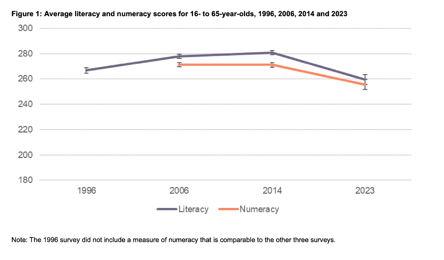
Image reproduced for purposes of education, criticism and commentary.
In a situation like this, it's generally better to show the full range of possible values for a metric. That eliminates the problem of inconsistency across visualisations (within and across outputs) and also results in more accurate intuitive interpretation of the magnitude of differences.
Lesson: When showing the same metric across multiple charts to the same audience (whether in a single output or multiple outputs) the range of the axes should remain constant.
Colour consistency
Another aspect of the design of the visualisations in this report that viewers would need to attend to before focussing on the survey results or their implications is the use of colours. The charts showing the test scores all use two colours – purple and orange; however what is purple and what is orange varies. In Figure 1, literacy is purple and numeracy is orange, but in Figures 2, 5, 7, 17 and 18 the year 2014 is purple and 2023 is orange. In Figures 4 and 6 males are purple and females are orange.
Many organisations have style guides that stipulate the use of particular colours, and that’s likely to have influenced this choice, but using the same colours for different things at best results in viewers needing a little bit more time to digest each chart and at worst can result in confusion or misunderstanding. There are multiple ways to avoid that, even staying within a restricted colour palette.
First, small changes to some of the charts would mean that literacy could always be purple and numeracy could always be orange. In Figure 2 making the marker in the second box (literacy 2023) purple and the marker in the third box (numeracy 2014) orange would maintain the colour convention established in Figure 1: literacy purple, numeracy orange. In Figure 4 consistency could be achieved by changing the structure so the columns show literacy type by gender by year instead of gender by year by literacy type. Alternatively different colours (besides just purple and orange) could be used to designate different things. Even fairly strict style guides typically include more than two colours, and use of different shades and patterns are options for stretching a limited colour palette further.
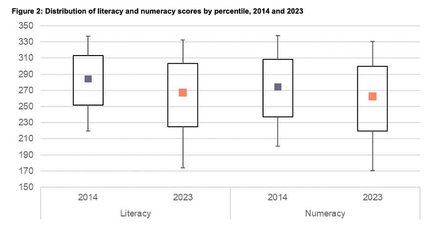
Image reproduced for purposes of education, criticism and commentary.
Lesson: When using colour to designate different groups, try to make colour assignments consistent.
Chart type consistency
Even though Figures 1, 2 and 4 all show literacy and numeracy scores, they do so using three different chart types. There is no reason for that, and as with the different colours at best it results in viewers needing a little bit more time to comprehend each chart and at worst it can result in confusion or misunderstanding.
In a situation like this when trying to show overall results for a particular metric and then how it varies based on different characteristics it can be helpful to use the same chart type, and gradually build it out or show versions that vary only on those different characteristics that you want to highlight. That makes it easy for viewers to understand what is being communicated and to see where the key differences are.
For example, this report could have started with the data communicated via box and whisker charts as it is shown in Figure 2, but with the colour changes and axis adjustments described previously and then used subsequent charts with the same structure but broken down by characteristics such as gender, age, educational attainment, and time in New Zealand.
Or, depending on the intended target audience, column charts showing averages could be used, such as a modified version of Figure 4, for all of the charts. Either of those options would enable the viewer to orient themselves to the structure of the chart once and from then on focus on changes resulting from showing the same data for different years and groups.
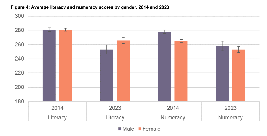
Image reproduced for purposes of education, criticism and commentary.
Since either of those chart types could work for showing the data consistently, the choice between them would come down to the intended target audience. Box and whisker charts would work well if the intended target audience is highly numerate themselves. That’s because the ability to interpret charts is part of the measurement of numeracy. Box and whisker charts contain more information than column charts in that they are a compact way of showing the median (marker in the middle) as well as the 10th (bottom whisker), 25th (bottom of the box), 75th (top of the box), and 90th (top whisker) percentiles. All of that information presented in a compact display would be appreciated by people who are highly numerate, but may confuse those who are less so. Column charts convey less information (in this example only an average), but are easier for a target audience that is less numerate to interpret.
Lesson: When telling a story about if or how a given metric varies based on characteristics such as demographics it's helpful to keep the chart type consistent so that people can focus on just how the focal metric changes depending on the characteristics that are changing.
Once all of the analysis has been completed for a big piece of work, it’s tempting to try to get the results out as soon as possible in a ‘good enough’ format, but spending just a bit of extra time on things like consistency can help ensure that all of that analytical work can be clearly understood and actioned. That work to improve the experience of the audience is not unimaginative. It’s sensible and considerate.
Tables may not be flashy, but they’re often very useful
When faced with data-intensive insights to communicate, common mistakes are to go for a cool new type of chart you’ve recently seen, to include a variety of different visualisations to ‘mix things up’, or to rely too heavily on a single type of visualisation.
It’s helpful to think of the best way to communicate insights derived from data the same way a tradesperson might think about their tools, and select the right one for the job at hand. While they may not be the flashiest tool in the data toolbox, tables are often a good visualisation option, and can be the best one.
This example from Tourism New Zealand helps illustrate why that’s the case. The table shows data related to international visitors' arrivals in New Zealand. It is part of an interactive online dashboard and includes many more countries and territories than can be seen in this screenshot (237 in total). Data for the other countries is visible if you view the data online and scroll or download it.
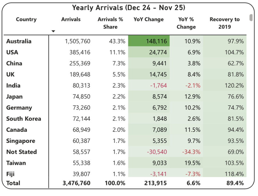
Screenshot from Tourism New Zealand’s International Visitor Arrivals dashboard accessed February 2026. Image reproduced for purposes of education, criticism and commentary.
This is good data communication because it aligns the visualisation type with audience needs.
Why tables work well when audience interests vary, and there are a lot of possible ways of aggregating and showing the data
If the target audience was only interested in the total number of visitor arrivals, that could easily be shown with a different chart type, such as a line chart showing arrivals over time; however it’s easy to imagine many reasons why people might want to be able to see the disaggregated data for specific countries. Something like a line chart, scatter plot, or bubble chart showing each country or territory individually would be far too cluttered and make it hard to discern precise values for specific countries.
Showing the data in this table format makes it possible for viewers to easily see the data for the countries that are of interest to them. That might vary depending on whether the user is a government policy analyst, someone working for an airline, the owner of a specific tourism-focussed business, etc.
Lesson: Consider what type of data communication will create the best user experience. When there are many possible cuts of the data and different audience members are interested in different aspects, tables often work better than charts.
Smart design choices reduce cognitive load
Good tables aren’t just about showing numbers in rows and columns. Notice the conditional formatting in this example: green shading shows year-over-year increases, with darker shades indicating larger gains. Australia’s substantial 148,116 increase appears in the darkest green. Red text flags decreases, such as the drop in visitor numbers from India and Fiji.
This formatting follows data visualisation conventions that most viewers intuitively understand: red typically signals decreases or concerning values, green indicates increases or positive values, and darker shades represent greater magnitude. These conventions reduce cognitive load - users don’t need to learn a new visual language for each dataset but can instead focus on the insights revealed from the data. Such formatting also lets users quickly spot patterns and outliers without needing to manually compare numbers across rows.
While it’s not obvious from the screenshot, clicking on the titles of any of the columns in the table enables you to sort on that metric and the dots in the upper right corner lead to more options, including filtering. Those features enable users to see the data in the way that’s most helpful for them with minimal effort. For example, a capacity analyst at an airline might want to sort the data as they are by number of arrivals. In contrast, a policy analyst documenting the effectiveness of covid recovery policies might sort on the final column or someone with a tourism business focussing on visitors from just a few countries could filter the data to show only those countries.
Lesson: Good design reduces the work viewers must do. Features like conditional formatting should help users spot patterns instantly, while sorting and filtering capabilities let users organise data for their specific questions rather than forcing them to search through irrelevant information.
When tables work - and when they don’t
For all their strengths in an interactive dashboard context like this one, tables are normally much less effective in a presentation setting. Imagine projecting this table in a conference room. The font would be too small to read if you showed all countries at once. If you enlarged the font and spread the data across multiple slides, audiences couldn’t easily find the countries of greatest interest to them unless the countries were arranged in alphabetical order. But alphabetical ordering would obscure the patterns revealed by metric-based sorting. The difference comes down to how people interact with the data. Dashboard users can sort, filter, scroll, and spend time with individual data points that matter to them. Presentation audiences are passive viewers who see whatever the presenter shows them, in whatever order, for however long the slide stays on screen. Different contexts demand different approaches.
If the data had to be communicated in a presentation, it would be better to focus on the more aggregated data and the overall trends and patterns in that, and then distribute a detailed table via something like a handout or a link. A link would make it possible to offer the types of interactivity described previously, but even in a handout the data could be shown in different orders (e.g., alphabetical, greatest to fewest arrivals, greatest year on year change, etc.) to aid usability.
Lesson: Context determines effectiveness. The same data often requires different visualisations for different viewing situations. Design for how and where your audience will actually view the data.
Choose the right tool for the job
As will be discussed in subsequent posts, there are many things that can be done to polish data visualisations and other communications, but the starting point should be choosing the right type of data visualisation for the audience, the data, and the delivery context. Tables may not be the flashiest choice, but there are many situations where they are the right tool for the job.
Reducing greenhouse gas emissions is hard. So is counting and showing them.
One popular part of the data-related courses I teach through Wellington Uni Professional involves participants critiquing various forms of data communication created by others. The idea is that it's easier to spot things that are confusing, misleading, inaccurate, or just could be better when they were made by other people because we're all too close to our own work and know what we mean even if that's not what comes across to others.
I thought I would share some publicly available examples of data communication and visualisation and comment on what works, what doesn't, and what's okay but could be improved. The idea isn't to disparage the people or organisations that have produced less than ideal data communications – we've all done that – but rather to show how hard it is to craft truly effective data communication, and to share some lessons and tips toward that end.
Let's examine this chart from Danyl McLauchlan's thoughtful column in this week's Listener to see what broader lessons we can draw about effective data communication. I want to start by pointing out that the chart has little to do with the points being made in the column itself.

The chart appears in 'Increasingly common tragedy' by Danyl McLauchlan on page 11 of the Listener, February 7, 2026. Image reproduced for purposes of education, criticism and commentary.
A quick glance at the chart would lead you to believe that the column is about what sources contribute most to New Zealand's greenhouse gas emissions; however that is only touched on briefly in the text. Mainly, the column offers a game-theoretic explanation for the collective failure of the country and the world to reduce emissions sufficiently to avoid the types of weather extremes we are already starting to experience, comments on New Zealand's lack of resilience in the face of those extremes, and discusses the benefits clean energy offers above and beyond its contribution to reducing emissions. Someone just flipping through the magazine might look at the chart and take away the message that climate is really just a problem for farmers, which is not the point of the column. This data visualisation detracts from the important, but nuanced, arguments being made rather than helping to communicate them clearly.
Lesson: Data visualisations are not decorations. They should only be used when they help enhance viewers' understanding of the topic being discussed.
Besides not being particularly relevant to the text of the article, the data shown in the chart is unlikely to be clearly understood by the audience – in this case readers of the Listener. The data comes from The Ministry for the Environment. It is based on measurement standards developed as part of international agreements. Climate professionals would be familiar with those standards, but the average reader of the Listener is unlikely to be.
That's a crucial difference because data communication created for subject matter experts should be different from data communication created for the general public. In this case, a couple important things that climate experts know, but most of the magazine reading public does not are that: 1) Greenhouse gas emissions can be measured on either a production or consumption basis, and 2) The standard way of reporting greenhouse gas emissions excludes international travel and transport.
The data in the chart shows greenhouse gas emissions generated by source in the goods and services New Zealand produces (not consumes). That makes even that first, dramatic, bar hard to interpret because New Zealand exports a lot of animal products. That first bar being the longest doesn't tell us if livestock is farmed more or less efficiently in terms of greenhouse gas emissions in New Zealand than elsewhere. We also can't tell if farming is more or less efficient in terms of greenhouse gas emissions than other industries because we have no information about the outputs associated with the emissions.
With regard to the second point, a reader unfamiliar with the fact that international travel and transport are not included in the data shown might reasonably conclude that their twice yearly international trips are not a problem given domestic aviation is at the bottom of the chart and international aviation does not appear at all. Yet if such a reader were to calculate his or her personal consumption-based emissions and include all sources, they might be surprised to discover that those international flights are likely to be their greatest personal source of greenhouse gas emissions.
Lesson: Data communications should be tailored to the intended target audience.
These two principles of using visualisations purposefully rather than decoratively, and tailoring them to the intended target audience can make the difference between data communication that clarifies and data communication that confuses. In future posts, I'll explore more examples of what works, what doesn't, and what could be better with some thoughtful improvements.