
Tables may not be flashy, but they’re often very useful
When faced with data-intensive insights to communicate, common mistakes are to go for a cool new type of chart you’ve recently seen, to include a variety of different visualisations to ‘mix things up’, or to rely too heavily on a single type of visualisation.
It’s helpful to think of the best way to communicate insights derived from data the same way a tradesperson might think about their tools, and select the right one for the job at hand. While they may not be the flashiest tool in the data toolbox, tables are often a good visualisation option, and can be the best one.
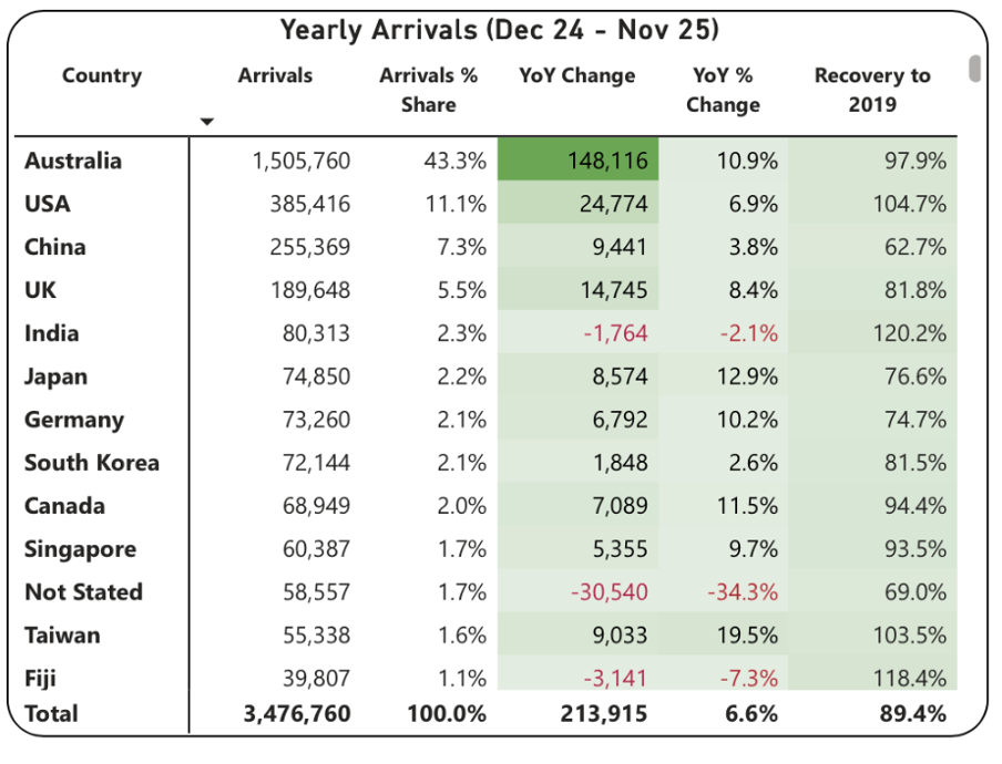
This example from Tourism New Zealand helps illustrate why that’s the case. The table shows data related to international visitors' arrivals in New Zealand. It is part of an interactive online dashboard and includes many more countries and territories than can be seen in this screenshot (237 in total). Data for the other countries is visible if you view the data online and scroll or download it.
Screenshot from Tourism New Zealand’s International Visitor Arrivals dashboard accessed February 2026. Image reproduced for purposes of education, criticism and commentary.
This is good data communication because it aligns the visualisation type with audience needs.
Why tables work well when audience interests vary, and there are a lot of possible ways of aggregating and showing the data
If the target audience was only interested in the total number of visitor arrivals, that could easily be shown with a different chart type, such as a line chart showing arrivals over time; however it’s easy to imagine many reasons why people might want to be able to see the disaggregated data for specific countries. Something like a line chart, scatter plot, or bubble chart showing each country or territory individually would be far too cluttered and make it hard to discern precise values for specific countries.
Showing the data in this table format makes it possible for viewers to easily see the data for the countries that are of interest to them. That might vary depending on whether the user is a government policy analyst, someone working for an airline, the owner of a specific tourism-focussed business, etc.
Lesson: Consider what type of data communication will create the best user experience. When there are many possible cuts of the data and different audience members are interested in different aspects, tables often work better than charts.
Smart design choices reduce cognitive load
Good tables aren’t just about showing numbers in rows and columns. Notice the conditional formatting in this example: green shading shows year-over-year increases, with darker shades indicating larger gains. Australia’s substantial 148,116 increase appears in the darkest green. Red text flags decreases, such as the drop in visitor numbers from India and Fiji.
This formatting follows data visualisation conventions that most viewers intuitively understand: red typically signals decreases or concerning values, green indicates increases or positive values, and darker shades represent greater magnitude. These conventions reduce cognitive load - users don’t need to learn a new visual language for each dataset but can instead focus on the insights revealed from the data. Such formatting also lets users quickly spot patterns and outliers without needing to manually compare numbers across rows.
While it’s not obvious from the screenshot, clicking on the titles of any of the columns in the table enables you to sort on that metric and the dots in the upper right corner lead to more options, including filtering. Those features enable users to see the data in the way that’s most helpful for them with minimal effort. For example, a capacity analyst at an airline might want to sort the data as they are by number of arrivals. In contrast, a policy analyst documenting the effectiveness of covid recovery policies might sort on the final column or someone with a tourism business focussing on visitors from just a few countries could filter the data to show only those countries.
Lesson: Good design reduces the work viewers must do. Features like conditional formatting should help users spot patterns instantly, while sorting and filtering capabilities let users organise data for their specific questions rather than forcing them to search through irrelevant information.
When tables work - and when they don’t
For all their strengths in an interactive dashboard context like this one, tables are normally much less effective in a presentation setting. Imagine projecting this table in a conference room. The font would be too small to read if you showed all countries at once. If you enlarged the font and spread the data across multiple slides, audiences couldn’t easily find the countries of greatest interest to them unless the countries were arranged in alphabetical order. But alphabetical ordering would obscure the patterns revealed by metric-based sorting. The difference comes down to how people interact with the data. Dashboard users can sort, filter, scroll, and spend time with individual data points that matter to them. Presentation audiences are passive viewers who see whatever the presenter shows them, in whatever order, for however long the slide stays on screen. Different contexts demand different approaches.
If the data had to be communicated in a presentation, it would be better to focus on the more aggregated data and the overall trends and patterns in that, and then distribute a detailed table via something like a handout or a link. A link would make it possible to offer the types of interactivity described previously, but even in a handout the data could be shown in different orders (e.g., alphabetical, greatest to fewest arrivals, greatest year on year change, etc.) to aid usability.
Lesson: Context determines effectiveness. The same data often requires different visualisations for different viewing situations. Design for how and where your audience will actually view the data.
Choose the right tool for the job
As will be discussed in subsequent posts, there are many things that can be done to polish data visualisations and other communications, but the starting point should be choosing the right type of data visualisation for the audience, the data, and the delivery context. Tables may not be the flashiest choice, but there are many situations where they are the right tool for the job.