
Discussion and visualisation of data should make an issue more understandable
Housing is a fraught topic in New Zealand, as it is in many places. Too many people lack access to a decent place to live at a price they can afford. On the other hand, people who have lived in neighbourhoods they love for decades may be reluctant to see them change through intensification. That is a hard problem, and one that’s helpful to consider in light of good available data.
An article in the most recent edition of The Sunday Star-Times missed an opportunity to do that. The article describes results of a survey conducted by Freshwater Strategy on behalf of The Sunday Star-Times. The survey measured attitudes of eligible voters toward new housing and increased housing density. Ideally the survey results would have helped to inform the debate around these issues, but the results were communicated poorly, reducing their ability to make a constructive contribution to the debate.
Reproduced from page 6 of the Sunday Star-Times from 22 Feb, 2026 for purposes of education, commentary, and criticism.
Show the things that are most important for the audience to know
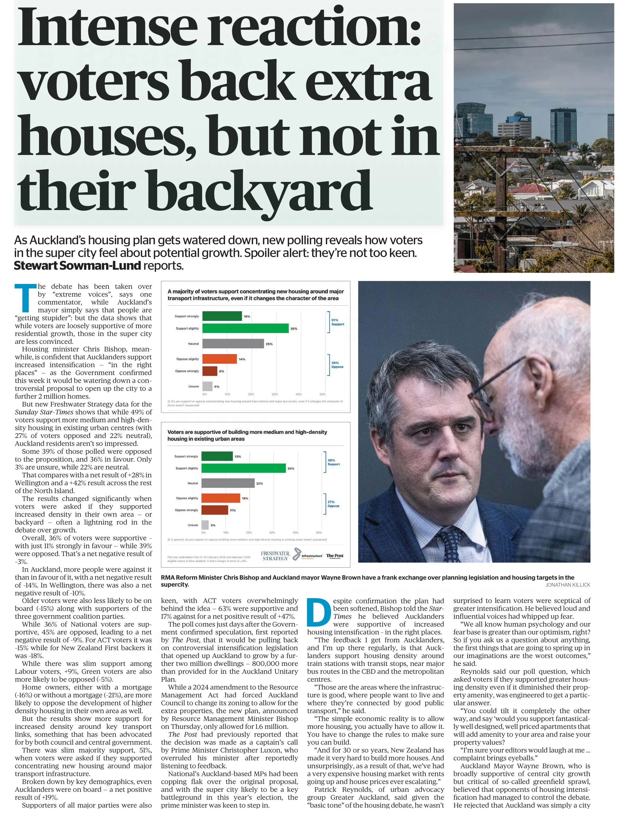
One data communication choice in the article that limits its likely use and usefulness relates to which results were featured in visualisations and which were not. The headline of the article says that ‘voters back extra houses, but not in their backyard’ and the text of the article describes density in people’s own local area as ‘often a lightning rod in the debate over growth’. Given those things, it’s surprising to see that even though the text of the article discusses attitudes toward increased density in survey respondents’ own local areas, those results don’t feature in either of the two charts shown in the article. The two charts that are shown illustrate fairly similar responses to fairly similar questions (about increased housing intensification around transport infrastructure and in existing urban areas, which in practice are often likely to be the same places).
Lesson: When using a combination of text and visualisations to communicate insights from data, the data visualisations should be used to illustrate the most important points.
Show (and tell) your audience about your results at a level of granularity required to inform their decision making
A second problem with the way the data from the survey is communicated in the article is that the charts that are shown present more granular results than the text descriptions that accompany them. That makes it difficult to understand the results in detail – particularly for the crucial question for which there is no visualisation.
That is problematic because for emotive issues such as housing there is a big difference between being strongly supportive versus slightly supportive or being strongly opposed versus slightly opposed. Those who are strongly supportive or opposed are much more likely to take actions such as contacting their elected representatives, signing petitions, participating in consultation processes, and sharing their views formally or informally. Their votes are also more likely to be influenced by the issue.
Showing more granular results with all six possible responses to each question would have made it easier to see the differences in attitudes when increased density is discussed in the abstract versus in a way that could have an immediate effect on the people expressing the attitudes. Obviously data communication almost always involves choices about what to include and what to exclude or present in an aggregated manner, but in this case a relatively small change in the type of chart used would have enabled much more information to have been communicated to help readers understand the issue being discussed.
Both of the charts shown are bar charts, with each bar representing the proportion of survey respondents who gave each response to the question shown at the bottom of the chart. Because they are mutually exclusive proportions (each person can give only one answer to each question, and all respondents are represented if only to say they are neutral or unsure) then these results could have been shown using a stacked bar chart. That is where there is a bar sliced into segments – in this case based on which response people selected for each question. One stacked bar chart with three bars could have been used to compare overall results for the three questions discussed in the article.
The text of the article also discusses variation in responses to all three questions based on location, age, voting preferences, and home ownership. There are no charts for any of those things, which makes it somewhat difficult to follow the text-based discussion about how results vary by group. Additional stacked bar charts would have helped to show key differences based on location, age, voting preferences, and home ownership.
Lesson: When possible – and especially when details are important to truly understanding an issue – try to preserve granularity when communicating data and only aggregate when doing so helps the viewer understand the data more clearly.
Define your metrics
Given the previously described issues with what was shown in visualisations, the text of the article had to carry most of the burden of communicating the survey results; however many readers would probably struggle to fully understand the text-based descriptions. To see why, let’s take a look at an excerpt from the text of the article.
“… while 49% of voters support more medium and high-density housing in existing urban centres (with 27% of voters opposed and 22% neutral), Auckland residents aren't so impressed.
Some 39% of those polled were opposed to the proposition, and 36% in favour. Only 3% are unsure, while 22% are neutral. That compares with a net result of +28% in Wellington and a +42% result across the rest of the North Island.”
The last sentence in the excerpt shown discusses ‘net results’ of +28% in Wellington and +42% across the rest of the North Island. The subsequent discussion also uses the ‘net’ terminology. People who regularly review survey data are likely to know that ‘net results’ in this context mean the total percentage in support (slightly + strongly) minus the total percentage in opposition (slightly + strongly); however the article does not say that anywhere and it seems unlikely that most readers of the Sunday Star-Times are familiar with that convention. Calculated metrics like that should be explained when viewers may be unfamiliar with them.
Lesson: If you are using a calculated metric, you should explain how it’s calculated if more than a very small percentage of the target audience are unlikely to know that.
Between the most salient question not being shown in a chart or described in full, group differences not being shown in charts or described in full, and many people not understanding the concept of net results in this context I suspect this article may leave many readers no better informed than they were before they read it. That is a lost opportunity for data to play an important role in helping people understand and make decisions about this important issue for our society. A detailed understanding of how attitudes vary by group and by form of intensification is likely to be necessary for finding housing solutions with enough community support to be implemented, and for identifying the specific challenges that must be overcome to make that happen.
Consistency is helpful to those viewing data visualisations
Famous quotes such as: “A foolish consistency is the hobgoblin of little minds” by Ralph Waldo Emerson and Oscar Wilde's "Consistency is the last refuge of the unimaginative" give the concept of consistency a bad name. Like most things though, consistency has its place, and one of them is in data visualisations.
Ideally, the structural elements of a data visualisation should fade into the background to enable viewers to take away the key insights without having to spend a lot of time orienting themselves. Consistency in the use of axes, colour, and chart types can help achieve that. Let’s see how by looking at some examples from a report on the literacy and numeracy skills of New Zealand adults produced by the Ministry of Education.
The report has inconsistencies in the use of axes, colour, and chart types. Resolving those would turn an accurate but clunky data communication into a better, more polished one.
Axis consistency
The main focus of the report is on the literacy and numeracy skills of adults in New Zealand as measured through surveys conducted in 2014 and 2023. The report goes into a lot of detail about the response rate being much lower in 2023 than in 2014, resulting in the need to exercise caution when interpreting and comparing results; however we will focus on how the results are shown rather than how they were derived.
Possible scores on the numeracy and literacy tests that are the focus of the report can vary between 0 and 500 with higher numbers meaning greater literacy or numeracy. Eight different visualisations within the report show results based on those scales, yet none of them show the full 0 to 500 range. The ranges that are actually used vary. Figures 1, 4, 5, 7, 17 and 18 use 180 to 300 whereas Figure 2 uses 150 to 350 and Figure 6 uses 170 to 310. This makes it difficult for users to intuitively grasp the magnitude of differences being described without looking carefully at the axis value labels.
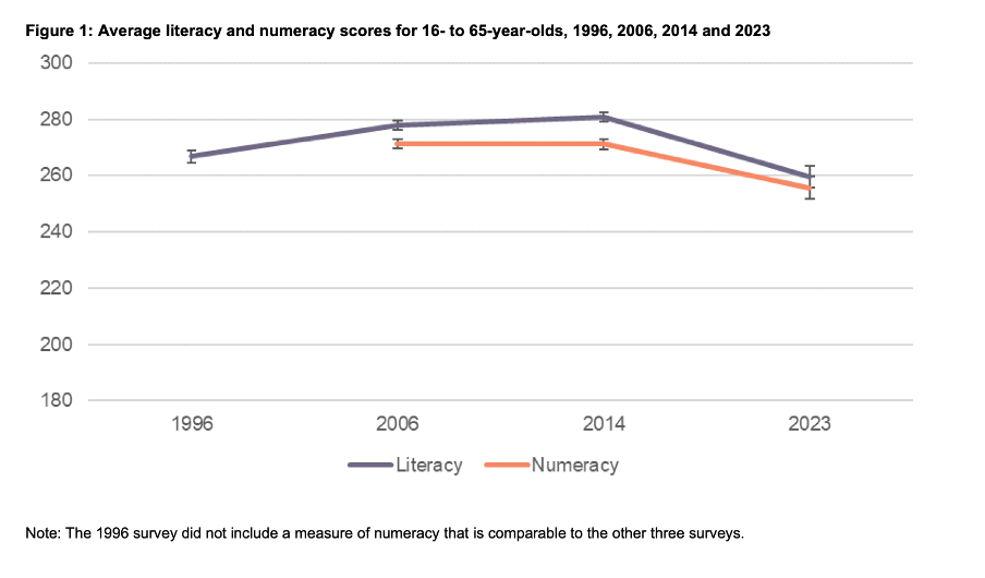
Image reproduced for purposes of education, criticism and commentary.
In a situation like this, it's generally better to show the full range of possible values for a metric. That eliminates the problem of inconsistency across visualisations (within and across outputs) and also results in more accurate intuitive interpretation of the magnitude of differences.
Lesson: When showing the same metric across multiple charts to the same audience (whether in a single output or multiple outputs) the range of the axes should remain constant.
Colour consistency
Another aspect of the design of the visualisations in this report that viewers would need to attend to before focussing on the survey results or their implications is the use of colours. The charts showing the test scores all use two colours – purple and orange; however what is purple and what is orange varies. In Figure 1, literacy is purple and numeracy is orange, but in Figures 2, 5, 7, 17 and 18 the year 2014 is purple and 2023 is orange. In Figures 4 and 6 males are purple and females are orange.
Many organisations have style guides that stipulate the use of particular colours, and that’s likely to have influenced this choice, but using the same colours for different things at best results in viewers needing a little bit more time to digest each chart and at worst can result in confusion or misunderstanding. There are multiple ways to avoid that, even staying within a restricted colour palette.
First, small changes to some of the charts would mean that literacy could always be purple and numeracy could always be orange. In Figure 2 making the marker in the second box (literacy 2023) purple and the marker in the third box (numeracy 2014) orange would maintain the colour convention established in Figure 1: literacy purple, numeracy orange. In Figure 4 consistency could be achieved by changing the structure so the columns show literacy type by gender by year instead of gender by year by literacy type. Alternatively different colours (besides just purple and orange) could be used to designate different things. Even fairly strict style guides typically include more than two colours, and use of different shades and patterns are options for stretching a limited colour palette further.
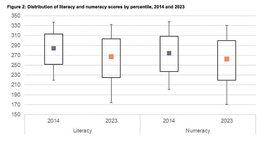
Image reproduced for purposes of education, criticism and commentary.
Lesson: When using colour to designate different groups, try to make colour assignments consistent.
Chart type consistency
Even though Figures 1, 2 and 4 all show literacy and numeracy scores, they do so using three different chart types. There is no reason for that, and as with the different colours at best it results in viewers needing a little bit more time to comprehend each chart and at worst it can result in confusion or misunderstanding.
In a situation like this when trying to show overall results for a particular metric and then how it varies based on different characteristics it can be helpful to use the same chart type, and gradually build it out or show versions that vary only on those different characteristics that you want to highlight. That makes it easy for viewers to understand what is being communicated and to see where the key differences are.
For example, this report could have started with the data communicated via box and whisker charts as it is shown in Figure 2, but with the colour changes and axis adjustments described previously and then used subsequent charts with the same structure but broken down by characteristics such as gender, age, educational attainment, and time in New Zealand.
Or, depending on the intended target audience, column charts showing averages could be used, such as a modified version of Figure 4, for all of the charts. Either of those options would enable the viewer to orient themselves to the structure of the chart once and from then on focus on changes resulting from showing the same data for different years and groups.
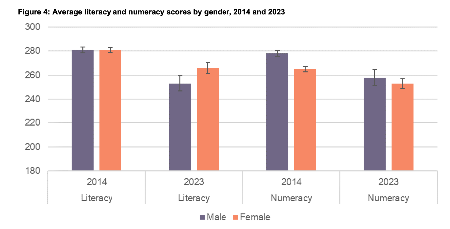
Image reproduced for purposes of education, criticism and commentary.
Since either of those chart types could work for showing the data consistently, the choice between them would come down to the intended target audience. Box and whisker charts would work well if the intended target audience is highly numerate themselves. That’s because the ability to interpret charts is part of the measurement of numeracy. Box and whisker charts contain more information than column charts in that they are a compact way of showing the median (marker in the middle) as well as the 10th (bottom whisker), 25th (bottom of the box), 75th (top of the box), and 90th (top whisker) percentiles. All of that information presented in a compact display would be appreciated by people who are highly numerate, but may confuse those who are less so. Column charts convey less information (in this example only an average), but are easier for a target audience that is less numerate to interpret.
Lesson: When telling a story about if or how a given metric varies based on characteristics such as demographics it's helpful to keep the chart type consistent so that people can focus on just how the focal metric changes depending on the characteristics that are changing.
Once all of the analysis has been completed for a big piece of work, it’s tempting to try to get the results out as soon as possible in a ‘good enough’ format, but spending just a bit of extra time on things like consistency can help ensure that all of that analytical work can be clearly understood and actioned. That work to improve the experience of the audience is not unimaginative. It’s sensible and considerate.