
Everyone has off days
I often use data visualisation and communication appearing on the New York Times’ app and website to illustrate good aspects of data communication. NYT staff seem particularly skilled at making complex, data-intensive topics digestible. For example, they have created visualisations that crystallise the extent of climate change, and — perhaps most impressively — a podcast episode about pedestrian deaths that tells a data-intensive story without a single chart or table, but with the intrigue and suspense of a murder mystery.
In spite of this impressive track record, everyone has off days, and the New York Times itself had one recently on a day when it was trying to communicate about the stock market having an off day. That day (June 5th US time) I opened the New York Times app and saw the chart below. As shown there, the chart was in the main ‘today’ section of the app rather than the business or markets section.
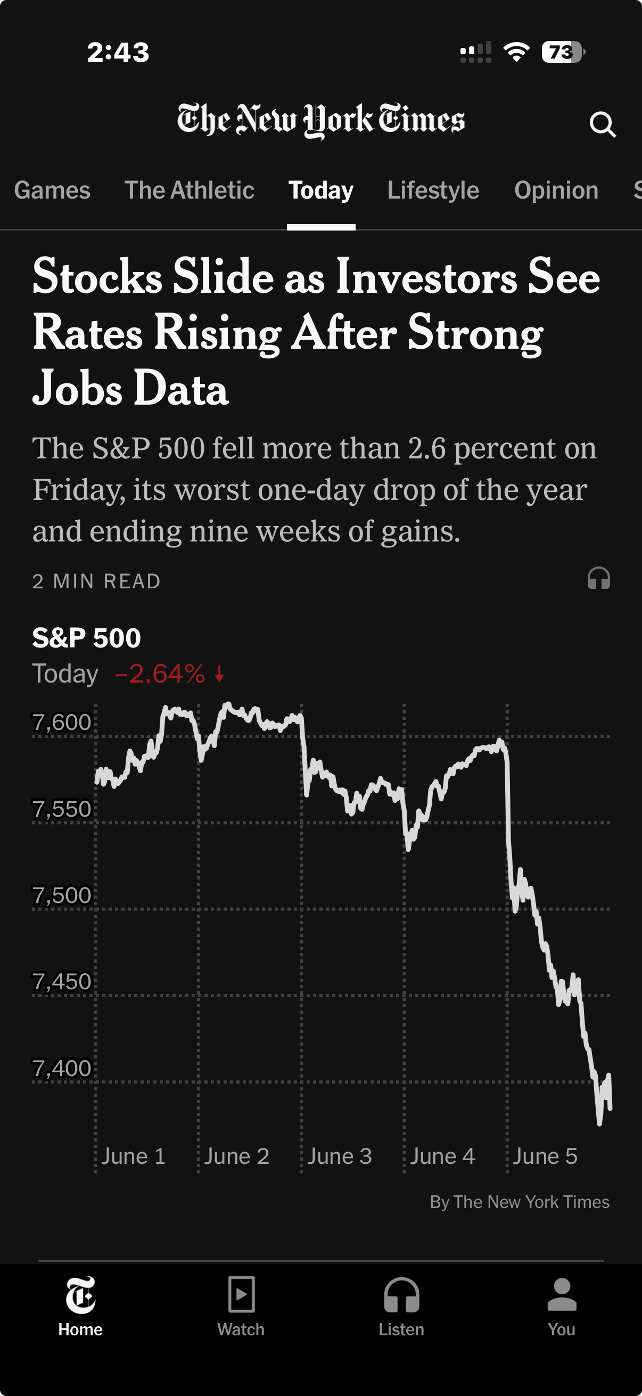
Image from the ‘today’ section of the New York Times iPhone app, 5 June 2026 (US time), reproduced for purposes of education, criticism and commentary.
Truncating axes magnifies differences
The headline describes stocks as sliding, and the graphic certainly appears to show quite a precipitous slide. But looking more closely, we can see that the axis shown only goes from about 7350 to 7650. If we look even more closely we can see the drop for the S&P 500 that day was 2.64%. That was certainly likely to be of interest, and potentially concern, to some investors, but it was a much smaller decrease than readers might have guessed looking at the graphic alone.
Generally speaking, truncating axes to exclude zero tends to magnify differences and make them appear larger than they actually are and it should therefore be avoided. That’s particularly the case because without zero there is nothing to anchor axes to and a chart the next day might use the same vertical distance to show a drop of 1.6% or a gain of 3.6%.
Those who truncate axes often intend to magnify differences, arguing that they are trying to show them clearly. For example, in this situation, they might say that starting the axis at zero and going up to 7650 or so (to include all of the data) would make the nearly 201 point drop in the S&P 500 on the 5th of June very hard to see. That’s a valid concern, but one with a better solution, as we’ll see in the next lesson.
Lesson: Include zero in axes when showing numeric data
Metric choice matters
If you asked a random sample of New York Times app users what 7,384 on the S&P 500 actually means my guess is that while many people would know it is a reflection of the collective value of large companies, few would know precisely what criteria are used for inclusion nor exactly how their value is combined into the value of the S&P on a given day. Therefore, a specific value on a given day, such as 7,384, is unlikely to mean much to them.
On the other hand, I would think most New York Times app users have a good understanding of what a 2.64% drop means. That raises a question: why don't the New York Times and others show day-to-day percentage changes rather than the index value itself? That would make it easier for people to distinguish noteworthy increases and decreases from normal day-to-day variations and long-term growth trends.
Lesson: Communicate data using the metric(s) that are most useful and intuitive to the intended target audience.
According to data from Macrotrends.net and a calculation by Claude, the S&P 500 dropped by at least 2.5% 22 times in the past five years. Showing the S&P chart as percentage changes in the New York Times app rather than the value of the S&P would have allowed viewers to see that while June 5th was a bad day in the financial markets, it wasn’t extremely uncommonly bad. Similarly, while the graphic shown by the New York Times that day wasn’t extremely uncommonly bad, it wasn’t their best data communication work either. Everyone has bad days. Even the S&P 500 and the New York Times.
Don’t sacrifice accuracy for attention
"The gender-age divide has tripled since 2011." That bold claim is the title of a data visualisation in this week's Listener. It's the kind of headline figure that grabs the attention of a reader flipping through a magazine in an election year. If that reader is attentive, however, they would realise that it’s a claim that doesn't quite hold up when checked against the chart's own numbers.
The visualisation is part of the cover article of this week’s Listener. It describes New Zealand’s political ‘tribes’ based on analysis of survey data. It includes an interesting discussion of how the political views of voters have changed over time.
Unfortunately, the article includes a data visualisation that contains two critical flaws as well as one more minor one.
Make sure your visualisations, titles, and text-based descriptions all match
The data visualisation shows where women under 40 and men over 40 place themselves on a 0-10 scale where 5 is politically centrist, numbers below 5 get increasingly left-leaning as you go toward zero and numbers above 5 get increasingly right-leaning as you go toward 10.
As previously mentioned, the title of the visualisation in question is ‘the gender-age divide has tripled since 2011.’ In 2011 the chart shows the value for men over 40 being 5.6 and for women under 40 being 5.1. As the chart shows, that is a gap of .5, so to triple the difference in 2023 the gap would need to be 1.5 (.5*3), but it is actually 1.3. It’s possible that the difference is due to rounding of the values, but the title of the chart not matching the data in the chart is a problem.
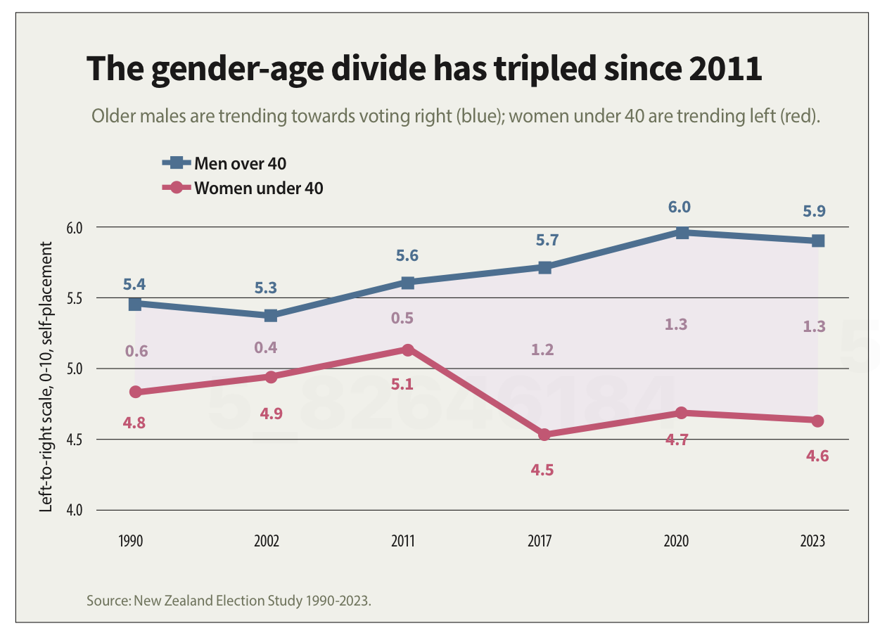
Image reproduced for purposes of education, criticism and commentary.
If someone quickly does the maths and realises that the claim of tripling is over-stated, they may wonder about the veracity of other aspects of the visualisation, the article, or the underlying research. If a difference such as the one just described is due to rounding, that could be addressed by changing the chart title, showing the values to one more decimal point or adding a rounding disclaimer. If the gap has not actually tripled, the title should not say that it has.
Lesson: Chart titles and text-based descriptions of data should match results shown in visualisations
Don’t truncate axes
The second major issue undermining the credibility of this visualisation is the axis, which shows values ranging from 4 to 6. Remembering that the scale went from 0-10 and was centred on 5, what that means is that the portion of the scale shown goes from a little bit left-leaning to a little bit right-leaning. While it’s clear from the visualisation that there is a difference between the two groups and that it has grown over time, in the context of the whole scale the gap is still not that large.
Because only the middle portion of the 11-point scale is shown on the axis, it makes the gap appear to be much larger and more meaningful than it actually is. The impulse to do that may be to make it seem more newsworthy or to help viewers see how the gap has evolved over time, but either way it does not help the viewers understand the data in its full context.
Any time only a portion of an axis is shown as it is here it tends to have the effect of magnifying differences, trends, etc. and to the extent it does that it misrepresents the data even if all of the numbers shown are accurate.
Lesson: Using a truncated axis makes trends, differences, etc. appear larger than they actually are.
State your metrics
Obviously not all women under 40 or all men over 40 place themselves in the exact same place on a political scale, so the visualisation is almost certainly showing the mean value for each group (as opposed to the median, which is the other most common way of representing what’s typical for a group, but in this situation could only produce values ending in 0 or 5 after the decimal point). It should explicitly specify that it’s showing the mean (assuming that’s what it is), but it does not.
We can make an educated guess in this context, which is why this is a less critical issue than the other two, but we shouldn’t have to guess. Clearly stating your metrics lets viewers focus on what the data means, not what it is, and avoids confusion and misunderstanding.
Lesson: Viewers should not have to guess what the values you are showing in a visualisation are — state that explicitly
The political gender-age gap widening over the past couple of decades is genuinely interesting, and could be consequential in the upcoming election, so it doesn't need to be overstated to earn attention. When the numbers in a chart don't support the headline above it or the chart seems to exaggerate results, readers who notice may question not just the visualisation but the research behind it. That's a high price to pay to try to make a title or headline a bit catchier or to make the data in a graph seem more dramatic.
Consistency is helpful to those viewing data visualisations
Famous quotes such as: “A foolish consistency is the hobgoblin of little minds” by Ralph Waldo Emerson and Oscar Wilde's "Consistency is the last refuge of the unimaginative" give the concept of consistency a bad name. Like most things though, consistency has its place, and one of them is in data visualisations.
Ideally, the structural elements of a data visualisation should fade into the background to enable viewers to take away the key insights without having to spend a lot of time orienting themselves. Consistency in the use of axes, colour, and chart types can help achieve that. Let’s see how by looking at some examples from a report on the literacy and numeracy skills of New Zealand adults produced by the Ministry of Education.
The report has inconsistencies in the use of axes, colour, and chart types. Resolving those would turn an accurate but clunky data communication into a better, more polished one.
Axis consistency
The main focus of the report is on the literacy and numeracy skills of adults in New Zealand as measured through surveys conducted in 2014 and 2023. The report goes into a lot of detail about the response rate being much lower in 2023 than in 2014, resulting in the need to exercise caution when interpreting and comparing results; however we will focus on how the results are shown rather than how they were derived.
Possible scores on the numeracy and literacy tests that are the focus of the report can vary between 0 and 500 with higher numbers meaning greater literacy or numeracy. Eight different visualisations within the report show results based on those scales, yet none of them show the full 0 to 500 range. The ranges that are actually used vary. Figures 1, 4, 5, 7, 17 and 18 use 180 to 300 whereas Figure 2 uses 150 to 350 and Figure 6 uses 170 to 310. This makes it difficult for users to intuitively grasp the magnitude of differences being described without looking carefully at the axis value labels.
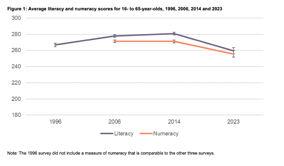
Image reproduced for purposes of education, criticism and commentary.
In a situation like this, it's generally better to show the full range of possible values for a metric. That eliminates the problem of inconsistency across visualisations (within and across outputs) and also results in more accurate intuitive interpretation of the magnitude of differences.
Lesson: When showing the same metric across multiple charts to the same audience (whether in a single output or multiple outputs) the range of the axes should remain constant.
Colour consistency
Another aspect of the design of the visualisations in this report that viewers would need to attend to before focussing on the survey results or their implications is the use of colours. The charts showing the test scores all use two colours – purple and orange; however what is purple and what is orange varies. In Figure 1, literacy is purple and numeracy is orange, but in Figures 2, 5, 7, 17 and 18 the year 2014 is purple and 2023 is orange. In Figures 4 and 6 males are purple and females are orange.
Many organisations have style guides that stipulate the use of particular colours, and that’s likely to have influenced this choice, but using the same colours for different things at best results in viewers needing a little bit more time to digest each chart and at worst can result in confusion or misunderstanding. There are multiple ways to avoid that, even staying within a restricted colour palette.
First, small changes to some of the charts would mean that literacy could always be purple and numeracy could always be orange. In Figure 2 making the marker in the second box (literacy 2023) purple and the marker in the third box (numeracy 2014) orange would maintain the colour convention established in Figure 1: literacy purple, numeracy orange. In Figure 4 consistency could be achieved by changing the structure so the columns show literacy type by gender by year instead of gender by year by literacy type. Alternatively different colours (besides just purple and orange) could be used to designate different things. Even fairly strict style guides typically include more than two colours, and use of different shades and patterns are options for stretching a limited colour palette further.
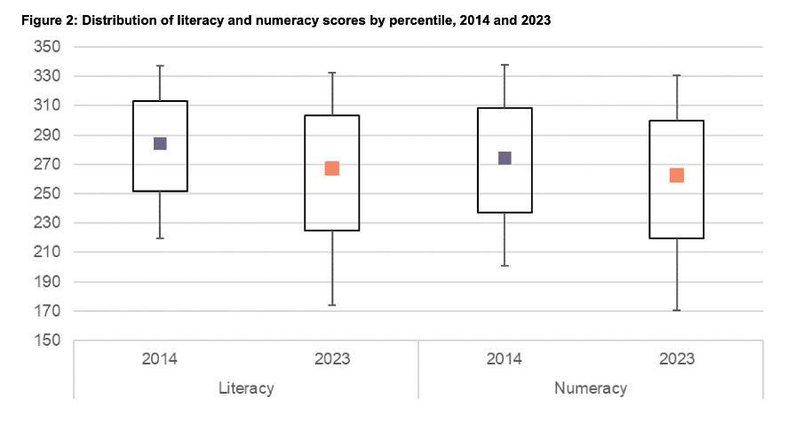
Image reproduced for purposes of education, criticism and commentary.
Lesson: When using colour to designate different groups, try to make colour assignments consistent.
Chart type consistency
Even though Figures 1, 2 and 4 all show literacy and numeracy scores, they do so using three different chart types. There is no reason for that, and as with the different colours at best it results in viewers needing a little bit more time to comprehend each chart and at worst it can result in confusion or misunderstanding.
In a situation like this when trying to show overall results for a particular metric and then how it varies based on different characteristics it can be helpful to use the same chart type, and gradually build it out or show versions that vary only on those different characteristics that you want to highlight. That makes it easy for viewers to understand what is being communicated and to see where the key differences are.
For example, this report could have started with the data communicated via box and whisker charts as it is shown in Figure 2, but with the colour changes and axis adjustments described previously and then used subsequent charts with the same structure but broken down by characteristics such as gender, age, educational attainment, and time in New Zealand.
Or, depending on the intended target audience, column charts showing averages could be used, such as a modified version of Figure 4, for all of the charts. Either of those options would enable the viewer to orient themselves to the structure of the chart once and from then on focus on changes resulting from showing the same data for different years and groups.
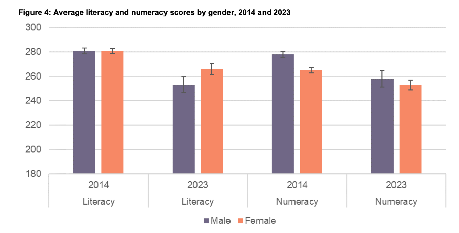
Image reproduced for purposes of education, criticism and commentary.
Since either of those chart types could work for showing the data consistently, the choice between them would come down to the intended target audience. Box and whisker charts would work well if the intended target audience is highly numerate themselves. That’s because the ability to interpret charts is part of the measurement of numeracy. Box and whisker charts contain more information than column charts in that they are a compact way of showing the median (marker in the middle) as well as the 10th (bottom whisker), 25th (bottom of the box), 75th (top of the box), and 90th (top whisker) percentiles. All of that information presented in a compact display would be appreciated by people who are highly numerate, but may confuse those who are less so. Column charts convey less information (in this example only an average), but are easier for a target audience that is less numerate to interpret.
Lesson: When telling a story about if or how a given metric varies based on characteristics such as demographics it's helpful to keep the chart type consistent so that people can focus on just how the focal metric changes depending on the characteristics that are changing.
Once all of the analysis has been completed for a big piece of work, it’s tempting to try to get the results out as soon as possible in a ‘good enough’ format, but spending just a bit of extra time on things like consistency can help ensure that all of that analytical work can be clearly understood and actioned. That work to improve the experience of the audience is not unimaginative. It’s sensible and considerate.