
Everyone has off days
I often use data visualisation and communication appearing on the New York Times’ app and website to illustrate good aspects of data communication. NYT staff seem particularly skilled at making complex, data-intensive topics digestible. For example, they have created visualisations that crystallise the extent of climate change, and — perhaps most impressively — a podcast episode about pedestrian deaths that tells a data-intensive story without a single chart or table, but with the intrigue and suspense of a murder mystery.
In spite of this impressive track record, everyone has off days, and the New York Times itself had one recently on a day when it was trying to communicate about the stock market having an off day. That day (June 5th US time) I opened the New York Times app and saw the chart below. As shown there, the chart was in the main ‘today’ section of the app rather than the business or markets section.
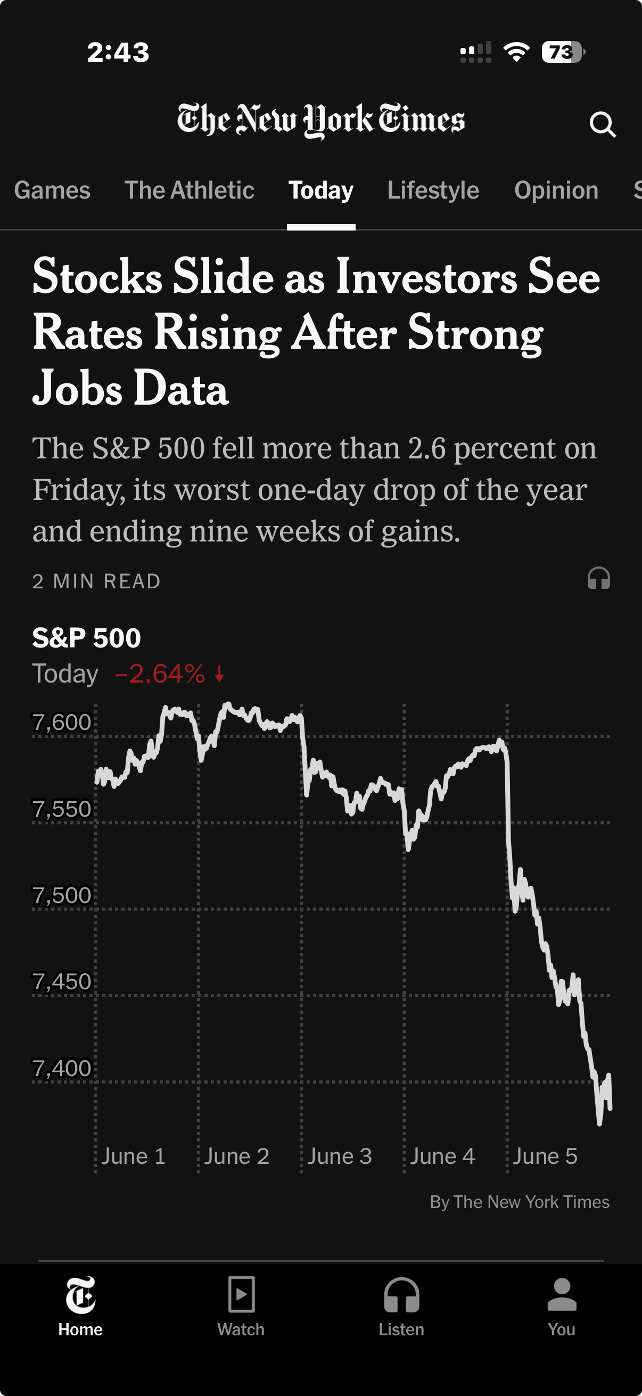
Image from the ‘today’ section of the New York Times iPhone app, 5 June 2026 (US time), reproduced for purposes of education, criticism and commentary.
Truncating axes magnifies differences
The headline describes stocks as sliding, and the graphic certainly appears to show quite a precipitous slide. But looking more closely, we can see that the axis shown only goes from about 7350 to 7650. If we look even more closely we can see the drop for the S&P 500 that day was 2.64%. That was certainly likely to be of interest, and potentially concern, to some investors, but it was a much smaller decrease than readers might have guessed looking at the graphic alone.
Generally speaking, truncating axes to exclude zero tends to magnify differences and make them appear larger than they actually are and it should therefore be avoided. That’s particularly the case because without zero there is nothing to anchor axes to and a chart the next day might use the same vertical distance to show a drop of 1.6% or a gain of 3.6%.
Those who truncate axes often intend to magnify differences, arguing that they are trying to show them clearly. For example, in this situation, they might say that starting the axis at zero and going up to 7650 or so (to include all of the data) would make the nearly 201 point drop in the S&P 500 on the 5th of June very hard to see. That’s a valid concern, but one with a better solution, as we’ll see in the next lesson.
Lesson: Include zero in axes when showing numeric data
Metric choice matters
If you asked a random sample of New York Times app users what 7,384 on the S&P 500 actually means my guess is that while many people would know it is a reflection of the collective value of large companies, few would know precisely what criteria are used for inclusion nor exactly how their value is combined into the value of the S&P on a given day. Therefore, a specific value on a given day, such as 7,384, is unlikely to mean much to them.
On the other hand, I would think most New York Times app users have a good understanding of what a 2.64% drop means. That raises a question: why don't the New York Times and others show day-to-day percentage changes rather than the index value itself? That would make it easier for people to distinguish noteworthy increases and decreases from normal day-to-day variations and long-term growth trends.
Lesson: Communicate data using the metric(s) that are most useful and intuitive to the intended target audience.
According to data from Macrotrends.net and a calculation by Claude, the S&P 500 dropped by at least 2.5% 22 times in the past five years. Showing the S&P chart as percentage changes in the New York Times app rather than the value of the S&P would have allowed viewers to see that while June 5th was a bad day in the financial markets, it wasn’t extremely uncommonly bad. Similarly, while the graphic shown by the New York Times that day wasn’t extremely uncommonly bad, it wasn’t their best data communication work either. Everyone has bad days. Even the S&P 500 and the New York Times.
Precisely what do you mean?
John Maynard Keynes is reported to have said: "It is better to be roughly right than precisely wrong." When it comes to data communication, we can think about roughly the impression we want readers or viewers to come away with as well as the precision with which we report individual results, and consider how those two things go together.
Health New Zealand recently published some data in several New Zealand newspapers that we can use to consider those ideas. We might describe the overall effect of that example as roughly wrong and precisely right.
Show me the big picture
The largest numbers in the visualisation are the national percentages for each metric and under each one of those is an upward arrow showing the percentage improvement from the same quarter of the previous year. Since all of those arrows are pointing up, if you quickly glanced at the visualisation it might leave you with the impression that everything is going great. The ‘Delivering better healthcare for you’ headline above the visualisation and description of improvements below would probably reinforce that impression.
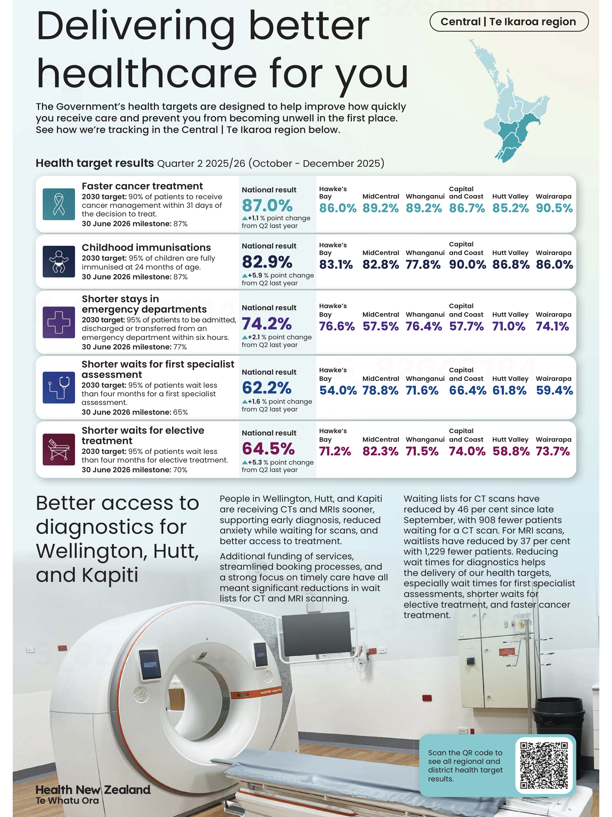
Image reproduced for purposes of education, criticism and commentary.
To the left of those large percentages are 2030 targets and 30 June 2026 milestones for each metric. Comparing the large font national results for the quarter ending in December 2025 to the target for the 30th of June 2026 shows that only one of the five metrics (faster cancer treatment) had reached the June 2026 milestone as of the end of December 2025, while the other four seem unlikely to be able to catch up within six months based on where they were at the end of 2025 and how much they changed in the prior year. In other words, while there has been improvement on all of the metrics between 2024 and 2025, the national milestones set for June 2026 seem unlikely to be met for most of the metrics.
At a local level things are somewhat more complicated. Data is shown for six parts of the lower North Island. None of those areas have reached the June 2026 milestone on one of the metrics (shorter stays in emergency departments), but on another one of the metrics (shorter waits for elective treatment) five of the six areas have already met the June 2026 milestone. Results for other metrics are more mixed.
You need to examine the data closely to see those differences. Use of conditional formatting would have made it much easier to quickly see the big picture. For example, if green font was used for milestones already met, yellow for those likely to be met in time to reach the June 2026 deadline, and red for those unlikely to be met we could easily see the metrics and areas that are on track and those that are lagging behind.
Lesson: Visualisations should leave viewers with an accurate overall impression as well as being accurate in the details.
Don’t drown me in detail
Details like which metrics are on track toward their milestones and which are not help fill in the big picture, but other details can distract from it. A common example, in this and many other data visualisations, is showing numbers to a level of precision that is not meaningful. In this visualisation, numbers could be rounded to the nearest percentage. Showing tenths of a percent clouds the overall picture rather than adding to it since it is unlikely to affect anyone’s perception of how Health New Zealand is doing and even less likely to change any decisions.
Lesson: Report results at a meaningful level of precision.
Someone quickly glancing at this data visualisation in their newspaper might come away with an inaccurate impression of how the health system is performing, so in that sense it is not a good example of data communication overall.
Nonetheless, it’s good that Health New Zealand appears to be making a genuine effort to document their performance for the New Zealand public since the public both uses and pays for the health system. It’s also good that they provided not only a snapshot of where things are now, but included comparative benchmarks and historical data to put current performance into context.
Doing those things while also applying the lessons described would let the audience see how individual data points combine into a larger picture while not drowning them in so much detail that they find it hard to see that larger picture. That would create data communication that is roughly right rather than precisely wrong.
Don’t sacrifice accuracy for attention
"The gender-age divide has tripled since 2011." That bold claim is the title of a data visualisation in this week's Listener. It's the kind of headline figure that grabs the attention of a reader flipping through a magazine in an election year. If that reader is attentive, however, they would realise that it’s a claim that doesn't quite hold up when checked against the chart's own numbers.
The visualisation is part of the cover article of this week’s Listener. It describes New Zealand’s political ‘tribes’ based on analysis of survey data. It includes an interesting discussion of how the political views of voters have changed over time.
Unfortunately, the article includes a data visualisation that contains two critical flaws as well as one more minor one.
Make sure your visualisations, titles, and text-based descriptions all match
The data visualisation shows where women under 40 and men over 40 place themselves on a 0-10 scale where 5 is politically centrist, numbers below 5 get increasingly left-leaning as you go toward zero and numbers above 5 get increasingly right-leaning as you go toward 10.
As previously mentioned, the title of the visualisation in question is ‘the gender-age divide has tripled since 2011.’ In 2011 the chart shows the value for men over 40 being 5.6 and for women under 40 being 5.1. As the chart shows, that is a gap of .5, so to triple the difference in 2023 the gap would need to be 1.5 (.5*3), but it is actually 1.3. It’s possible that the difference is due to rounding of the values, but the title of the chart not matching the data in the chart is a problem.
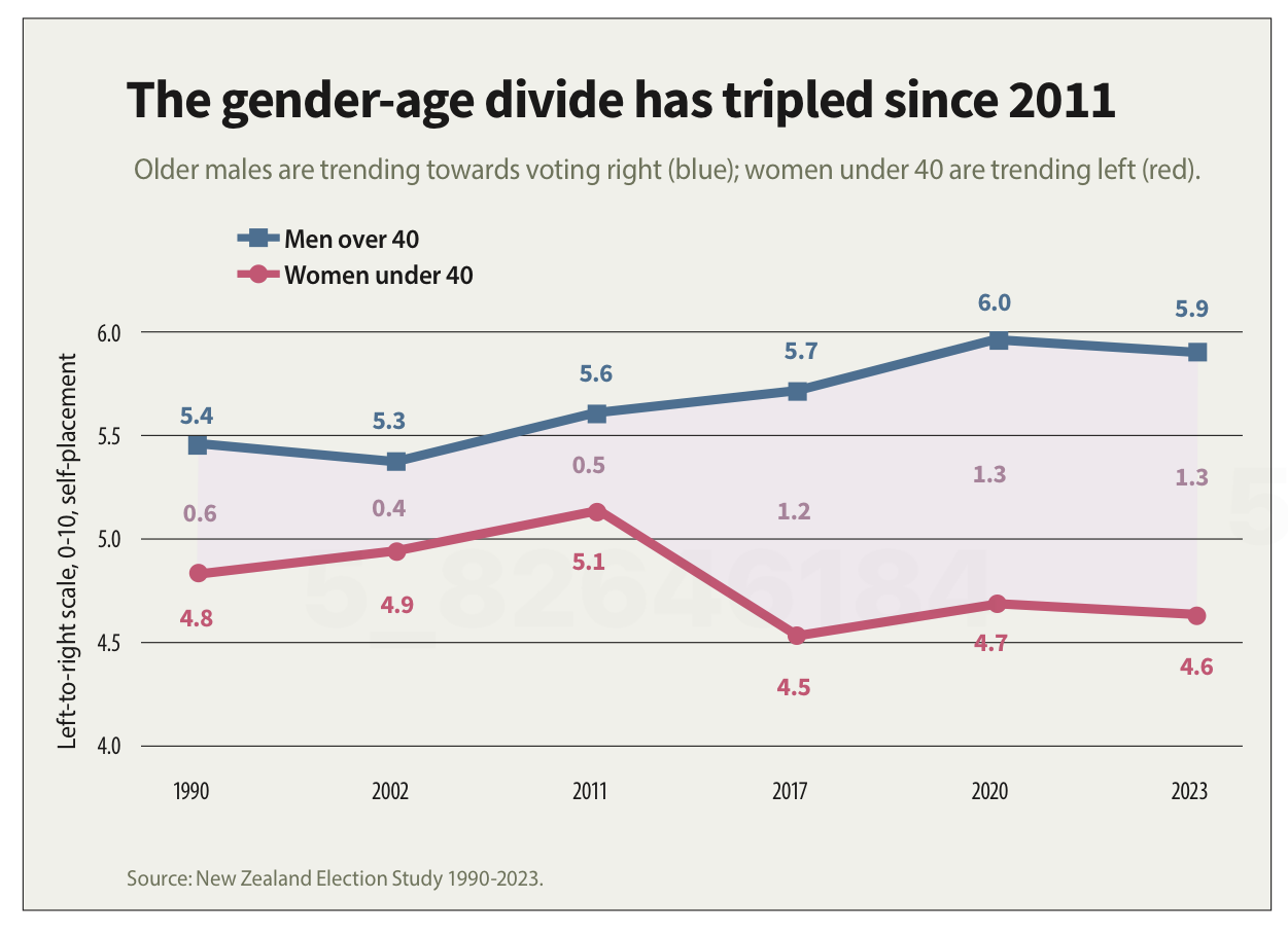
Image reproduced for purposes of education, criticism and commentary.
If someone quickly does the maths and realises that the claim of tripling is over-stated, they may wonder about the veracity of other aspects of the visualisation, the article, or the underlying research. If a difference such as the one just described is due to rounding, that could be addressed by changing the chart title, showing the values to one more decimal point or adding a rounding disclaimer. If the gap has not actually tripled, the title should not say that it has.
Lesson: Chart titles and text-based descriptions of data should match results shown in visualisations
Don’t truncate axes
The second major issue undermining the credibility of this visualisation is the axis, which shows values ranging from 4 to 6. Remembering that the scale went from 0-10 and was centred on 5, what that means is that the portion of the scale shown goes from a little bit left-leaning to a little bit right-leaning. While it’s clear from the visualisation that there is a difference between the two groups and that it has grown over time, in the context of the whole scale the gap is still not that large.
Because only the middle portion of the 11-point scale is shown on the axis, it makes the gap appear to be much larger and more meaningful than it actually is. The impulse to do that may be to make it seem more newsworthy or to help viewers see how the gap has evolved over time, but either way it does not help the viewers understand the data in its full context.
Any time only a portion of an axis is shown as it is here it tends to have the effect of magnifying differences, trends, etc. and to the extent it does that it misrepresents the data even if all of the numbers shown are accurate.
Lesson: Using a truncated axis makes trends, differences, etc. appear larger than they actually are.
State your metrics
Obviously not all women under 40 or all men over 40 place themselves in the exact same place on a political scale, so the visualisation is almost certainly showing the mean value for each group (as opposed to the median, which is the other most common way of representing what’s typical for a group, but in this situation could only produce values ending in 0 or 5 after the decimal point). It should explicitly specify that it’s showing the mean (assuming that’s what it is), but it does not.
We can make an educated guess in this context, which is why this is a less critical issue than the other two, but we shouldn’t have to guess. Clearly stating your metrics lets viewers focus on what the data means, not what it is, and avoids confusion and misunderstanding.
Lesson: Viewers should not have to guess what the values you are showing in a visualisation are — state that explicitly
The political gender-age gap widening over the past couple of decades is genuinely interesting, and could be consequential in the upcoming election, so it doesn't need to be overstated to earn attention. When the numbers in a chart don't support the headline above it or the chart seems to exaggerate results, readers who notice may question not just the visualisation but the research behind it. That's a high price to pay to try to make a title or headline a bit catchier or to make the data in a graph seem more dramatic.
Discussion and visualisation of data should make an issue more understandable
Housing is a fraught topic in New Zealand, as it is in many places. Too many people lack access to a decent place to live at a price they can afford. On the other hand, people who have lived in neighbourhoods they love for decades may be reluctant to see them change through intensification. That is a hard problem, and one that’s helpful to consider in light of good available data.
An article in the most recent edition of The Sunday Star-Times missed an opportunity to do that. The article describes results of a survey conducted by Freshwater Strategy on behalf of The Sunday Star-Times. The survey measured attitudes of eligible voters toward new housing and increased housing density. Ideally the survey results would have helped to inform the debate around these issues, but the results were communicated poorly, reducing their ability to make a constructive contribution to the debate.
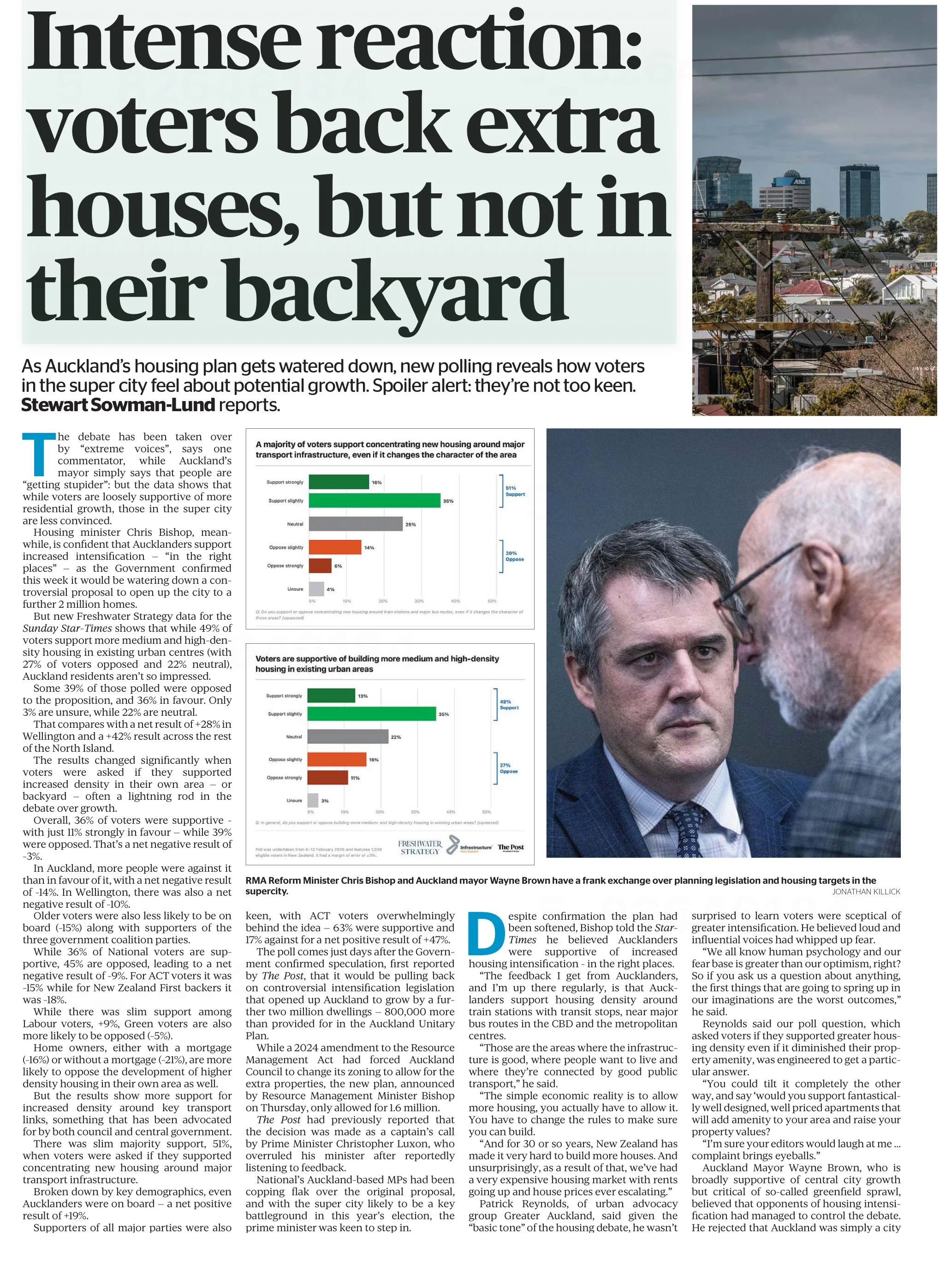
Reproduced from page 6 of the Sunday Star-Times from 22 Feb, 2026 for purposes of education, commentary, and criticism.
Show the things that are most important for the audience to know
One data communication choice in the article that limits its likely use and usefulness relates to which results were featured in visualisations and which were not. The headline of the article says that ‘voters back extra houses, but not in their backyard’ and the text of the article describes density in people’s own local area as ‘often a lightning rod in the debate over growth’. Given those things, it’s surprising to see that even though the text of the article discusses attitudes toward increased density in survey respondents’ own local areas, those results don’t feature in either of the two charts shown in the article. The two charts that are shown illustrate fairly similar responses to fairly similar questions (about increased housing intensification around transport infrastructure and in existing urban areas, which in practice are often likely to be the same places).
Lesson: When using a combination of text and visualisations to communicate insights from data, the data visualisations should be used to illustrate the most important points.
Show (and tell) your audience about your results at a level of granularity required to inform their decision making
A second problem with the way the data from the survey is communicated in the article is that the charts that are shown present more granular results than the text descriptions that accompany them. That makes it difficult to understand the results in detail – particularly for the crucial question for which there is no visualisation.
That is problematic because for emotive issues such as housing there is a big difference between being strongly supportive versus slightly supportive or being strongly opposed versus slightly opposed. Those who are strongly supportive or opposed are much more likely to take actions such as contacting their elected representatives, signing petitions, participating in consultation processes, and sharing their views formally or informally. Their votes are also more likely to be influenced by the issue.
Showing more granular results with all six possible responses to each question would have made it easier to see the differences in attitudes when increased density is discussed in the abstract versus in a way that could have an immediate effect on the people expressing the attitudes. Obviously data communication almost always involves choices about what to include and what to exclude or present in an aggregated manner, but in this case a relatively small change in the type of chart used would have enabled much more information to have been communicated to help readers understand the issue being discussed.
Both of the charts shown are bar charts, with each bar representing the proportion of survey respondents who gave each response to the question shown at the bottom of the chart. Because they are mutually exclusive proportions (each person can give only one answer to each question, and all respondents are represented if only to say they are neutral or unsure) then these results could have been shown using a stacked bar chart. That is where there is a bar sliced into segments – in this case based on which response people selected for each question. One stacked bar chart with three bars could have been used to compare overall results for the three questions discussed in the article.
The text of the article also discusses variation in responses to all three questions based on location, age, voting preferences, and home ownership. There are no charts for any of those things, which makes it somewhat difficult to follow the text-based discussion about how results vary by group. Additional stacked bar charts would have helped to show key differences based on location, age, voting preferences, and home ownership.
Lesson: When possible – and especially when details are important to truly understanding an issue – try to preserve granularity when communicating data and only aggregate when doing so helps the viewer understand the data more clearly.
Define your metrics
Given the previously described issues with what was shown in visualisations, the text of the article had to carry most of the burden of communicating the survey results; however many readers would probably struggle to fully understand the text-based descriptions. To see why, let’s take a look at an excerpt from the text of the article.
“… while 49% of voters support more medium and high-density housing in existing urban centres (with 27% of voters opposed and 22% neutral), Auckland residents aren't so impressed.
Some 39% of those polled were opposed to the proposition, and 36% in favour. Only 3% are unsure, while 22% are neutral. That compares with a net result of +28% in Wellington and a +42% result across the rest of the North Island.”
The last sentence in the excerpt shown discusses ‘net results’ of +28% in Wellington and +42% across the rest of the North Island. The subsequent discussion also uses the ‘net’ terminology. People who regularly review survey data are likely to know that ‘net results’ in this context mean the total percentage in support (slightly + strongly) minus the total percentage in opposition (slightly + strongly); however the article does not say that anywhere and it seems unlikely that most readers of the Sunday Star-Times are familiar with that convention. Calculated metrics like that should be explained when viewers may be unfamiliar with them.
Lesson: If you are using a calculated metric, you should explain how it’s calculated if more than a very small percentage of the target audience are unlikely to know that.
Between the most salient question not being shown in a chart or described in full, group differences not being shown in charts or described in full, and many people not understanding the concept of net results in this context I suspect this article may leave many readers no better informed than they were before they read it. That is a lost opportunity for data to play an important role in helping people understand and make decisions about this important issue for our society. A detailed understanding of how attitudes vary by group and by form of intensification is likely to be necessary for finding housing solutions with enough community support to be implemented, and for identifying the specific challenges that must be overcome to make that happen.
Reducing greenhouse gas emissions is hard. So is counting and showing them.
One popular part of the data-related courses I teach through Wellington Uni Professional involves participants critiquing various forms of data communication created by others. The idea is that it's easier to spot things that are confusing, misleading, inaccurate, or just could be better when they were made by other people because we're all too close to our own work and know what we mean even if that's not what comes across to others.
I thought I would share some publicly available examples of data communication and visualisation and comment on what works, what doesn't, and what's okay but could be improved. The idea isn't to disparage the people or organisations that have produced less than ideal data communications – we've all done that – but rather to show how hard it is to craft truly effective data communication, and to share some lessons and tips toward that end.
Let's examine this chart from Danyl McLauchlan's thoughtful column in this week's Listener to see what broader lessons we can draw about effective data communication. I want to start by pointing out that the chart has little to do with the points being made in the column itself.

The chart appears in 'Increasingly common tragedy' by Danyl McLauchlan on page 11 of the Listener, February 7, 2026. Image reproduced for purposes of education, criticism and commentary.
A quick glance at the chart would lead you to believe that the column is about what sources contribute most to New Zealand's greenhouse gas emissions; however that is only touched on briefly in the text. Mainly, the column offers a game-theoretic explanation for the collective failure of the country and the world to reduce emissions sufficiently to avoid the types of weather extremes we are already starting to experience, comments on New Zealand's lack of resilience in the face of those extremes, and discusses the benefits clean energy offers above and beyond its contribution to reducing emissions. Someone just flipping through the magazine might look at the chart and take away the message that climate is really just a problem for farmers, which is not the point of the column. This data visualisation detracts from the important, but nuanced, arguments being made rather than helping to communicate them clearly.
Lesson: Data visualisations are not decorations. They should only be used when they help enhance viewers' understanding of the topic being discussed.
Besides not being particularly relevant to the text of the article, the data shown in the chart is unlikely to be clearly understood by the audience – in this case readers of the Listener. The data comes from The Ministry for the Environment. It is based on measurement standards developed as part of international agreements. Climate professionals would be familiar with those standards, but the average reader of the Listener is unlikely to be.
That's a crucial difference because data communication created for subject matter experts should be different from data communication created for the general public. In this case, a couple important things that climate experts know, but most of the magazine reading public does not are that: 1) Greenhouse gas emissions can be measured on either a production or consumption basis, and 2) The standard way of reporting greenhouse gas emissions excludes international travel and transport.
The data in the chart shows greenhouse gas emissions generated by source in the goods and services New Zealand produces (not consumes). That makes even that first, dramatic, bar hard to interpret because New Zealand exports a lot of animal products. That first bar being the longest doesn't tell us if livestock is farmed more or less efficiently in terms of greenhouse gas emissions in New Zealand than elsewhere. We also can't tell if farming is more or less efficient in terms of greenhouse gas emissions than other industries because we have no information about the outputs associated with the emissions.
With regard to the second point, a reader unfamiliar with the fact that international travel and transport are not included in the data shown might reasonably conclude that their twice yearly international trips are not a problem given domestic aviation is at the bottom of the chart and international aviation does not appear at all. Yet if such a reader were to calculate his or her personal consumption-based emissions and include all sources, they might be surprised to discover that those international flights are likely to be their greatest personal source of greenhouse gas emissions.
Lesson: Data communications should be tailored to the intended target audience.
These two principles of using visualisations purposefully rather than decoratively, and tailoring them to the intended target audience can make the difference between data communication that clarifies and data communication that confuses. In future posts, I'll explore more examples of what works, what doesn't, and what could be better with some thoughtful improvements.