
Don’t sacrifice accuracy for attention
"The gender-age divide has tripled since 2011." That bold claim is the title of a data visualisation in this week's Listener. It's the kind of headline figure that grabs the attention of a reader flipping through a magazine in an election year. If that reader is attentive, however, they would realise that it’s a claim that doesn't quite hold up when checked against the chart's own numbers.
The visualisation is part of the cover article of this week’s Listener. It describes New Zealand’s political ‘tribes’ based on analysis of survey data. It includes an interesting discussion of how the political views of voters have changed over time.
Unfortunately, the article includes a data visualisation that contains two critical flaws as well as one more minor one.
Make sure your visualisations, titles, and text-based descriptions all match
The data visualisation shows where women under 40 and men over 40 place themselves on a 0-10 scale where 5 is politically centrist, numbers below 5 get increasingly left-leaning as you go toward zero and numbers above 5 get increasingly right-leaning as you go toward 10.
As previously mentioned, the title of the visualisation in question is ‘the gender-age divide has tripled since 2011.’ In 2011 the chart shows the value for men over 40 being 5.6 and for women under 40 being 5.1. As the chart shows, that is a gap of .5, so to triple the difference in 2023 the gap would need to be 1.5 (.5*3), but it is actually 1.3. It’s possible that the difference is due to rounding of the values, but the title of the chart not matching the data in the chart is a problem.
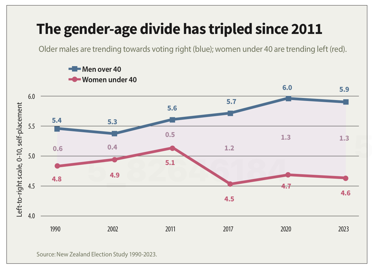
Image reproduced for purposes of education, criticism and commentary.
If someone quickly does the maths and realises that the claim of tripling is over-stated, they may wonder about the veracity of other aspects of the visualisation, the article, or the underlying research. If a difference such as the one just described is due to rounding, that could be addressed by changing the chart title, showing the values to one more decimal point or adding a rounding disclaimer. If the gap has not actually tripled, the title should not say that it has.
Lesson: Chart titles and text-based descriptions of data should match results shown in visualisations
Don’t truncate axes
The second major issue undermining the credibility of this visualisation is the axis, which shows values ranging from 4 to 6. Remembering that the scale went from 0-10 and was centred on 5, what that means is that the portion of the scale shown goes from a little bit left-leaning to a little bit right-leaning. While it’s clear from the visualisation that there is a difference between the two groups and that it has grown over time, in the context of the whole scale the gap is still not that large.
Because only the middle portion of the 11-point scale is shown on the axis, it makes the gap appear to be much larger and more meaningful than it actually is. The impulse to do that may be to make it seem more newsworthy or to help viewers see how the gap has evolved over time, but either way it does not help the viewers understand the data in its full context.
Any time only a portion of an axis is shown as it is here it tends to have the effect of magnifying differences, trends, etc. and to the extent it does that it misrepresents the data even if all of the numbers shown are accurate.
Lesson: Using a truncated axis makes trends, differences, etc. appear larger than they actually are.
State your metrics
Obviously not all women under 40 or all men over 40 place themselves in the exact same place on a political scale, so the visualisation is almost certainly showing the mean value for each group (as opposed to the median, which is the other most common way of representing what’s typical for a group, but in this situation could only produce values ending in 0 or 5 after the decimal point). It should explicitly specify that it’s showing the mean (assuming that’s what it is), but it does not.
We can make an educated guess in this context, which is why this is a less critical issue than the other two, but we shouldn’t have to guess. Clearly stating your metrics lets viewers focus on what the data means, not what it is, and avoids confusion and misunderstanding.
Lesson: Viewers should not have to guess what the values you are showing in a visualisation are — state that explicitly
The political gender-age gap widening over the past couple of decades is genuinely interesting, and could be consequential in the upcoming election, so it doesn't need to be overstated to earn attention. When the numbers in a chart don't support the headline above it or the chart seems to exaggerate results, readers who notice may question not just the visualisation but the research behind it. That's a high price to pay to try to make a title or headline a bit catchier or to make the data in a graph seem more dramatic.