
Everyone has off days
I often use data visualisation and communication appearing on the New York Times’ app and website to illustrate good aspects of data communication. NYT staff seem particularly skilled at making complex, data-intensive topics digestible. For example, they have created visualisations that crystallise the extent of climate change, and — perhaps most impressively — a podcast episode about pedestrian deaths that tells a data-intensive story without a single chart or table, but with the intrigue and suspense of a murder mystery.
In spite of this impressive track record, everyone has off days, and the New York Times itself had one recently on a day when it was trying to communicate about the stock market having an off day. That day (June 5th US time) I opened the New York Times app and saw the chart below. As shown there, the chart was in the main ‘today’ section of the app rather than the business or markets section.
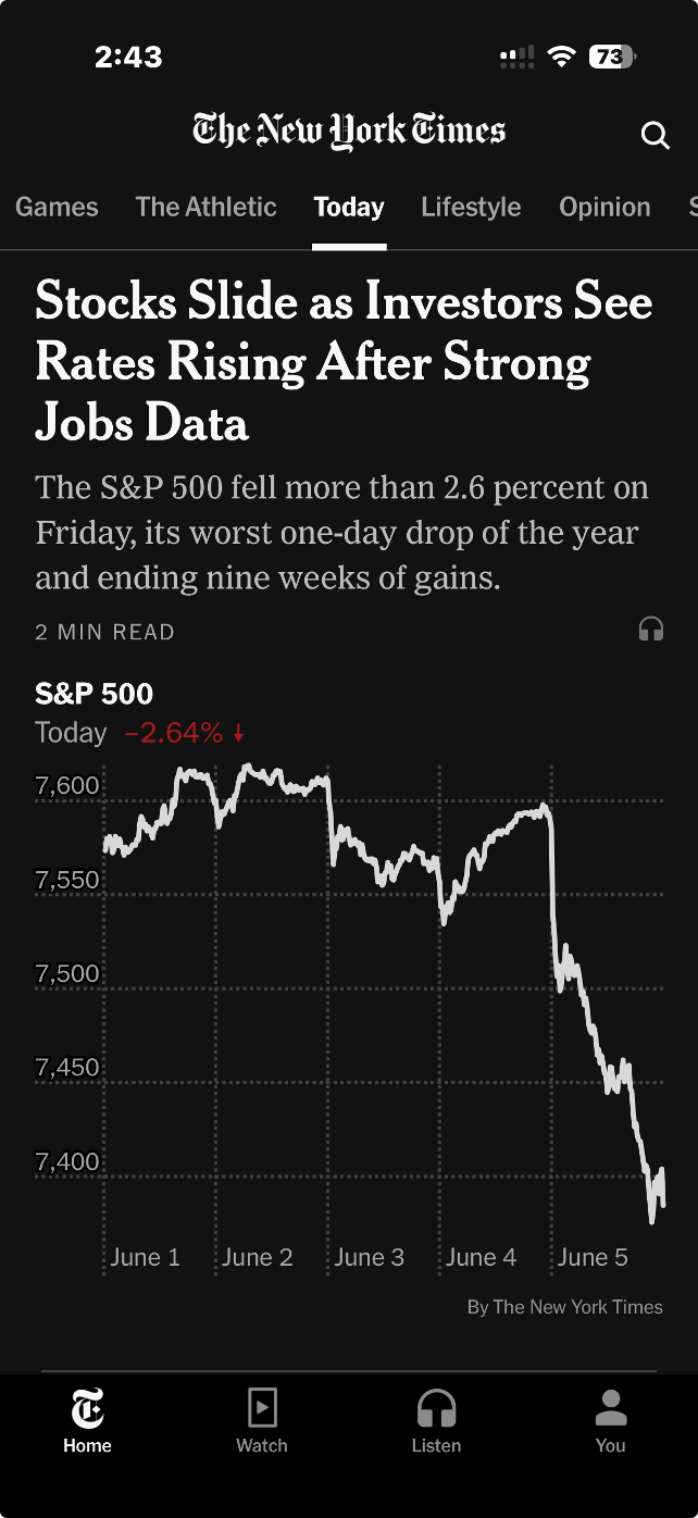
Image from the ‘today’ section of the New York Times iPhone app, 5 June 2026 (US time), reproduced for purposes of education, criticism and commentary.
Truncating axes magnifies differences
The headline describes stocks as sliding, and the graphic certainly appears to show quite a precipitous slide. But looking more closely, we can see that the axis shown only goes from about 7350 to 7650. If we look even more closely we can see the drop for the S&P 500 that day was 2.64%. That was certainly likely to be of interest, and potentially concern, to some investors, but it was a much smaller decrease than readers might have guessed looking at the graphic alone.
Generally speaking, truncating axes to exclude zero tends to magnify differences and make them appear larger than they actually are and it should therefore be avoided. That’s particularly the case because without zero there is nothing to anchor axes to and a chart the next day might use the same vertical distance to show a drop of 1.6% or a gain of 3.6%.
Those who truncate axes often intend to magnify differences, arguing that they are trying to show them clearly. For example, in this situation, they might say that starting the axis at zero and going up to 7650 or so (to include all of the data) would make the nearly 201 point drop in the S&P 500 on the 5th of June very hard to see. That’s a valid concern, but one with a better solution, as we’ll see in the next lesson.
Lesson: Include zero in axes when showing numeric data
Metric choice matters
If you asked a random sample of New York Times app users what 7,384 on the S&P 500 actually means my guess is that while many people would know it is a reflection of the collective value of large companies, few would know precisely what criteria are used for inclusion nor exactly how their value is combined into the value of the S&P on a given day. Therefore, a specific value on a given day, such as 7,384, is unlikely to mean much to them.
On the other hand, I would think most New York Times app users have a good understanding of what a 2.64% drop means. That raises a question: why don't the New York Times and others show day-to-day percentage changes rather than the index value itself? That would make it easier for people to distinguish noteworthy increases and decreases from normal day-to-day variations and long-term growth trends.
Lesson: Communicate data using the metric(s) that are most useful and intuitive to the intended target audience.
According to data from Macrotrends.net and a calculation by Claude, the S&P 500 dropped by at least 2.5% 22 times in the past five years. Showing the S&P chart as percentage changes in the New York Times app rather than the value of the S&P would have allowed viewers to see that while June 5th was a bad day in the financial markets, it wasn’t extremely uncommonly bad. Similarly, while the graphic shown by the New York Times that day wasn’t extremely uncommonly bad, it wasn’t their best data communication work either. Everyone has bad days. Even the S&P 500 and the New York Times.
Don’t sacrifice accuracy for attention
"The gender-age divide has tripled since 2011." That bold claim is the title of a data visualisation in this week's Listener. It's the kind of headline figure that grabs the attention of a reader flipping through a magazine in an election year. If that reader is attentive, however, they would realise that it’s a claim that doesn't quite hold up when checked against the chart's own numbers.
The visualisation is part of the cover article of this week’s Listener. It describes New Zealand’s political ‘tribes’ based on analysis of survey data. It includes an interesting discussion of how the political views of voters have changed over time.
Unfortunately, the article includes a data visualisation that contains two critical flaws as well as one more minor one.
Make sure your visualisations, titles, and text-based descriptions all match
The data visualisation shows where women under 40 and men over 40 place themselves on a 0-10 scale where 5 is politically centrist, numbers below 5 get increasingly left-leaning as you go toward zero and numbers above 5 get increasingly right-leaning as you go toward 10.
As previously mentioned, the title of the visualisation in question is ‘the gender-age divide has tripled since 2011.’ In 2011 the chart shows the value for men over 40 being 5.6 and for women under 40 being 5.1. As the chart shows, that is a gap of .5, so to triple the difference in 2023 the gap would need to be 1.5 (.5*3), but it is actually 1.3. It’s possible that the difference is due to rounding of the values, but the title of the chart not matching the data in the chart is a problem.
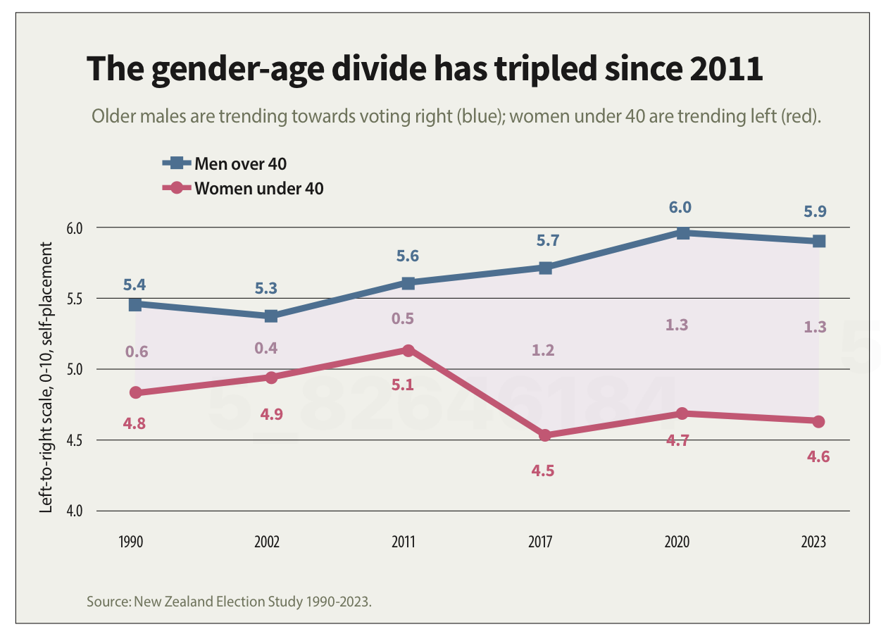
Image reproduced for purposes of education, criticism and commentary.
If someone quickly does the maths and realises that the claim of tripling is over-stated, they may wonder about the veracity of other aspects of the visualisation, the article, or the underlying research. If a difference such as the one just described is due to rounding, that could be addressed by changing the chart title, showing the values to one more decimal point or adding a rounding disclaimer. If the gap has not actually tripled, the title should not say that it has.
Lesson: Chart titles and text-based descriptions of data should match results shown in visualisations
Don’t truncate axes
The second major issue undermining the credibility of this visualisation is the axis, which shows values ranging from 4 to 6. Remembering that the scale went from 0-10 and was centred on 5, what that means is that the portion of the scale shown goes from a little bit left-leaning to a little bit right-leaning. While it’s clear from the visualisation that there is a difference between the two groups and that it has grown over time, in the context of the whole scale the gap is still not that large.
Because only the middle portion of the 11-point scale is shown on the axis, it makes the gap appear to be much larger and more meaningful than it actually is. The impulse to do that may be to make it seem more newsworthy or to help viewers see how the gap has evolved over time, but either way it does not help the viewers understand the data in its full context.
Any time only a portion of an axis is shown as it is here it tends to have the effect of magnifying differences, trends, etc. and to the extent it does that it misrepresents the data even if all of the numbers shown are accurate.
Lesson: Using a truncated axis makes trends, differences, etc. appear larger than they actually are.
State your metrics
Obviously not all women under 40 or all men over 40 place themselves in the exact same place on a political scale, so the visualisation is almost certainly showing the mean value for each group (as opposed to the median, which is the other most common way of representing what’s typical for a group, but in this situation could only produce values ending in 0 or 5 after the decimal point). It should explicitly specify that it’s showing the mean (assuming that’s what it is), but it does not.
We can make an educated guess in this context, which is why this is a less critical issue than the other two, but we shouldn’t have to guess. Clearly stating your metrics lets viewers focus on what the data means, not what it is, and avoids confusion and misunderstanding.
Lesson: Viewers should not have to guess what the values you are showing in a visualisation are — state that explicitly
The political gender-age gap widening over the past couple of decades is genuinely interesting, and could be consequential in the upcoming election, so it doesn't need to be overstated to earn attention. When the numbers in a chart don't support the headline above it or the chart seems to exaggerate results, readers who notice may question not just the visualisation but the research behind it. That's a high price to pay to try to make a title or headline a bit catchier or to make the data in a graph seem more dramatic.
What the screen industry can teach data communicators
People in the screen sector excel at telling stories, and a report about the New Zealand screen sector provides an opportunity to consider how we tell stories with and about data. The report provides an interesting overview of the sector, but also illustrates some common ways in which the use of charts is not quite as effective as it could be.
The film director David Fincher is quoted as saying: "My idea of professionalism is probably a lot of people's idea of obsessive." Attention to detail can elevate a data communication from serviceable to excellent just as it can elevate a film or a TV show.
Consider the metric you’re using when creating stacked bar and column charts
Figures 3 and 6 of the report focus on how the New Zealand screen sector breaks down into sub-sectors such as production and post-production. It does this based on a count of firms in Figure 3 and a count of people in Figure 6. That’s interesting and important information, but it’s shown in a way that makes it harder to digest than it needs to be.
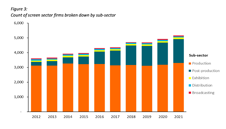
Image reproduced for purposes of education, criticism and commentary.
Because both figures show the data as counts, or absolute values, rather than as percentages, it’s somewhat hard to discern to what extent a particular sub-sector is growing because that can be masked by growth in the sector overall. For example, looking at Figure 3 we can reasonably conclude that, when it comes to firms, the production sub-sector is shrinking as a percentage of the overall sector and post-production is growing because the orange portion of each column has stayed around the same height while the columns have grown overall and the dark teal portion appears to have grown as a percentage of the columns.
Beyond that though we don’t have a very good idea of the magnitude of the shift in those percentages, and we have even less idea of whether there have been any changes in the proportions of the smaller sub-sectors since those are represented by relatively small slices of relatively tall columns.
When using stacked columns or stacked bars, the story being told will generally be more clear if the data is shown as percentages rather than as counts or absolute values. That makes it easy to scan horizontally (for stacked columns) or vertically (for stacked bars) to see differences. For example, while not perfect for other reasons we will touch on shortly, Figure 19 of the same report uses stacked columns showing percentages to illustrate the breakdown of sub-sectors by region and from that we can easily see that people working in post-production are concentrated primarily in Wellington, whereas production represents a large proportion of people working in the screen sector in all regions.
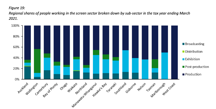
Image reproduced for purposes of education, criticism and commentary.
Lesson: Stacked column (and bar) charts usually work best when they show percentages rather than absolute values
Continuity
While Figure 19 is good in the sense that it represents the data as percentages rather than counts or absolute values it’s not as good as it could be in that the colours used to represent the different sub-sectors have changed from what they were earlier in the report, such as in Figure 3. That is a common problem in data communication, as we’ve seen in earlier posts. It can occur when different people work on the same output or even if the same person works on it at different times. It often occurs because people rely on software defaults, which are a function of the order the data is in and sometimes the particular theme or template a person has on their computer.
No matter how or why this shift in colour assignment happens it’s as disruptive as it would be if the colours of the costumes the characters in a TV show or movie you were watching changed part way through for no apparent reason. In our data communication, as in film or TV production, we should take care to avoid that.
That maintenance of consistency is called continuity in the screen industry. For example, besides noticing if a costume has changed colour from one scene to the next without explanation we would also be likely to notice if an object is in a different place. Similarly, in data communication the idea of continuity applies to order as well as colour. Once we have established a particular order for something, such as the sub-sectors in this report, maintaining it makes it easier for viewers to understand what they are looking at in a given chart and to make comparisons across charts.
For example, like Figure 3, Figure 6 shows the breakdown of sub-sectors, but this time by workers rather than by firms. It’s interesting to compare and contrast the two, but if you visually scan back and forth between Figures 3 and 6 you can see it’s not that easy to do. Part of that is because both use counts rather than percentages, as described previously, but it’s also because the order of the sub-sectors has changed. Maintaining continuity when it comes to the order of the sub-sectors across both charts would have improved the experience of the viewer.
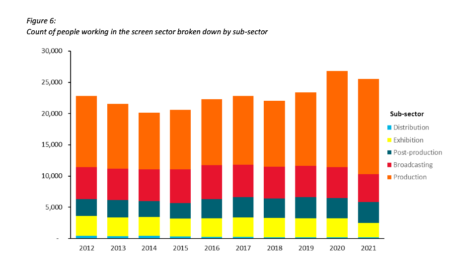
Image reproduced for purposes of education, criticism and commentary.
Lesson: Once you’ve established a colour scheme or an order in which to show different groups, categories, etc., maintain it unless there is a very good reason not to
Two (or more) charts are often better than one
Just as filmmakers use different scenes to show us different insights into characters, we can use different charts to show different insights derived from data. The stacked column charts shown in the current versions of Figures 3 and 6 each show two different insights: 1) total growth in firms or people working in the New Zealand screen industry, and 2) changes to the proportional breakdown of firms or people by sub-sector.
There are many similar situations in data communication. For example, we might want to show how the number of customers or clients has changed and how that breaks down by region, age, income, etc.
In all of those situations it generally works better to use a chart with solid bars or columns first to show the change in the absolute value or count of whatever we are focussed on and then follow that up with a stacked bar or column chart showing the proportional breakdown than to try to do both at once as happens in the current versions of Figures 3 and 6. The first chart establishes the overall change and then the second one shows whether that is being driven disproportionately by particular sub-groups. Additional stacked bar or column charts can be used to show additional breakdowns.
Lesson: If you are trying to communicate multiple insights consider using multiple charts
Those of us trying to communicate data-driven insights are like filmmakers and TV producers in that we are trying to create an engaging narrative. We can learn from them in taking care to ensure the story we tell is clear, maintains continuity when it comes to things such as colour and order, and is not unnecessarily complicated to follow. We should carefully attend to those details because in data communication, as in filmmaking, Fincher's 'obsessiveness' is really true professionalism.