
What the screen industry can teach data communicators
People in the screen sector excel at telling stories, and a report about the New Zealand screen sector provides an opportunity to consider how we tell stories with and about data. The report provides an interesting overview of the sector, but also illustrates some common ways in which the use of charts is not quite as effective as it could be.
The film director David Fincher is quoted as saying: "My idea of professionalism is probably a lot of people's idea of obsessive." Attention to detail can elevate a data communication from serviceable to excellent just as it can elevate a film or a TV show.
Consider the metric you’re using when creating stacked bar and column charts
Figures 3 and 6 of the report focus on how the New Zealand screen sector breaks down into sub-sectors such as production and post-production. It does this based on a count of firms in Figure 3 and a count of people in Figure 6. That’s interesting and important information, but it’s shown in a way that makes it harder to digest than it needs to be.
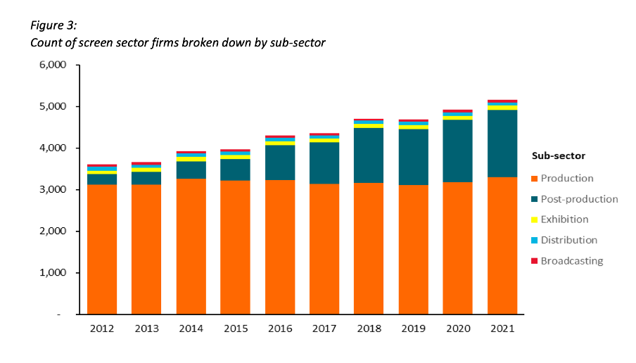
Image reproduced for purposes of education, criticism and commentary.
Because both figures show the data as counts, or absolute values, rather than as percentages, it’s somewhat hard to discern to what extent a particular sub-sector is growing because that can be masked by growth in the sector overall. For example, looking at Figure 3 we can reasonably conclude that, when it comes to firms, the production sub-sector is shrinking as a percentage of the overall sector and post-production is growing because the orange portion of each column has stayed around the same height while the columns have grown overall and the dark teal portion appears to have grown as a percentage of the columns.
Beyond that though we don’t have a very good idea of the magnitude of the shift in those percentages, and we have even less idea of whether there have been any changes in the proportions of the smaller sub-sectors since those are represented by relatively small slices of relatively tall columns.
When using stacked columns or stacked bars, the story being told will generally be more clear if the data is shown as percentages rather than as counts or absolute values. That makes it easy to scan horizontally (for stacked columns) or vertically (for stacked bars) to see differences. For example, while not perfect for other reasons we will touch on shortly, Figure 19 of the same report uses stacked columns showing percentages to illustrate the breakdown of sub-sectors by region and from that we can easily see that people working in post-production are concentrated primarily in Wellington, whereas production represents a large proportion of people working in the screen sector in all regions.
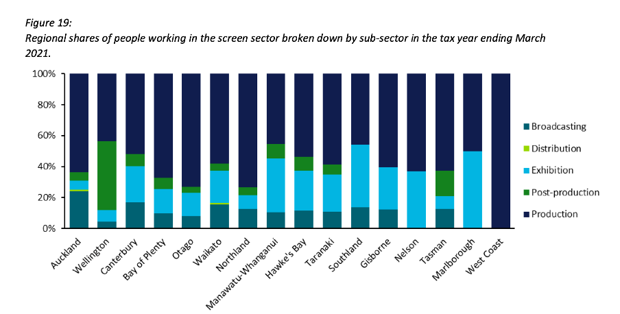
Image reproduced for purposes of education, criticism and commentary.
Lesson: Stacked column (and bar) charts usually work best when they show percentages rather than absolute values
Continuity
While Figure 19 is good in the sense that it represents the data as percentages rather than counts or absolute values it’s not as good as it could be in that the colours used to represent the different sub-sectors have changed from what they were earlier in the report, such as in Figure 3. That is a common problem in data communication, as we’ve seen in earlier posts. It can occur when different people work on the same output or even if the same person works on it at different times. It often occurs because people rely on software defaults, which are a function of the order the data is in and sometimes the particular theme or template a person has on their computer.
No matter how or why this shift in colour assignment happens it’s as disruptive as it would be if the colours of the costumes the characters in a TV show or movie you were watching changed part way through for no apparent reason. In our data communication, as in film or TV production, we should take care to avoid that.
That maintenance of consistency is called continuity in the screen industry. For example, besides noticing if a costume has changed colour from one scene to the next without explanation we would also be likely to notice if an object is in a different place. Similarly, in data communication the idea of continuity applies to order as well as colour. Once we have established a particular order for something, such as the sub-sectors in this report, maintaining it makes it easier for viewers to understand what they are looking at in a given chart and to make comparisons across charts.
For example, like Figure 3, Figure 6 shows the breakdown of sub-sectors, but this time by workers rather than by firms. It’s interesting to compare and contrast the two, but if you visually scan back and forth between Figures 3 and 6 you can see it’s not that easy to do. Part of that is because both use counts rather than percentages, as described previously, but it’s also because the order of the sub-sectors has changed. Maintaining continuity when it comes to the order of the sub-sectors across both charts would have improved the experience of the viewer.
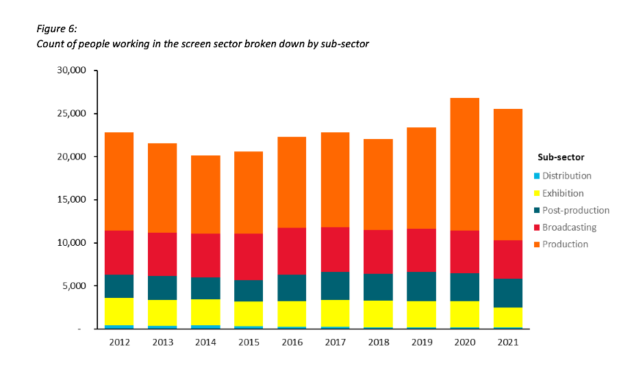
Image reproduced for purposes of education, criticism and commentary.
Lesson: Once you’ve established a colour scheme or an order in which to show different groups, categories, etc., maintain it unless there is a very good reason not to
Two (or more) charts are often better than one
Just as filmmakers use different scenes to show us different insights into characters, we can use different charts to show different insights derived from data. The stacked column charts shown in the current versions of Figures 3 and 6 each show two different insights: 1) total growth in firms or people working in the New Zealand screen industry, and 2) changes to the proportional breakdown of firms or people by sub-sector.
There are many similar situations in data communication. For example, we might want to show how the number of customers or clients has changed and how that breaks down by region, age, income, etc.
In all of those situations it generally works better to use a chart with solid bars or columns first to show the change in the absolute value or count of whatever we are focussed on and then follow that up with a stacked bar or column chart showing the proportional breakdown than to try to do both at once as happens in the current versions of Figures 3 and 6. The first chart establishes the overall change and then the second one shows whether that is being driven disproportionately by particular sub-groups. Additional stacked bar or column charts can be used to show additional breakdowns.
Lesson: If you are trying to communicate multiple insights consider using multiple charts
Those of us trying to communicate data-driven insights are like filmmakers and TV producers in that we are trying to create an engaging narrative. We can learn from them in taking care to ensure the story we tell is clear, maintains continuity when it comes to things such as colour and order, and is not unnecessarily complicated to follow. We should carefully attend to those details because in data communication, as in filmmaking, Fincher's 'obsessiveness' is really true professionalism.