
On average, considering variation leads to better decisions
Garrison Keillor describes the people of his fictional town, Lake Wobegon, by saying "All the women are strong, all the men are good-looking, and all the children are above average." While the last claim is impossible and the first two are unlikely, even for a fictional town, the statement illustrates our tendency to focus on aggregate statistics such as totals and averages when we summarise things.
Aggregate statistics are important, but if you only examine overall measures such as those without also checking the extent and nature of underlying variation you may miss important pieces of the puzzle you are trying to put together. That’s particularly the case when what you are describing is less homogeneous than the people of Lake Wobegon.
A recently released report on community engagement done by the New Zealand Transport Agency (NZTA) regarding proposed changes to how State Highway 1 travels through Wellington demonstrates the value of looking into the extent and nature of variation rather than just at aggregate statistics. It does that by breaking down the data a variety of ways using a consistent chart type to make it easy to compare different results to get a clear understanding of the overall situation. Whatever your opinion about the changes proposed for State Highway 1, the report is an example of good data communication.
Aggregate measures sometimes don’t show the full picture
The report summarises results of a survey that asked about five specific changes being considered to the portion of State Highway 1 that runs through Wellington City. Community members who took the opportunity to provide feedback were asked to indicate how they believe the changes overall, and each change individually, would affect them personally and the Wellington region more generally.
Results for each of those two measures for the full set of changes collectively are shown in aggregate in Figure 5-1.
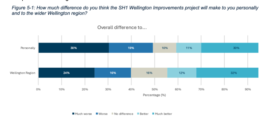
Image reproduced for purposes of education, criticism and commentary.
Importantly though, the report also includes the results for each measure based on where survey participants live, as shown in Figure 5-2 below for how survey respondents think the whole programme of changes would affect them personally.
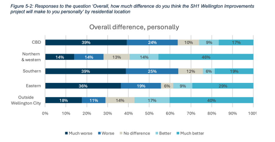
Image reproduced for purposes of education, criticism and commentary.
If we only looked at the first figure we would get a sense that the community is somewhat evenly split on whether the project overall would make things better (41%) or worse (49%) for them personally, but by examining the more granular geographic breakdown of results it becomes clear that the people who believe the changes would make things better disproportionately live outside of Wellington City or in the northern and western suburbs while the people who believe the changes would make things worse for them live in the CBD and the southern and eastern suburbs.
This is important information for policy makers to consider given the changes proposed would occur in the CBD and the southern and eastern suburbs. In other words, the people most likely to be most directly affected by the changes during and after implementation were disproportionately likely to believe the changes would make things worse for them personally.
In this situation a lot of variation in attitudes toward the proposed changes can be explained by where people live, but characteristics such as age, gender, and income, may account for variation in other metrics. It’s always worth checking for such differences rather than just focussing on aggregate measures such as totals and overall averages when using data to make decisions.
Lesson: Aggregated results may hide a lot of variation across different characteristics. Check for such differences, and when they exist show and explain the variation as well as the aggregated results.
Make comparison easy
Previous posts have shown examples of inconsistency in how data insights are communicated. This report shows the benefit of consistency when it comes to choices such as the type of chart, the order of data series, and the colour scheme.
Both Figure 5-1 and 5-2 use stacked bar charts, ordered to show responses from much worse to much better, and with the same colours used to represent each possible response option. Similar charts were used to show perceived personal and Wellington-wide effects toward each change considered. For example, Figure 5-5 below shows how responses varied for each change under consideration.
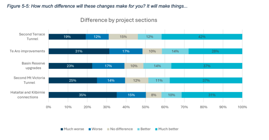
Image reproduced for purposes of education, criticism and commentary.
A stacked bar was a good choice for this data because the response options for each question are mutually exclusive and some labels for different projects and locations are long. Having selected an optimal chart type for the situation, keeping everything else constant makes it very easy to make comparisons between charts as well as within them. It means that someone reading the report can concentrate on how attitudes change depending on where a person lives or what part of the project is being considered rather than forcing them to waste mental bandwidth trying to orient themselves around each new chart because it’s designed slightly differently.
Lesson: Using charts of the same type and with the same order and colour scheme helps facilitate comparisons
Unlike the fictional, reportedly highly homogeneous Lake Wobegon, variation is common in the real world and the data that represents it. Understanding that variation rather than focussing exclusively on aggregate metrics won’t make decisions such as whether to change a state highway easy, but it will, on average, result in better decisions.
What the screen industry can teach data communicators
People in the screen sector excel at telling stories, and a report about the New Zealand screen sector provides an opportunity to consider how we tell stories with and about data. The report provides an interesting overview of the sector, but also illustrates some common ways in which the use of charts is not quite as effective as it could be.
The film director David Fincher is quoted as saying: "My idea of professionalism is probably a lot of people's idea of obsessive." Attention to detail can elevate a data communication from serviceable to excellent just as it can elevate a film or a TV show.
Consider the metric you’re using when creating stacked bar and column charts
Figures 3 and 6 of the report focus on how the New Zealand screen sector breaks down into sub-sectors such as production and post-production. It does this based on a count of firms in Figure 3 and a count of people in Figure 6. That’s interesting and important information, but it’s shown in a way that makes it harder to digest than it needs to be.
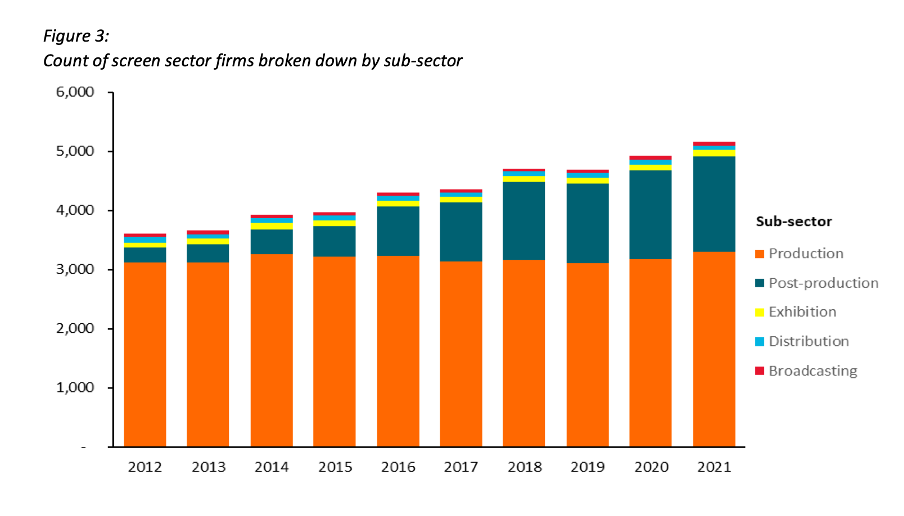
Image reproduced for purposes of education, criticism and commentary.
Because both figures show the data as counts, or absolute values, rather than as percentages, it’s somewhat hard to discern to what extent a particular sub-sector is growing because that can be masked by growth in the sector overall. For example, looking at Figure 3 we can reasonably conclude that, when it comes to firms, the production sub-sector is shrinking as a percentage of the overall sector and post-production is growing because the orange portion of each column has stayed around the same height while the columns have grown overall and the dark teal portion appears to have grown as a percentage of the columns.
Beyond that though we don’t have a very good idea of the magnitude of the shift in those percentages, and we have even less idea of whether there have been any changes in the proportions of the smaller sub-sectors since those are represented by relatively small slices of relatively tall columns.
When using stacked columns or stacked bars, the story being told will generally be more clear if the data is shown as percentages rather than as counts or absolute values. That makes it easy to scan horizontally (for stacked columns) or vertically (for stacked bars) to see differences. For example, while not perfect for other reasons we will touch on shortly, Figure 19 of the same report uses stacked columns showing percentages to illustrate the breakdown of sub-sectors by region and from that we can easily see that people working in post-production are concentrated primarily in Wellington, whereas production represents a large proportion of people working in the screen sector in all regions.
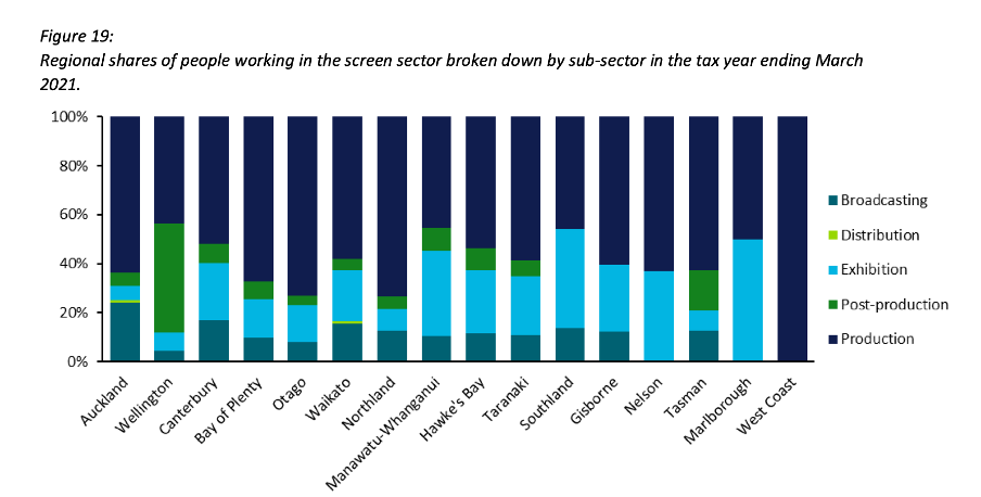
Image reproduced for purposes of education, criticism and commentary.
Lesson: Stacked column (and bar) charts usually work best when they show percentages rather than absolute values
Continuity
While Figure 19 is good in the sense that it represents the data as percentages rather than counts or absolute values it’s not as good as it could be in that the colours used to represent the different sub-sectors have changed from what they were earlier in the report, such as in Figure 3. That is a common problem in data communication, as we’ve seen in earlier posts. It can occur when different people work on the same output or even if the same person works on it at different times. It often occurs because people rely on software defaults, which are a function of the order the data is in and sometimes the particular theme or template a person has on their computer.
No matter how or why this shift in colour assignment happens it’s as disruptive as it would be if the colours of the costumes the characters in a TV show or movie you were watching changed part way through for no apparent reason. In our data communication, as in film or TV production, we should take care to avoid that.
That maintenance of consistency is called continuity in the screen industry. For example, besides noticing if a costume has changed colour from one scene to the next without explanation we would also be likely to notice if an object is in a different place. Similarly, in data communication the idea of continuity applies to order as well as colour. Once we have established a particular order for something, such as the sub-sectors in this report, maintaining it makes it easier for viewers to understand what they are looking at in a given chart and to make comparisons across charts.
For example, like Figure 3, Figure 6 shows the breakdown of sub-sectors, but this time by workers rather than by firms. It’s interesting to compare and contrast the two, but if you visually scan back and forth between Figures 3 and 6 you can see it’s not that easy to do. Part of that is because both use counts rather than percentages, as described previously, but it’s also because the order of the sub-sectors has changed. Maintaining continuity when it comes to the order of the sub-sectors across both charts would have improved the experience of the viewer.
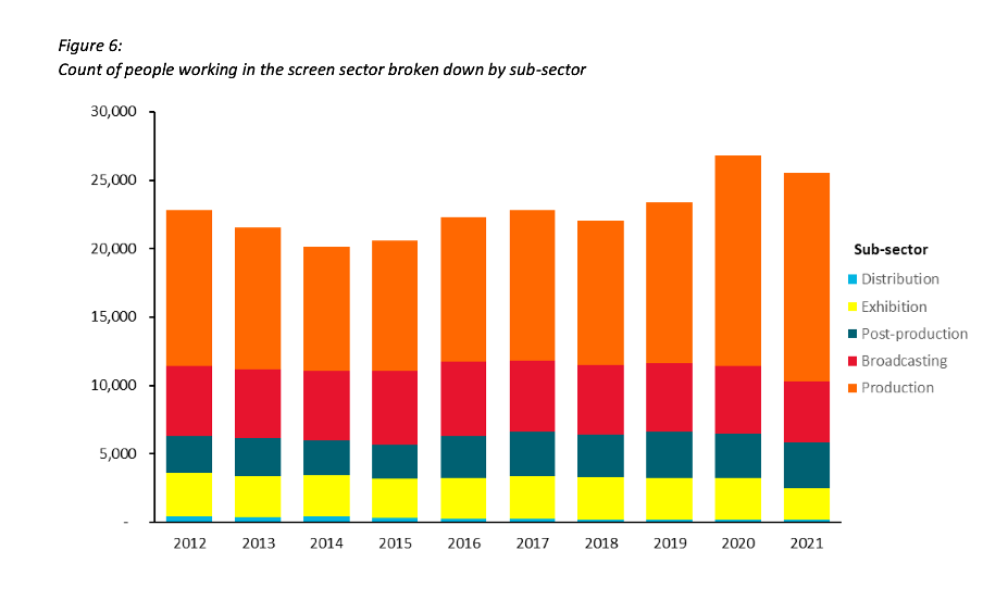
Image reproduced for purposes of education, criticism and commentary.
Lesson: Once you’ve established a colour scheme or an order in which to show different groups, categories, etc., maintain it unless there is a very good reason not to
Two (or more) charts are often better than one
Just as filmmakers use different scenes to show us different insights into characters, we can use different charts to show different insights derived from data. The stacked column charts shown in the current versions of Figures 3 and 6 each show two different insights: 1) total growth in firms or people working in the New Zealand screen industry, and 2) changes to the proportional breakdown of firms or people by sub-sector.
There are many similar situations in data communication. For example, we might want to show how the number of customers or clients has changed and how that breaks down by region, age, income, etc.
In all of those situations it generally works better to use a chart with solid bars or columns first to show the change in the absolute value or count of whatever we are focussed on and then follow that up with a stacked bar or column chart showing the proportional breakdown than to try to do both at once as happens in the current versions of Figures 3 and 6. The first chart establishes the overall change and then the second one shows whether that is being driven disproportionately by particular sub-groups. Additional stacked bar or column charts can be used to show additional breakdowns.
Lesson: If you are trying to communicate multiple insights consider using multiple charts
Those of us trying to communicate data-driven insights are like filmmakers and TV producers in that we are trying to create an engaging narrative. We can learn from them in taking care to ensure the story we tell is clear, maintains continuity when it comes to things such as colour and order, and is not unnecessarily complicated to follow. We should carefully attend to those details because in data communication, as in filmmaking, Fincher's 'obsessiveness' is really true professionalism.
Discussion and visualisation of data should make an issue more understandable
Housing is a fraught topic in New Zealand, as it is in many places. Too many people lack access to a decent place to live at a price they can afford. On the other hand, people who have lived in neighbourhoods they love for decades may be reluctant to see them change through intensification. That is a hard problem, and one that’s helpful to consider in light of good available data.
An article in the most recent edition of The Sunday Star-Times missed an opportunity to do that. The article describes results of a survey conducted by Freshwater Strategy on behalf of The Sunday Star-Times. The survey measured attitudes of eligible voters toward new housing and increased housing density. Ideally the survey results would have helped to inform the debate around these issues, but the results were communicated poorly, reducing their ability to make a constructive contribution to the debate.
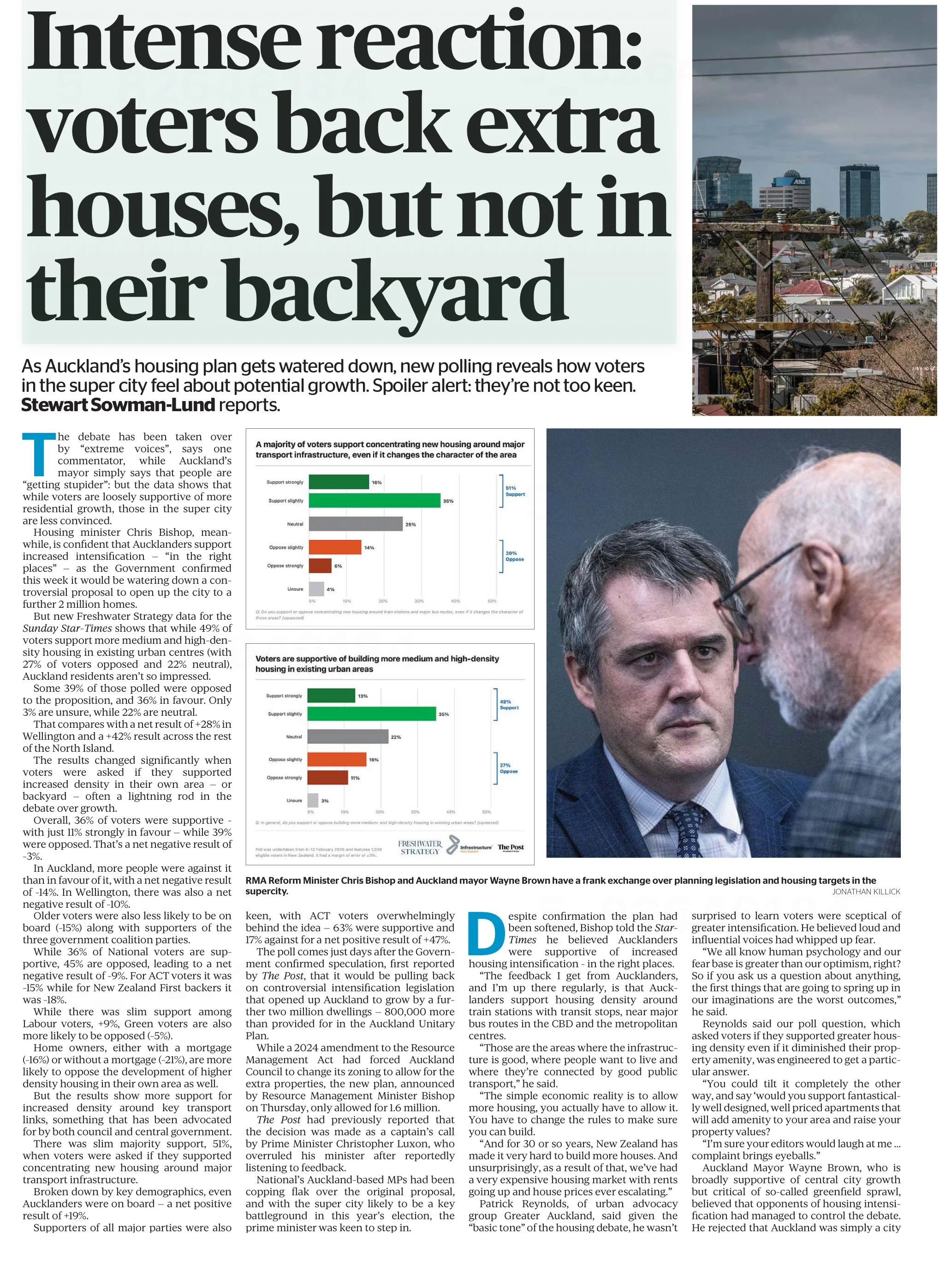
Reproduced from page 6 of the Sunday Star-Times from 22 Feb, 2026 for purposes of education, commentary, and criticism.
Show the things that are most important for the audience to know
One data communication choice in the article that limits its likely use and usefulness relates to which results were featured in visualisations and which were not. The headline of the article says that ‘voters back extra houses, but not in their backyard’ and the text of the article describes density in people’s own local area as ‘often a lightning rod in the debate over growth’. Given those things, it’s surprising to see that even though the text of the article discusses attitudes toward increased density in survey respondents’ own local areas, those results don’t feature in either of the two charts shown in the article. The two charts that are shown illustrate fairly similar responses to fairly similar questions (about increased housing intensification around transport infrastructure and in existing urban areas, which in practice are often likely to be the same places).
Lesson: When using a combination of text and visualisations to communicate insights from data, the data visualisations should be used to illustrate the most important points.
Show (and tell) your audience about your results at a level of granularity required to inform their decision making
A second problem with the way the data from the survey is communicated in the article is that the charts that are shown present more granular results than the text descriptions that accompany them. That makes it difficult to understand the results in detail – particularly for the crucial question for which there is no visualisation.
That is problematic because for emotive issues such as housing there is a big difference between being strongly supportive versus slightly supportive or being strongly opposed versus slightly opposed. Those who are strongly supportive or opposed are much more likely to take actions such as contacting their elected representatives, signing petitions, participating in consultation processes, and sharing their views formally or informally. Their votes are also more likely to be influenced by the issue.
Showing more granular results with all six possible responses to each question would have made it easier to see the differences in attitudes when increased density is discussed in the abstract versus in a way that could have an immediate effect on the people expressing the attitudes. Obviously data communication almost always involves choices about what to include and what to exclude or present in an aggregated manner, but in this case a relatively small change in the type of chart used would have enabled much more information to have been communicated to help readers understand the issue being discussed.
Both of the charts shown are bar charts, with each bar representing the proportion of survey respondents who gave each response to the question shown at the bottom of the chart. Because they are mutually exclusive proportions (each person can give only one answer to each question, and all respondents are represented if only to say they are neutral or unsure) then these results could have been shown using a stacked bar chart. That is where there is a bar sliced into segments – in this case based on which response people selected for each question. One stacked bar chart with three bars could have been used to compare overall results for the three questions discussed in the article.
The text of the article also discusses variation in responses to all three questions based on location, age, voting preferences, and home ownership. There are no charts for any of those things, which makes it somewhat difficult to follow the text-based discussion about how results vary by group. Additional stacked bar charts would have helped to show key differences based on location, age, voting preferences, and home ownership.
Lesson: When possible – and especially when details are important to truly understanding an issue – try to preserve granularity when communicating data and only aggregate when doing so helps the viewer understand the data more clearly.
Define your metrics
Given the previously described issues with what was shown in visualisations, the text of the article had to carry most of the burden of communicating the survey results; however many readers would probably struggle to fully understand the text-based descriptions. To see why, let’s take a look at an excerpt from the text of the article.
“… while 49% of voters support more medium and high-density housing in existing urban centres (with 27% of voters opposed and 22% neutral), Auckland residents aren't so impressed.
Some 39% of those polled were opposed to the proposition, and 36% in favour. Only 3% are unsure, while 22% are neutral. That compares with a net result of +28% in Wellington and a +42% result across the rest of the North Island.”
The last sentence in the excerpt shown discusses ‘net results’ of +28% in Wellington and +42% across the rest of the North Island. The subsequent discussion also uses the ‘net’ terminology. People who regularly review survey data are likely to know that ‘net results’ in this context mean the total percentage in support (slightly + strongly) minus the total percentage in opposition (slightly + strongly); however the article does not say that anywhere and it seems unlikely that most readers of the Sunday Star-Times are familiar with that convention. Calculated metrics like that should be explained when viewers may be unfamiliar with them.
Lesson: If you are using a calculated metric, you should explain how it’s calculated if more than a very small percentage of the target audience are unlikely to know that.
Between the most salient question not being shown in a chart or described in full, group differences not being shown in charts or described in full, and many people not understanding the concept of net results in this context I suspect this article may leave many readers no better informed than they were before they read it. That is a lost opportunity for data to play an important role in helping people understand and make decisions about this important issue for our society. A detailed understanding of how attitudes vary by group and by form of intensification is likely to be necessary for finding housing solutions with enough community support to be implemented, and for identifying the specific challenges that must be overcome to make that happen.