
On average, considering variation leads to better decisions
Garrison Keillor describes the people of his fictional town, Lake Wobegon, by saying "All the women are strong, all the men are good-looking, and all the children are above average." While the last claim is impossible and the first two are unlikely, even for a fictional town, the statement illustrates our tendency to focus on aggregate statistics such as totals and averages when we summarise things.
Aggregate statistics are important, but if you only examine overall measures such as those without also checking the extent and nature of underlying variation you may miss important pieces of the puzzle you are trying to put together. That’s particularly the case when what you are describing is less homogeneous than the people of Lake Wobegon.
A recently released report on community engagement done by the New Zealand Transport Agency (NZTA) regarding proposed changes to how State Highway 1 travels through Wellington demonstrates the value of looking into the extent and nature of variation rather than just at aggregate statistics. It does that by breaking down the data a variety of ways using a consistent chart type to make it easy to compare different results to get a clear understanding of the overall situation. Whatever your opinion about the changes proposed for State Highway 1, the report is an example of good data communication.
Aggregate measures sometimes don’t show the full picture
The report summarises results of a survey that asked about five specific changes being considered to the portion of State Highway 1 that runs through Wellington City. Community members who took the opportunity to provide feedback were asked to indicate how they believe the changes overall, and each change individually, would affect them personally and the Wellington region more generally.
Results for each of those two measures for the full set of changes collectively are shown in aggregate in Figure 5-1.
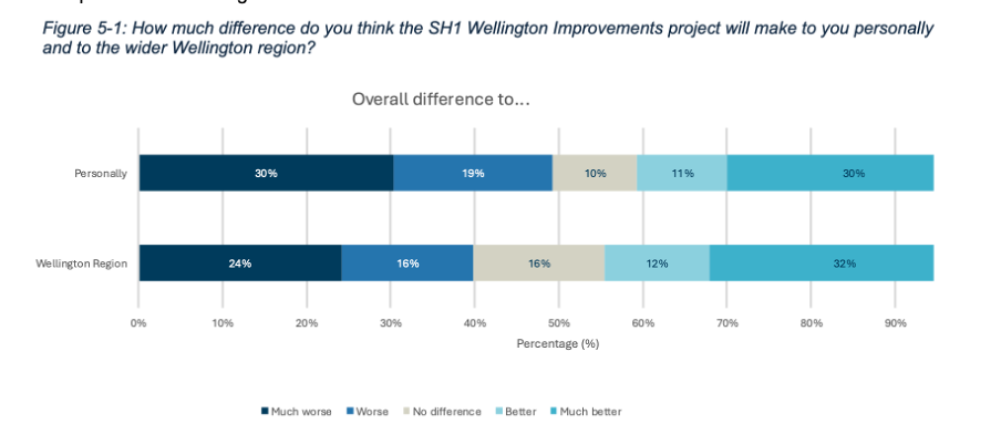
Image reproduced for purposes of education, criticism and commentary.
Importantly though, the report also includes the results for each measure based on where survey participants live, as shown in Figure 5-2 below for how survey respondents think the whole programme of changes would affect them personally.
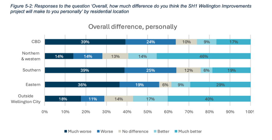
Image reproduced for purposes of education, criticism and commentary.
If we only looked at the first figure we would get a sense that the community is somewhat evenly split on whether the project overall would make things better (41%) or worse (49%) for them personally, but by examining the more granular geographic breakdown of results it becomes clear that the people who believe the changes would make things better disproportionately live outside of Wellington City or in the northern and western suburbs while the people who believe the changes would make things worse for them live in the CBD and the southern and eastern suburbs.
This is important information for policy makers to consider given the changes proposed would occur in the CBD and the southern and eastern suburbs. In other words, the people most likely to be most directly affected by the changes during and after implementation were disproportionately likely to believe the changes would make things worse for them personally.
In this situation a lot of variation in attitudes toward the proposed changes can be explained by where people live, but characteristics such as age, gender, and income, may account for variation in other metrics. It’s always worth checking for such differences rather than just focussing on aggregate measures such as totals and overall averages when using data to make decisions.
Lesson: Aggregated results may hide a lot of variation across different characteristics. Check for such differences, and when they exist show and explain the variation as well as the aggregated results.
Make comparison easy
Previous posts have shown examples of inconsistency in how data insights are communicated. This report shows the benefit of consistency when it comes to choices such as the type of chart, the order of data series, and the colour scheme.
Both Figure 5-1 and 5-2 use stacked bar charts, ordered to show responses from much worse to much better, and with the same colours used to represent each possible response option. Similar charts were used to show perceived personal and Wellington-wide effects toward each change considered. For example, Figure 5-5 below shows how responses varied for each change under consideration.
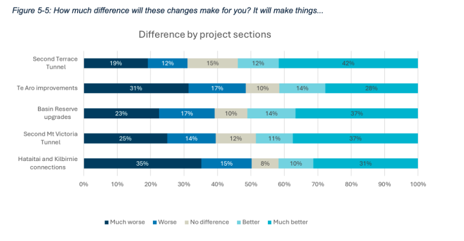
Image reproduced for purposes of education, criticism and commentary.
A stacked bar was a good choice for this data because the response options for each question are mutually exclusive and some labels for different projects and locations are long. Having selected an optimal chart type for the situation, keeping everything else constant makes it very easy to make comparisons between charts as well as within them. It means that someone reading the report can concentrate on how attitudes change depending on where a person lives or what part of the project is being considered rather than forcing them to waste mental bandwidth trying to orient themselves around each new chart because it’s designed slightly differently.
Lesson: Using charts of the same type and with the same order and colour scheme helps facilitate comparisons
Unlike the fictional, reportedly highly homogeneous Lake Wobegon, variation is common in the real world and the data that represents it. Understanding that variation rather than focussing exclusively on aggregate metrics won’t make decisions such as whether to change a state highway easy, but it will, on average, result in better decisions.