
Precisely what do you mean?
John Maynard Keynes is reported to have said: "It is better to be roughly right than precisely wrong." When it comes to data communication, we can think about roughly the impression we want readers or viewers to come away with as well as the precision with which we report individual results, and consider how those two things go together.
Health New Zealand recently published some data in several New Zealand newspapers that we can use to consider those ideas. We might describe the overall effect of that example as roughly wrong and precisely right.
Show me the big picture
The largest numbers in the visualisation are the national percentages for each metric and under each one of those is an upward arrow showing the percentage improvement from the same quarter of the previous year. Since all of those arrows are pointing up, if you quickly glanced at the visualisation it might leave you with the impression that everything is going great. The ‘Delivering better healthcare for you’ headline above the visualisation and description of improvements below would probably reinforce that impression.
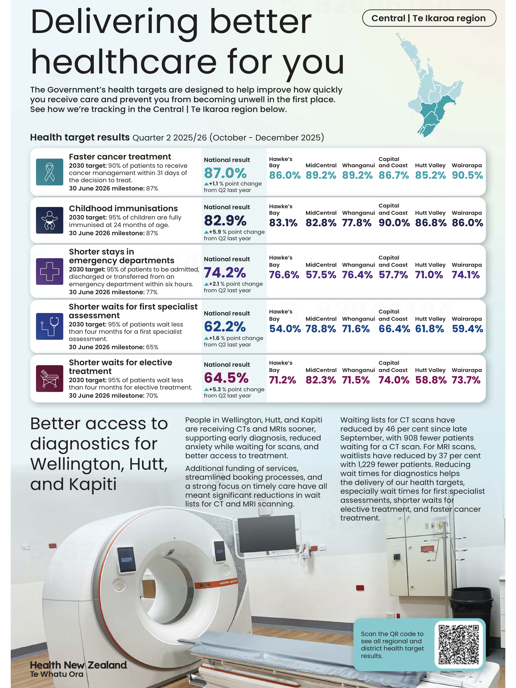
Image reproduced for purposes of education, criticism and commentary.
To the left of those large percentages are 2030 targets and 30 June 2026 milestones for each metric. Comparing the large font national results for the quarter ending in December 2025 to the target for the 30th of June 2026 shows that only one of the five metrics (faster cancer treatment) had reached the June 2026 milestone as of the end of December 2025, while the other four seem unlikely to be able to catch up within six months based on where they were at the end of 2025 and how much they changed in the prior year. In other words, while there has been improvement on all of the metrics between 2024 and 2025, the national milestones set for June 2026 seem unlikely to be met for most of the metrics.
At a local level things are somewhat more complicated. Data is shown for six parts of the lower North Island. None of those areas have reached the June 2026 milestone on one of the metrics (shorter stays in emergency departments), but on another one of the metrics (shorter waits for elective treatment) five of the six areas have already met the June 2026 milestone. Results for other metrics are more mixed.
You need to examine the data closely to see those differences. Use of conditional formatting would have made it much easier to quickly see the big picture. For example, if green font was used for milestones already met, yellow for those likely to be met in time to reach the June 2026 deadline, and red for those unlikely to be met we could easily see the metrics and areas that are on track and those that are lagging behind.
Lesson: Visualisations should leave viewers with an accurate overall impression as well as being accurate in the details.
Don’t drown me in detail
Details like which metrics are on track toward their milestones and which are not help fill in the big picture, but other details can distract from it. A common example, in this and many other data visualisations, is showing numbers to a level of precision that is not meaningful. In this visualisation, numbers could be rounded to the nearest percentage. Showing tenths of a percent clouds the overall picture rather than adding to it since it is unlikely to affect anyone’s perception of how Health New Zealand is doing and even less likely to change any decisions.
Lesson: Report results at a meaningful level of precision.
Someone quickly glancing at this data visualisation in their newspaper might come away with an inaccurate impression of how the health system is performing, so in that sense it is not a good example of data communication overall.
Nonetheless, it’s good that Health New Zealand appears to be making a genuine effort to document their performance for the New Zealand public since the public both uses and pays for the health system. It’s also good that they provided not only a snapshot of where things are now, but included comparative benchmarks and historical data to put current performance into context.
Doing those things while also applying the lessons described would let the audience see how individual data points combine into a larger picture while not drowning them in so much detail that they find it hard to see that larger picture. That would create data communication that is roughly right rather than precisely wrong.