
EVs are getting better all the time; so should data communication
Current geopolitics and associated oil and petrol prices have me feeling good about owning an EV. I bought mine a few years ago, and knew sales had dropped after incentives were removed in New Zealand, but I was curious to see if they had picked up again given current events. Anecdotal news reports suggest that they have, but it was harder than I expected to find the actual data.
Show your sources
After a bit of online searching, I found the dashboard shown below from Infometrics. The surge in EV registrations during the period of the Clean Car Discount is evident in the middle chart, as is the falloff after. I suspected the data came from the New Zealand Transport Agency (NZTA), as that’s the first place I checked myself (more on that later), but at first I could not verify that. Eventually I realised that the small red ‘i’ symbol under ‘Highlights for New Zealand’ was clickable and led to a list of data sources, but I had to search through that to find the one I was looking for and even then it just said NZTA without saying exactly where to find this specific NZTA data on their website.
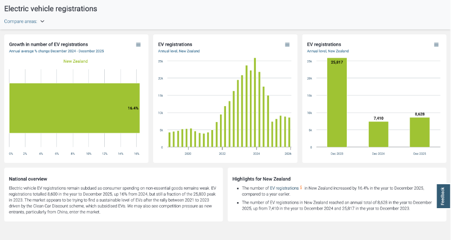
Image reproduced for purposes of education, criticism and commentary.
Not everyone wants to see sources, but some people do, and providing sources and making them easy to find adds to the credibility of your data communication. Sometimes it can be essential for viewers to really understand what they’re looking at. For instance, in this example, you may be wondering if plug-in hybrids are being counted within this dashboard or not. They were not, but the only way to know that for sure is to find and click the symbol and read that additional information about the source.
Lesson: Always show your sources, and make it easy for those who want them to find them.
Provide comparisons
While it’s clear from the last two charts that EV registrations dropped between 2023 and 2024 and from all three that EV registrations grew between 2024 and 2025, what’s not clear is how that compares to other types of vehicles. For example, during 2024 you often heard the mantra ‘survive until 2025’ reflecting the difficult economic times, so perhaps sales of all vehicles were down in 2024. Without comparative data, we can’t tell for sure.
While the second chart in the Infometrics dashboard is very helpful, the other two essentially just show the same information in different ways, and would have been usefully replaced by charts for hybrid and petrol only vehicles so we could compare and contrast registrations for each type of vehicle across time.
Lesson: A lot of data is most informative when shown in relationship to relevant comparative data.
Getting granularity right
The other thing that’s missing from the Infometrics dashboard is data for the first three months of 2026. Given the rapidly changing situation in the oil-rich Middle East, things might have changed a lot in the past few months, but we can’t tell from the Infometrics dashboard.
As I mentioned, I went to the NZTA website first because I recalled that they have their own dashboard, and that did indeed have data up through March 2026 and it did have comparative data for different types of vehicles, but it had different limitations from the Infometrics dashboard. Specifically, even after several attempts I was unable to get it to display data by month as opposed to showing it for one month or a group of months added up.
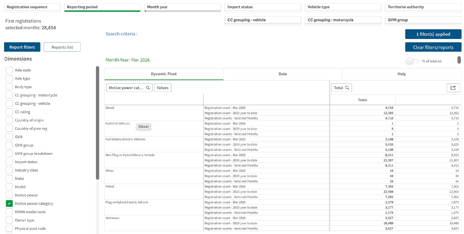
Image reproduced for purposes of education, criticism and commentary.
If I really needed to, I could have downloaded the data for January, February, and March 2026 one month at a time, but obviously that’s not the most user-friendly experience. In this situation, people making decisions about things such as whether to accelerate the roll-out of additional EV charging infrastructure probably want to know about any changes in trends sooner rather than later and therefore would have appreciated being able to access that more granular data without having to do a lot of their own manipulation of the data.
Lesson: Communicate data insights at the level of granularity that will be most useful for decision makers.
While I’m less concerned about current fuel prices and potential fuel shortages than owners of cars with combustion engines, my own EV from just a few years ago doesn’t go as far on a charge as the new ones being sold today. EV manufacturers didn’t get everything perfect on the first try. They needed to improve battery technologies and redesign car bodies to accommodate differences in things such as the weight distribution resulting from EVs having much larger batteries than internal combustion cars, but no engine.
It’s also hard to get data communication right the first time. Neither the Infometrics nor the NZTA dashboard is perfect or individually sufficient, but that same sort of patience to redesign and refine pays off in data communication, just as it has for modern EVs.