
Little changes can make a big difference
On page 139 of his revered book ‘The Visual Display of Quantitative Information’, Edward Tufte says: ‘Multifunctional graphical elements, if designed with care and subtlety, can effectively display complex, multivariate data.’ Let’s consider charts Statistics New Zealand created to show immigration data to see how a bit more care and subtlety could improve the display of multivariate data in those examples.
Adding patterns can help show multiple dimensions
If you look at the first chart below, you can see that it is showing two different things: Whether people are arriving into or departing from New Zealand (also shown as the net difference between arrivals and departures), and whether or not the people arriving or departing are New Zealand citizens. Six different colours are used in the chart to show the combination of those two things.
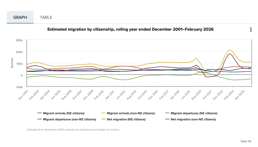
Image reproduced for purposes of education, criticism and commentary.
Since there is nothing particularly intuitive about the colours used, viewers of the chart need to repeatedly look back and forth between the legend and the line chart to remember which colour refers to which data series. This is exacerbated by the facts that: 1) different charts showing different immigration data on the same webpage use the same colours to show different things, as the chart below illustrates, and 2) all of the lines are fairly close together.
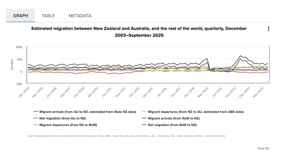
Image reproduced for purposes of education, criticism and commentary.
One way to use Tufte’s concept of multifunctional graphical elements would be to use different markers or symbols to convey one of the dimensions to make it easier for the viewer to distinguish between the different data series. In this situation, an obvious example would be to use up and down arrows or triangles to show arrivals and departures. That would then allow us to use one colour for New Zealand Citizens and another for non-citizens, which also helps make it easier for viewers to distinguish the different data series, as shown in the example below, remade with the data available after clicking on table tab in the top Statistics New Zealand chart.
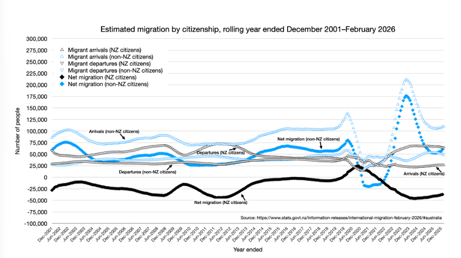
Author's own chart, using Stats NZ data.
Lesson: Consider using patterns as well as colours to distinguish between different data series in charts — particularly when trying to show multiple dimensions.
Making choices about chart sizing using care and subtlety
The main plot area of the original Statistics New Zealand charts are quite short vertically, but relatively wide horizontally. The width is likely to be a function of the fact that there are a large number of data points to show (one for each month, showing rolling years). Since the charts are shown online, it’s not clear why so little space was allowed for the vertical dimension. Sometimes page sizes or layouts restrict the vertical dimension of a printed document, but that should be less of a concern online within reason.
Expanding the vertical dimension of the chart, as shown in the remade example above, makes it easier to distinguish between the different data series. Because it still uses the same numeric range, which includes zero, expanding the vertical dimension does not give a misleading sense of things like changes and differences — it just makes them easier to see. Part of the reason care is important here is that truncating the range of an axis, especially to exclude zero, can magnify things such as changes and differences and therefore be misleading.
Lesson: Changes to the size or dimensions of a chart may make it easier for viewers to see patterns in the data — just make sure it enhances those rather than distorting them.
Err on the side of labels
Another noteworthy bit of wisdom from ‘The Visual Display of Quantitative Information’ (page 180) is: ‘Words and pictures belong together. Viewers need the help that words can provide… It is nearly always helpful to write little messages on the plotting field to explain the data, to label outliers and interesting data points, to write equations and sometimes tables on the graphic itself, and to integrate the caption and legend into the design so that the eye is not required to dart back and forth between textual material and the graphic.’
As noted in that quote, labels can be very helpful, and if in doubt it’s prudent to err on the side of more labelling rather than less. For instance, in the remade chart above the up and down arrows or triangle symbols may be somewhat hard to see because there are a lot of them and some viewers may be using small screens, so the individual data series are labelled in situ as well as in the legend.
Lesson: Make sure axes, data series, and other elements within data visualisations and other forms of data communication are well-labelled to avoid ambiguity and confusion and to ensure viewers can focus on patterns and insights revealed in the data.
The Visual Display of Quantitative Information was published more than 40 years ago, yet it remains as relevant now as the day it was first printed. The need to ‘effectively display complex, multivariate data’ is as important now as it was then.