
Get to the point
In one of the courses I teach for Wellington Uni-Professional, I have participants do an exercise where they critique an example of a data-intensive report (or other form of data communication) created by someone else. Over many iterations of the exercise, the most common negative critique relates to length. The examples are often reports that are hundreds of pages long, which are, unfortunately, extremely common in the New Zealand public sector. Participants rightly observe that few, if any, people are likely to want to wade through all of that and the length of the documents makes it hard for people to find the information they really want and potentially unlikely to even bother.
A recent information release from Statistics New Zealand illustrates the benefits of carefully curating data communications to focus on only what is essential and then to present that in a highly digestible way.
Less is more
In the course, we speculate about why the examples we are critiquing ended up being as long as they are. Theories typically include the authors erring on the side of including information just in case someone wants it, wanting to show all the analysis that they did, and not leaving enough time before a deadline to do a careful edit.
Whatever the reason, counter-intuitively, more information in a report, presentation or dashboard often leads to a worse experience for the reader or viewer. It makes it hard for them to find the information that they’re looking for and makes it more likely that they won’t try or will be unsuccessful even if somewhere, hidden in all of that material, are insights that would be very valuable to them.
Providing an overly long report or other form of data communication essentially outsources the curation and editing work to the reader or viewer when it should be the responsibility of the author. Statistics New Zealand’s Employment Indicators for February 2026 provides a good illustration of how concise a valuable data-intensive output can be when the authors take that responsibility seriously.
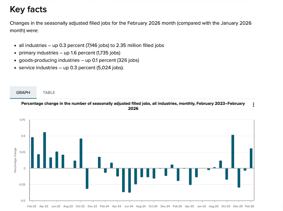
Image reproduced for purposes of education, criticism and commentary.
In just a page or two’s worth of words and numbers it provides a quick overview of changes in the number of filled jobs in New Zealand over time (as shown above), and breaks down changes by industry, region, gender, and age over the previous month (as shown below). It also shows changes in jobs as both a percentage and an actual number of jobs. That’s enough for most people to gain a clear understanding of recent trends in the job market for a very small investment in time.
Lesson: Carefully consider what information is essential and provide only that.
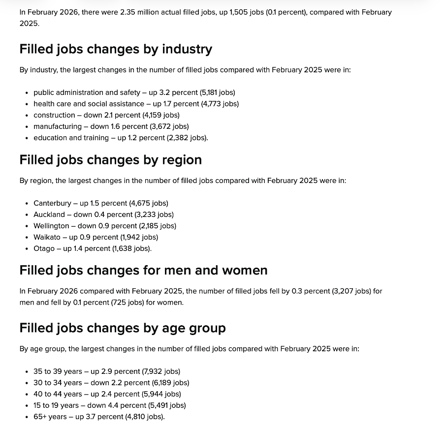
Image reproduced for purposes of education, criticism and commentary.
Start general then move to specifics
In addition to providing a good illustration of carefully pruning back to the most essential information, the Statistics New Zealand example also demonstrates a general pattern for how to summarise information well, and that is to start at a high-level of aggregation and then break things down into more granular detail.
In this example, that means starting with the percentage change in total filled jobs by month and then subsequently showing changes in the prior month by industry, region, gender, and age. Starting with that high-level view lets readers or viewers orient themselves first and then see how specific industries, regions, or groups vary from broader trends (such as the relatively large drop in jobs filled by 15-19 year olds in this instance). It also means that someone who only cares about the high-level view can stop once they’ve seen that.
Lesson: Start with the high-level view, then break things down into greater detail.
What are my options?
While many people may only want the high-level view, and most will be very pleased with a concise, well-curated version of the story you are telling with data, some may want additional information. That might include additional methodological detail, even more granular cuts of the data, or to see data in an alternative format.
As the Statistics New Zealand example shows, in today’s environment it’s easy to give readers and viewers the option of accessing that type of information via links to additional details, data, and information. In this situation, that includes links to download the actual data, to see definitions and metadata, and to show the time series data as a table rather than a chart.
This approach is convenient for people who, for example, may want to download data to do their own analysis rather than just looking at it, people who want to better understand particular aspects of how data was collected and analysed, and for those using technologies designed to aid accessibility.
Lesson: Provide options to access more information or alternative forms of the same information.
We’re living in a time when attention is at a premium, and it’s important to reflect that in the data products that we create. Take a little extra time to carefully curate your data communications to make sure that they contain only the most essential information, begin with higher-level insights then move to more granular ones, and give users who want more detail options for getting it. If you do, your report, presentation, or dashboard may end up being one of the positively critiqued examples in my classes or in this blog.