
Get to the point
In one of the courses I teach for Wellington Uni-Professional, I have participants do an exercise where they critique an example of a data-intensive report (or other form of data communication) created by someone else. Over many iterations of the exercise, the most common negative critique relates to length. The examples are often reports that are hundreds of pages long, which are, unfortunately, extremely common in the New Zealand public sector. Participants rightly observe that few, if any, people are likely to want to wade through all of that and the length of the documents makes it hard for people to find the information they really want and potentially unlikely to even bother.
A recent information release from Statistics New Zealand illustrates the benefits of carefully curating data communications to focus on only what is essential and then to present that in a highly digestible way.
Less is more
In the course, we speculate about why the examples we are critiquing ended up being as long as they are. Theories typically include the authors erring on the side of including information just in case someone wants it, wanting to show all the analysis that they did, and not leaving enough time before a deadline to do a careful edit.
Whatever the reason, counter-intuitively, more information in a report, presentation or dashboard often leads to a worse experience for the reader or viewer. It makes it hard for them to find the information that they’re looking for and makes it more likely that they won’t try or will be unsuccessful even if somewhere, hidden in all of that material, are insights that would be very valuable to them.
Providing an overly long report or other form of data communication essentially outsources the curation and editing work to the reader or viewer when it should be the responsibility of the author. Statistics New Zealand’s Employment Indicators for February 2026 provides a good illustration of how concise a valuable data-intensive output can be when the authors take that responsibility seriously.
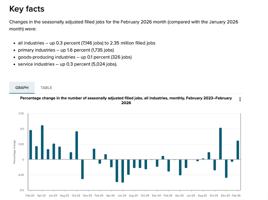
Image reproduced for purposes of education, criticism and commentary.
In just a page or two’s worth of words and numbers it provides a quick overview of changes in the number of filled jobs in New Zealand over time (as shown above), and breaks down changes by industry, region, gender, and age over the previous month (as shown below). It also shows changes in jobs as both a percentage and an actual number of jobs. That’s enough for most people to gain a clear understanding of recent trends in the job market for a very small investment in time.
Lesson: Carefully consider what information is essential and provide only that.
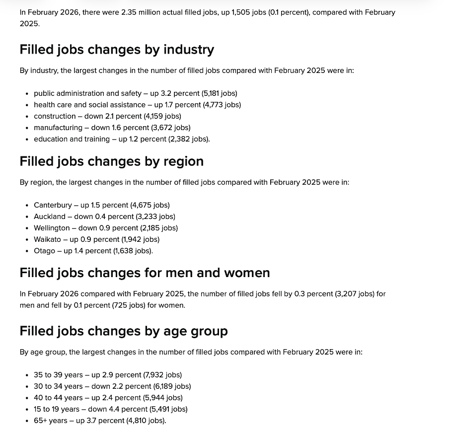
Image reproduced for purposes of education, criticism and commentary.
Start general then move to specifics
In addition to providing a good illustration of carefully pruning back to the most essential information, the Statistics New Zealand example also demonstrates a general pattern for how to summarise information well, and that is to start at a high-level of aggregation and then break things down into more granular detail.
In this example, that means starting with the percentage change in total filled jobs by month and then subsequently showing changes in the prior month by industry, region, gender, and age. Starting with that high-level view lets readers or viewers orient themselves first and then see how specific industries, regions, or groups vary from broader trends (such as the relatively large drop in jobs filled by 15-19 year olds in this instance). It also means that someone who only cares about the high-level view can stop once they’ve seen that.
Lesson: Start with the high-level view, then break things down into greater detail.
What are my options?
While many people may only want the high-level view, and most will be very pleased with a concise, well-curated version of the story you are telling with data, some may want additional information. That might include additional methodological detail, even more granular cuts of the data, or to see data in an alternative format.
As the Statistics New Zealand example shows, in today’s environment it’s easy to give readers and viewers the option of accessing that type of information via links to additional details, data, and information. In this situation, that includes links to download the actual data, to see definitions and metadata, and to show the time series data as a table rather than a chart.
This approach is convenient for people who, for example, may want to download data to do their own analysis rather than just looking at it, people who want to better understand particular aspects of how data was collected and analysed, and for those using technologies designed to aid accessibility.
Lesson: Provide options to access more information or alternative forms of the same information.
We’re living in a time when attention is at a premium, and it’s important to reflect that in the data products that we create. Take a little extra time to carefully curate your data communications to make sure that they contain only the most essential information, begin with higher-level insights then move to more granular ones, and give users who want more detail options for getting it. If you do, your report, presentation, or dashboard may end up being one of the positively critiqued examples in my classes or in this blog.
Clearly communicating when conclusions may be complicated or contentious
Only five out of the eighty-nine countries and regions included in the World Mortality Dataset had fewer excess deaths than New Zealand over the pandemic period. That might seem unremarkable to people who lived through New Zealand’s lockdowns or to those elsewhere who read about them — except that, indexed across the full period from 2020 to 2023, New Zealand's Covid restrictions were actually less stringent than those of almost every country it is typically compared to, including Sweden, the United Kingdom, Australia, Italy, and the United States. Whether that finding surprises you or confirms what you already suspected, you don't have to take anyone's word for it. The data is right there for you to check yourself — and that is no accident.
It’s part of a recently released series of reports from the New Zealand Royal Commission examining lessons learned about the country’s experience with Covid 19. The pandemic and its aftermath are things that all adults experienced and nearly all have opinions about. It also influenced and was influenced by a complicated web of public health, economic, and legal policies and practices. In situations like this, where the data and related analysis are complex, and many people have strong opinions about, or vested interests in the conclusions, the stakes and potential for a contentious reception are high.
In communicating the results of its investigation into this period of New Zealand’s history to provide lessons to guide responses to pandemics the country may face in the future, the Royal Commission also did two things that provide important lessons for those trying to communicate data-intensive insights in the future.
Divide and conquer
Somewhat unusually, the final outputs from the Commission’s work were delivered in not one, but three reports. The main report is mainly text that systematically lays out conclusions and recommendations about different aspects of the pandemic response. Two separate reports summarise submissions made to the Commission by the public and provide a curated collection of relevant publicly available data.
The one summarising the submissions includes some photos of, and direct quotes from the people who made submissions, showing how the pandemic affected them personally. The data-oriented report includes many charts and graphs showing how New Zealand compared to other countries on a variety of measures and also tracks changes to various measures before, during, and after the pandemic.
The information in those two separate reports inform the conclusions and recommendations in the main report, but each output is hundreds of pages individually, so combining them without removing any content would have created a document of over one thousand pages. Even the most interested parties are unlikely to want to read that.
Faced with a situation like this, it helps to split things up. In some cases that might mean dividing content by topic. For example, in this case maybe separating the health response from the economic response from the legal response. Those things were all inter-twined though, so it makes sense that’s not the option that the authors chose.
Another common way of dealing with this type of problem is to make different reports for different target audiences. In this situation that might have meant one report for policy makers and another for the general public. While that’s often a good solution, the pandemic is a rare situation in that it’s one where anyone reading anything about it is likely to have some direct personal experience with it, and yet there is probably no one who is an expert in all aspects of it. Health professionals don’t understand the nuances of the economic issues that had to be addressed and vice-versa, and everyone, regardless of their professional perspective, also had personal experiences.
Splitting the content the way the Commission did made it easy for politicians and policy makers to focus on the main document to consider possible lessons for the future (and to try to attribute blame for past decisions). It also demonstrated that the Royal Commission listened to and heard the many people who made submissions to it, which is particularly important given how intense, and often sceptical, feelings around the pandemic are. Finally, it allowed people who want to dive into the detailed and comparative data to easily find that. We will look more closely at some of that data ourselves next.
Lesson: If you have a lot of data-intensive information to communicate or you are trying to communicate data-intensive information to multiple audiences with different needs, consider using multiple outputs rather than trying to create one that is intended to be everything for everyone.
Anticipate assumptions, hypotheses and objections
Focusing now on the data-oriented ‘Covid by the Numbers’ supplementary report, we can see another smart decision. That was to make it easy for people to check their own assumptions, hypotheses and objections against the actual data.
People looking at any sort of data-oriented output often have their own views about the phenomena being examined. That’s certainly true of Covid. In some cases the views may be implicit assumptions, but in others they may be explicit hypotheses about how one thing affected another. In this and other situations, we can think about our audience’s assumptions and hypotheses and anticipate objections they might have to insights being presented. I think of these as the ‘yeah, but…’ thoughts that form in people’s minds as they watch a presentation or read a report.
We can leverage our understanding of an audience’s assumptions, hypotheses and objections in constructing data-oriented outputs. The idea is that almost as soon as the ‘yeah, but…’ thought forms in the minds of the viewer or reader the next slide or the next page of the report provides the information needed to answer that question or address that concern.
In the case of Covid, a common type of ‘yeah, but…’ thought is likely to relate to other countries. For example, ‘Yeah, but Sweden didn’t have so many rules, and not that many people died there.’ Or ‘Yeah, but people in the UK were much freer to live their lives.’ The ‘Covid by the Numbers’ supplementary report addresses concerns such as those with a series of charts providing comparative data across many countries and highlighting the exact countries that are most likely to feature in ‘yeah, but…’ thoughts.
For example, Figure 23 shows excess mortality by country (going from least to most excess mortality, and also explaining what excess mortality is in a note at the bottom) and Figure 46 shows the stringency of Covid policies (going from most to least stringent, though it might have been better to always have the most desirable end of the scale at the top). Both use highlighted bars along with arrows and larger labels to make it easy to find comparator countries most likely to feature in ‘yeah, but…’ thoughts and therefore make it easy for readers to test their own assumptions, hypotheses and objections against the actual data.
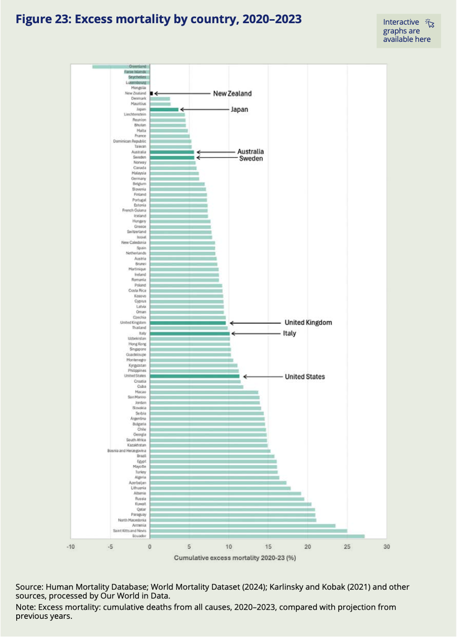
Image reproduced for purposes of education, criticism and commentary.
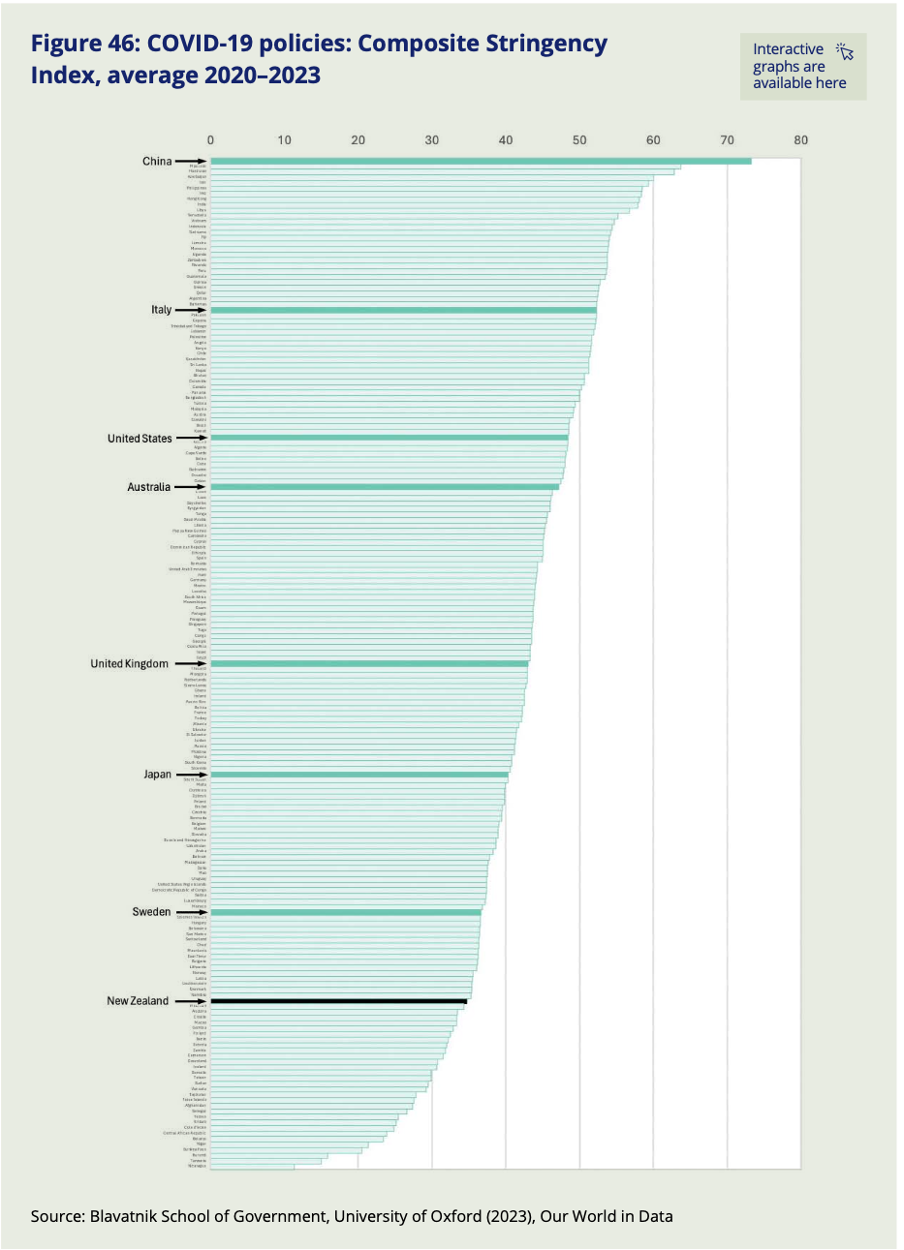
Image reproduced for purposes of education, criticism and commentary.
Lesson: Consider implicit assumptions, explicit hypotheses, or possible objections your audience is likely to have about the data you are trying to communicate and make it easy for them to test their assumptions, hypotheses and objections against the actual data.
Everyone had their own experience of the pandemic, and everyone is likely to have their own reaction to these reports — including to the findings shown in this post. Whether New Zealand's combination of near-best excess mortality and, indexed over the full pandemic period, relatively low policy stringency strikes you as expected, surprising, or still not the whole story, the Commission's choices mean that you are not left arguing from memory or anecdote. The data is there, clearly laid out, and deliberately designed to let you test your assumptions against the evidence. That is exactly what good data communication makes possible — and exactly what we can aim for when we need to communicate clearly about things that are complicated or contentious.