
Good jokes, and good data communication, depend on the audience
Everyone knows that explaining a joke can wreck it. Over-explaining a data visualisation can have the same effect. The trick in both situations is that failing to explain can also sometimes be a problem. The skill is knowing which is which. Jokes often draw on things such as cultural references. An audience already familiar with the references will pick up on them and enjoy getting them. On the other hand, the same joke told to an audience with different cultural references (due to age, location, etc.) might fall completely flat. That second audience might either need some additional explanation or else a different joke.
The same type of audience awareness is important in data communication, though in that case what’s relevant is how knowledgeable the audience is about the domain or about data and analytics more generally. Previous posts have described the importance of making data communication accessible to general audiences that include people who are not particularly data-savvy, but what about the reverse? How do you tailor data communication to an audience with a relatively high level of data capabilities?
The strengths and weaknesses of bubble charts
A chart developed by The Economist and posted on LinkedIn provides a good illustration. They use a bubble chart to show the relationship between three characteristics of recent graduates in different fields of study: 1) how exposed the field is to AI, 2) the change in the percentage of graduates in full-time employment between 2022 and 2024, and 3) the number of graduates in that field.
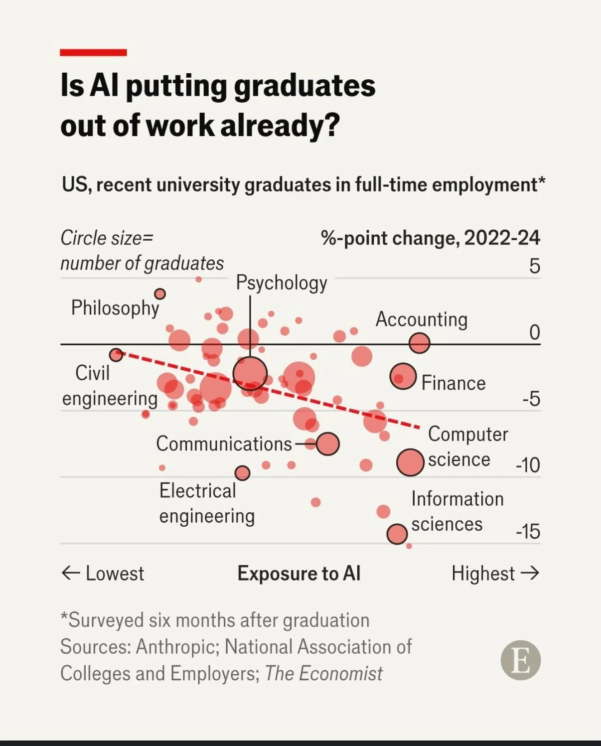
Image reproduced for purposes of education, criticism and commentary.
That packs a lot of information into a concise format for an audience that is comfortable with charts and graphs. Given the nature of the content it publishes, it seems safe to assume that includes most readers of The Economist and its LinkedIn followers. Such viewers are likely to be able to assimilate information about the three dimensions simultaneously.
In contrast, bubble charts can be very challenging for more general audiences to understand. Without a lot of explanation, and possibly a more gradual build-up, they may miss or misunderstand some of the information being communicated. The same is true of other more complex chart types, such as box and whisker or charts with two different y-axes.
Lesson: Complex chart types can reward data-savvy audiences but may confuse general ones.
To explain or not to explain
With its three dimensions’ worth of information, the Economist’s chart reveals interesting patterns with the help of some subtle cues. The solid black horizontal line separates fields in which more graduates were employed in 2024 than in 2022 (above the line) from fields in which fewer graduates were employed in 2024 than in 2022 (below the line). The downward sloping dashed red line shows the overall trend amongst all of the fields with the fields seeing the greatest drop in employment tending to be those that have the greatest exposure to AI. Scanning all of the bubbles with the help of those cues and the labels provided, we can see that computer and information science appear to be both among the most exposed to AI and among the fields that saw the greatest drop in employment of recent graduates between 2022 and 2024.
While all of that is interesting, the visualisation doesn’t say any of that, nor does the LinkedIn post in which it featured. The visualisation simply poses the question: ‘Is AI putting graduates out of work already?’ For a data-savvy audience, such as readers of The Economist, that creates an interesting puzzle to be solved. The chart gives them the information needed to solve it, and they have the skills to do so.
With a different audience, much more explanation would be needed to help them see how the chart answers the question posed. For example, they might not intuitively grasp the purpose of the dashed line or the meaning of the pattern of the bubbles. They also might not understand why the vertical axis shows the change in employment rather than just the employment rate.
You might be thinking: why not just explain everything all of the time? It does make sense to err on the side of explanation when you’re not sure about an audience, but too much explanation to an expert audience can easily come off as boring or condescending. It can also deprive them of the pleasure of finding the patterns themselves.
Lesson: More sophisticated audiences require less explanation.
This visualisation is a Good example of data communication for this audience — but with a different audience, the same chart could easily be Bad. Like knowing when not to explain a joke, knowing when not to explain a chart is a skill — and it starts with knowing your audience.