
Dispiriting mortgages, and disproportionate columns
A chart in a recent article in the Listener likely caught the attention of people hoping to buy their first homes, and possibly their parents too. The column chart shows the average mortgage size for first-home buyers, using data from credit bureau Centrix. It is included in an article considering whether first-home buyers are ending up with larger mortgages because the Bank of Mum and Dad is drying up.
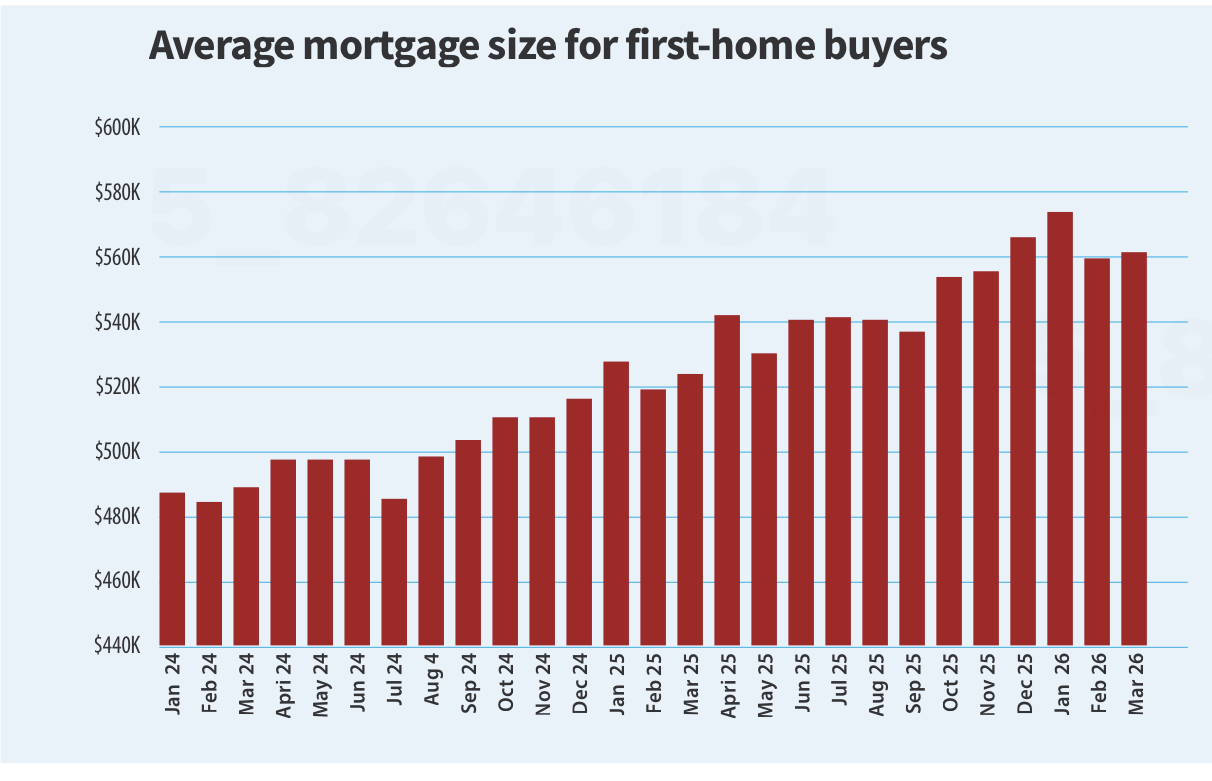
Bigger Mortgages by Eric Fryberg, New Zealand Listener, 3 October 2026, page 20. Reproduced for purposes of education, criticism and commentary.
The chart certainly makes the mortgages look bigger. The last column in the chart (March 2026) is about two and a half times as tall as the first column (January 2024). The values shown in the chart confirm that first-home buyers are borrowing more; however, the difference in the value of the average first-home buyer mortgage between January 2024 and March 2026 represents an increase of only about 15%.
This example offers three lessons that apply beyond housing: how the size of a change is shown, what it is compared with, and the source of the data.
Numerical axes should start at zero
The value of data visualisations stems from the ability of our brains to perceive patterns from pictures, so when the height of one column appears to be about two and a half times the height of another our brains quickly make the inference that whatever is being measured has more than doubled in size. In this case the axis begins at $440,000 and goes to $600,000, which makes the $74,000 difference between the value for January 2024 (about $487,000) and March 2026 (about $561,000) appear much larger than it really is even though the axis is clearly labelled, and the article text reports the values accurately.
Sometimes this happens by accident. Unfortunately, a lot of software defaults to showing only the range of an axis where there is a change. Other times those creating a data visualisation believe that showing just the portion of the axis where there has been a change will make it easier to see since starting the axis at zero would make the columns look much more similar. But the goal of a visualisation should be to leave the viewer with an accurate understanding of the situation the data represents. As in this situation, that often means a modest change in one direction or another rather than a dramatic one. Where seeing the detail is important, the actual values can be provided or the type of chart that incorporates a magnified pull-out can be used. Either of those options allows for the detail to be shown within its broader context, which will leave the viewer with a more accurate understanding.
Lesson: Don’t truncate numerical axes to show only the portion that changes during the period of interest. It distorts viewers’ perception of the magnitude of the change.
Add comparative data if it enhances understanding
Is a 15% increase in the average mortgage a lot? On its own, it is hard to say. If house prices had also risen 15% over the same period, bigger mortgages would be unremarkable — buyers’ share of equity in their homes would remain about the same.
In this case, the text of the article says: first-home buyers have been borrowing more at a time “when house prices have been flat or cheaper”. That contrast is the most interesting part of the story, yet it is not reflected in the chart.
Between January 2024 and March 2026, the national median sale price reported by REINZ rose from $760,000 to $788,000, an increase of about 4%. Interest.co.nz’s estimate of the average price paid by first-home buyers rose from about $657,000 to about $692,000, an increase of about 5%. A 15% rise in home loans against a 4–5% rise in house prices is a much more notable finding than a 15% rise in average mortgage values on its own.
A chart showing both series could have visually told the story of a closing gap between house prices and mortgages for first-home buyers. For example, data (from the same source, for reasons described in the following section) could have been shown by quarters, with columns in one colour showing average prices of houses purchased by first-home buyers and columns in another colour showing average mortgages for first-home buyers. Or alternatively it could have been a single data series showing the value of an average mortgage as a percentage of the value of an average house.
Lesson: Numbers become more meaningful when put into context by showing them in relationship to other important values or benchmarks.
Check whether the direction or magnitude of a conclusion depends on the source
There is a catch in the comparison above: the mortgage values and the house prices come from different sources.
Centrix is a credit bureau, and its mortgage figures come from the credit information lenders report to it. The Reserve Bank publishes its own monthly figures on new mortgage lending to first-home buyers, and the two don’t match. Using Reserve Bank data, first-home mortgages grew by about 7% (calculated from interest.co.nz figures for January 2024 and March 2026) over the time shown in the chart. Comparing that against the same 5% increase in average house prices for first-home buyers during that period implies slower closing of the gap between house prices and mortgages for first-home buyers.
The discrepancy between sources probably results from measurement differences in things such as how first-home buyers are identified, which loans are counted, and when. A sentence noting that Reserve Bank lending data show a smaller increase in the average size of first-home mortgages would have provided further evidence that there is indeed a closing gap while also signalling uncertainty about the magnitude of the gap.
Lesson: When reputable sources disagree, and the conclusion depends on which one you use, let the reader know.
The general gist of this part of the article — that the size of mortgages for first-home buyers is increasing — is interesting and true, if somewhat depressing for those first-home buyers, and potentially their parents. Artificially inflating their perception of the magnitude of that increase does not help tell that story more clearly. Adding comparative data about home values and alternative data sources would.